April 13, 2020
It’s time for more brightness! And a bit of practicality…
Let’s go back to the idea of the Weekly Timeless Wardrobe. Say you’ve got your 13 items for spring all set in your closet – navy and white are classic!
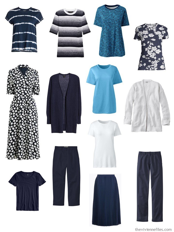
striped tee – Splendid; striped sweater – Banana Republic; blue floral tee shirt – Lands’ End; navy floral tee – Lord & Taylor; dress – J.Crew; navy linen cardigan – Halogen; blue solitude tee shirt – Lands’ End; white tee shirt – Lands’ End; white cardigan – L.L.Bean; navy tee – J.Crew; navy cropped pants – L.L.Bean; white tee shirt – Lands’ End; pleated skirt – Marks & Spencer; wrinkle-free cotton pants – L.L.Bean
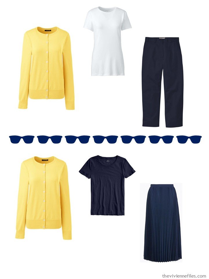
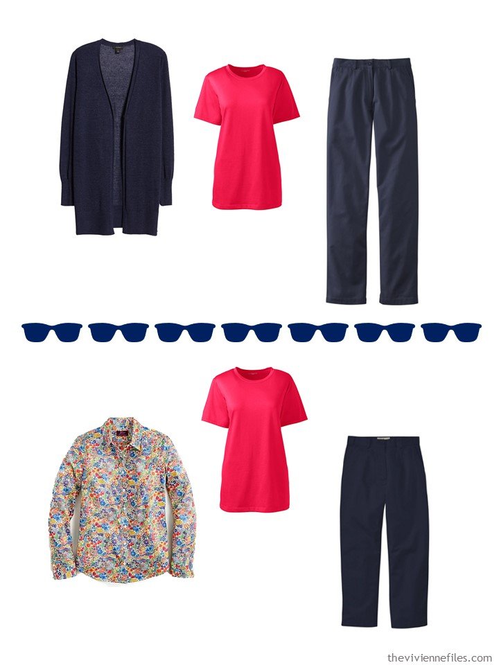
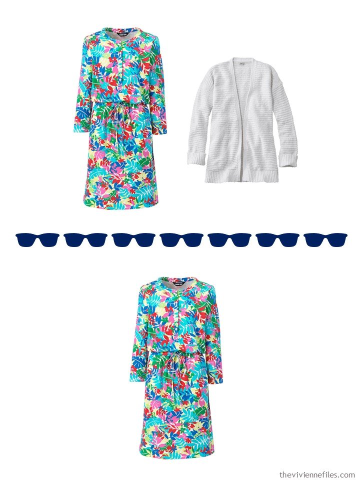
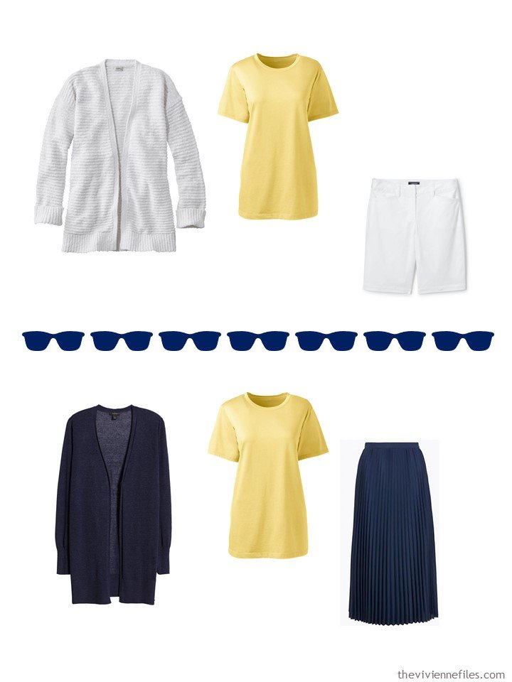
It’s a great year for some cheery, bright colors, and so our heroine has been thinking that red and yellow might be a nice addition for the upcoming season(s):
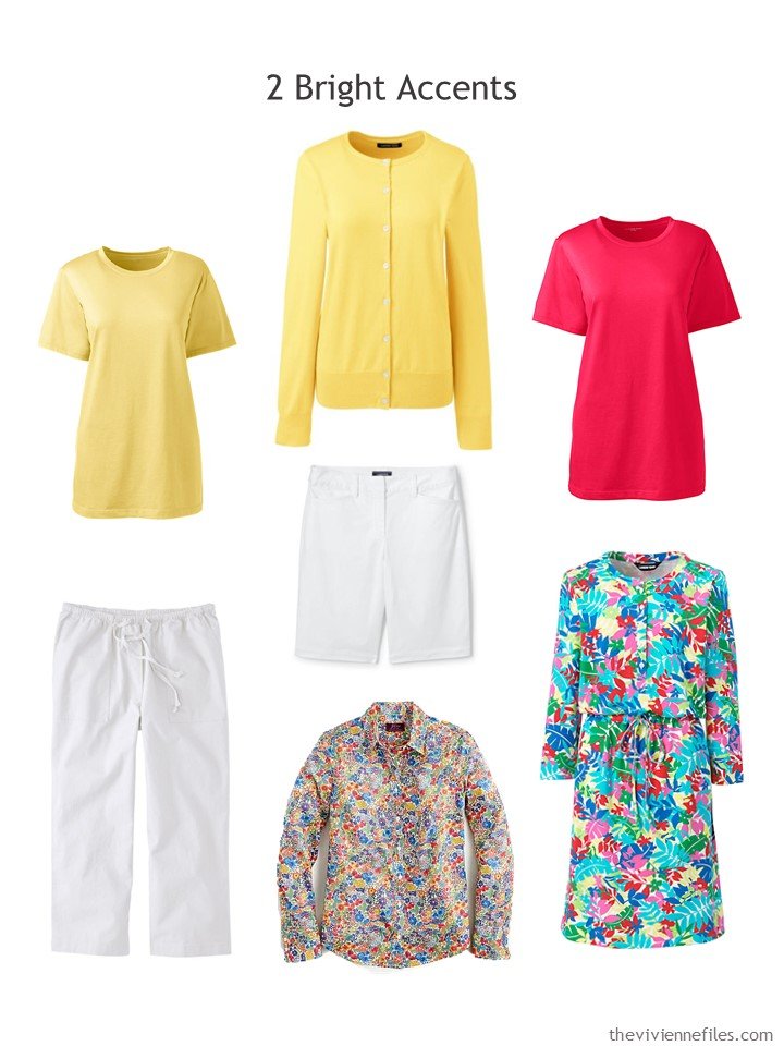
Golden sun tee – Lands’ End; golden sun cardigan – Lands’ End; red tee shirt – Lands’ End; white linen cropped pants – L.L.Bean; white shorts – Lands’ End; floral shirt – J.Crew; dress – Lands’ End
You don’t have to buy dozens of garments in order to bring something new into your wardrobe – our heroine had considered at some length adding a red cardigan too, but realized that it wasn’t necessary. She was much happier taking care of her wardrobe basics with white shorts and capris, and then indulging in some floral prints…
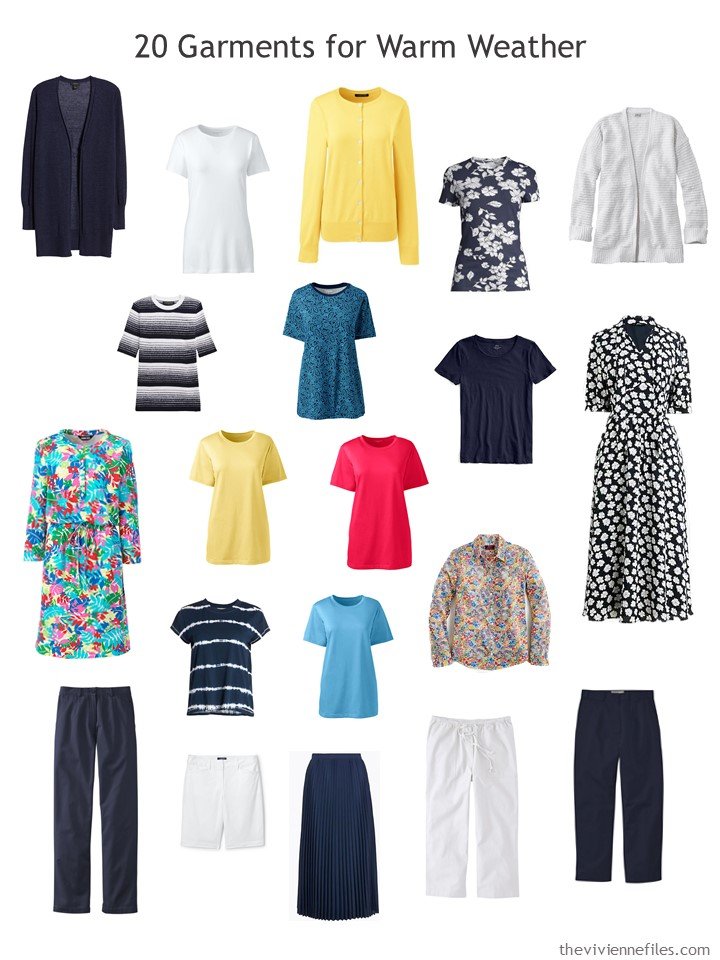
Her new wardrobe looks brighter, but still all hangs together (literally AND figuratively!):
Now that our heroine has this in her closet, there’s almost nothing she can’t do! Of course this isn’t the wardrobe for cleaning out the garage, or for attending a black-tie event, but for “normal” life (do you remember normal?) this will be great. So many ways to get dressed each day…
I want to look at some other accent colors to go with other Weekly Timeless Wardrobes… Small indulgences, and a way to bring some new color and freshness to our neutrals…
love,
Janice
p.s. Four years ago I reported back to you on what I noticed that women in Paris were wearing… Talk about homesick!
Like this article? Save it to Pinterest!
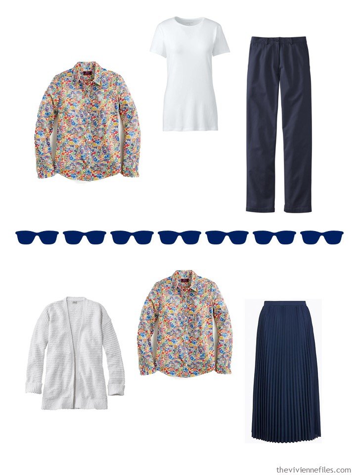
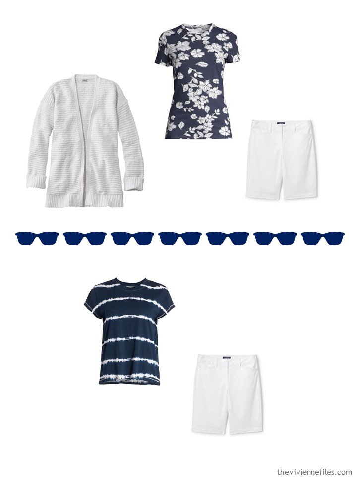
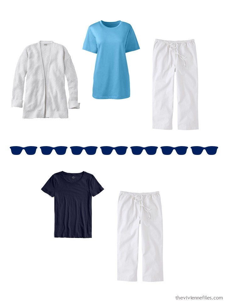
Thanks for a cheerful post on what is a grey and chilly day in the UK, though the sun might appear this afternoon and the forecast is for warm sunny weather for the next 10 days!
My accents are all shades of pink, light greens, and lilac/mauve. I love multicolored floral dresses and skirts in the summer which are so versatile worn with different coloured tops/cardigans and accessories.
I bought a Joe Brown dress in pastel florals for my son’s university graduation in July. Sadly that has been postponed until later in the year – goodness knows when. However, we are hoping that the UK lockdown may begin to be eased by June, so we might be able to have a family party and DIY graduation for our son, to at least mark the day!
I always used to have a navy and white dress in my wardrobe but I currently don’t – an omission? It might be because navy is now too heavy for me to wear all over and I need more white in the pattern. Instead I look for items that have a navy pattern on a white/ivory background. This is a lighter combination, but less common.
Out of curiosity, I looked online and found a couple of alternatives for a navy and white dress by Ralph Lauren and Gap.
The phrase “It wasn’t necessary” caught my eye this morning. I’ve been trying to pay better attention when my intuition says that something I need on paper really won’t be worn that often in real life. This is a great post too for when you’re cleaning out your closet. I’ve found it’s fun to keep my absolute favorite pieces in an accent color and bring them out when I need something different. A minimalist would purge them, I think, but I have been happy this year to find a few bright additions to my usual basic spring clothes. These are in watermelon and periwinkle this year; I’m glad I have a few pieces in these colors, though I wouldn’t organize an entire wardrobe around them anymore. And it’s a great time to wear your white clothes (if you don’t have small children at home!).
Lauramaureen,
That phrase resonated with me too ! As I unpacked and hung my clothes for warm weather, I came across a late last Summer purchase of 2 toppers in different fabrics, one warmer, one cooler , both in a color called “ orange sherbet”. I was thrilled to find that the color matched a stripe in a print top that I had thrifted . However —- as I hold the color up to my face, it’s too light and doesn’t do much for me . As I’m not purchasing any clothes right now, even online, I debated whether or not to just keep and use it . But the facts that I don’t love it, and it “ bothers’ me when I go to wear it, plus I have plenty of other options that do make me happy, means that it has to be put aside to be donated eventually . It also doesn’t work with other colors in my wardrobe, sooo it just “ isn’t necessary “ ! And like you , I shall employ a few periwinkle garments, along with some soft coral ones . As I crave both variety of style and color, I prefer to have more garments in more accent colors, but fewer pieces within each accent color , though in a perfect world I would like a print with both the accent color and the neutral both within it, a long sleeved solid to wear with scarves and necklaces, and a short sleeved top that has some embellished construction detail or trim, plus a topper to match. In reality, I end up with more of the just solids, as I have trouble finding prints in the scale , contrast levels and colors that I prefer.
OK, I wish to add something to my post . I have made a discovery ! Sometimes , when a color is too light by itself, if paired with a darker color, it works a whole lot better. After my shower today, I decided to pair the outer “ orange sherbet “ colored light weight topper over a navy blue background and white striped top and voila , I am now in “ strong like “ ! Blue and orange are complementary colors, so it seems to work pretty well! I might also try it with olive green . I love color pairing discoveries ! For a tonal look, I might try it with a soft rust top , though I sure would like to find some prints to pull these colors together for a point of connection ! As for a neutral, the thrifted top has taupe in it, so I’ll work it with that too .
Janice,
I could be very happy with this as a Spring wardrobe ! Plenty of both neutrals, patterns or prints, and accent colors ! I love the styling on the J Crew dress, but a size 6 I am not !
Some years back, did you not say that when it comes to a print piece that one with a dark background is the most versatile ?
So glad to discover your now daily posts (a real gift !) !!
All bright, convenient, and full of suggestions !
I also love your PS Posts.
Always very glad, also, to read all the comments from every part in the world : a way to travel, and to discover other thinkings, other realities, and to be wonderfully near…
Navy is one of my faves and core colors, and I also love it with white. I do not like any of the new five pieces you showed this wardrobe with – I’m not saying that to complain, but to comment again how useful this system is. When I don’t like something, that helps me figure out what colors and pieces I don’t like (for myself, that is — they are fine in general), and why, and what I would choose instead. I used to be partial to more “contrasty” colors, but now I like them to be mostly in the same hue. Instead of red and yellow and that bright blue, I can see this in light denim and blue linen or chambray, a raspberry instead of the red, and maybe flax or sage green instead of the yellow (like most people, I look awful in yellow, and while flax is no good near my face, flax pants and long cardigans are a different story). Plus some easy-on-the-eye prints…