December 20, 2019
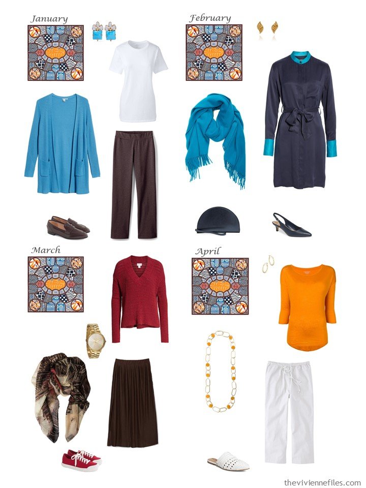
The last two wardrobes! These were the most difficult – no question. And I made a couple of early strategic mistakes that I would re-do…
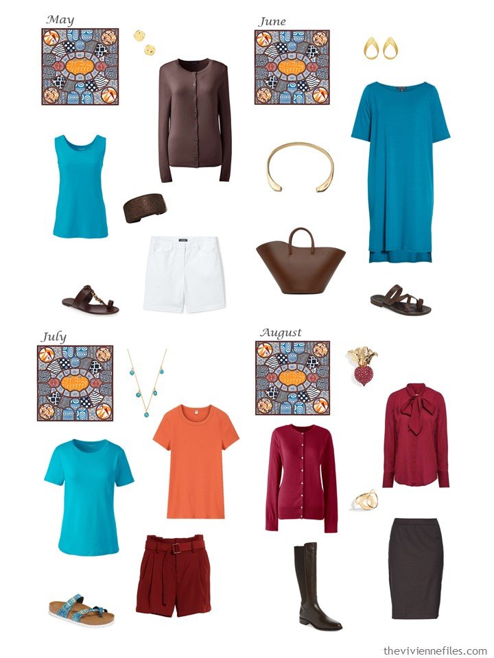
First up, this excellent scarf!
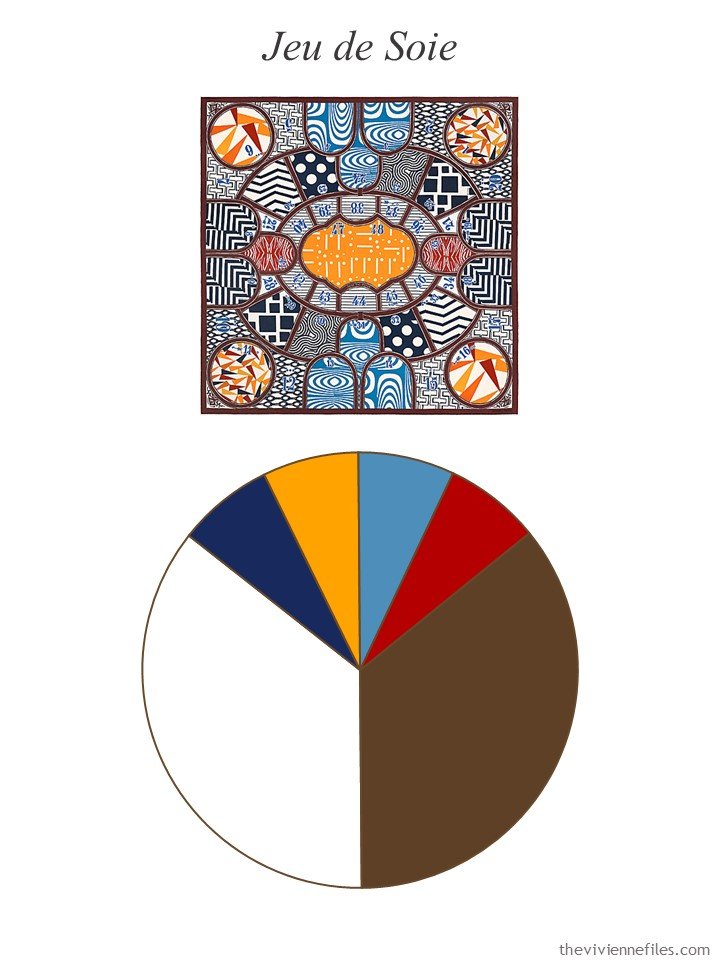
scarf – Hermès
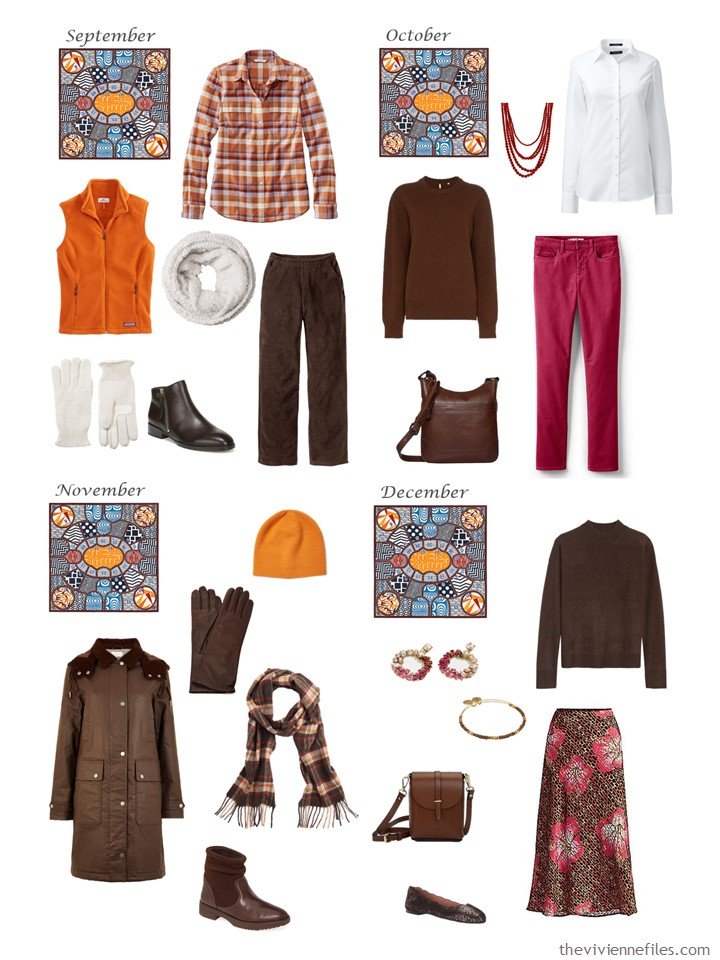
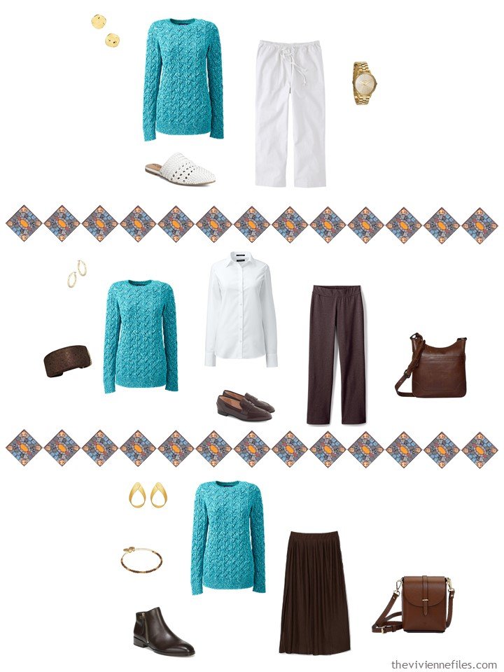
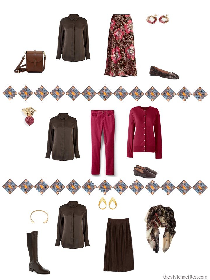
I should NOT have tried to make white one of the neutral colors. White as a neutral really only works well if you live in a hot place and don’t mind laundry…
A smarter move would have been to use brown and navy as “co-neutrals” and then white, red, turquoise and orange as accents. This would still have been a big stack of colors with which to work, but it might have been a better balance. It’s always easy to look back and say what I might have done differently, isn’t it?
I went off the rails in a big way in February – I had designated navy as an accent color (sort of by virtue of the smaller wedge in the palette pie!), and then I go and get navy shoes, and a navy bag, and a navy dress. All of these pieces are great, but they really don’t anchor a wardrobe that’s supposed to be based on brown and white!
How was I going to resist that dress though? We’re all going to do these kinds of things…
There next 4 months are pretty good; I struggled in July to really get a coherent little grouping. Each of those garments works nicely within the wardrobe, but it’s not exactly a couple of outfits that most of us would wear.
However, I’m still stupidly happy with that June handbag, earring and bracelet! Great accessories delight me…
These last 4 outfits are all just fine; who wouldn’t wear red pants? And an orange vest? But in all fairness, the color palette that I started with strongly suggested that we were going to see some pretty bright garments.
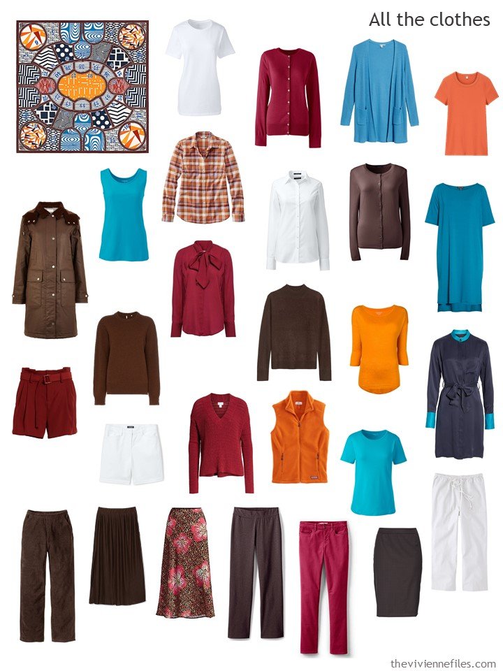
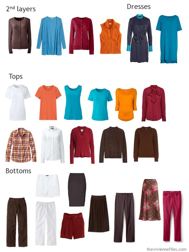
Even though I made a big strategic mistake with the colors, and went daft on that navy dress, this is still a coherent and versatile wardrobe:
The biggest impression that I get when I look at this wardrobe sorted like this is that it’s very dark. And that I should ALWAYS include the “shell” sweater that goes under a cardigan, when I put a cardigan in a wardrobe. Even if you never wear twinsets, having the 2 pieces makes sense…
The most difficult thing about choosing additions for this wardrobe was FINDING things that would go with the rest of the clothes! I need to be better about looking at Marks & Spencer; they always have colors that the normal world ignores…
Why did I pick these?
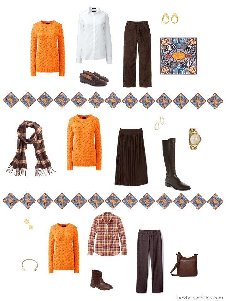
- The orange sweater – because it exists! Orange isn’t so abundant in the fashion world that you can turn away from it when it’s available. This sweater would be lovely in medium-warm weather with white, will be perfect over our heroine’s plaid shirt, and of course will be great with brown.
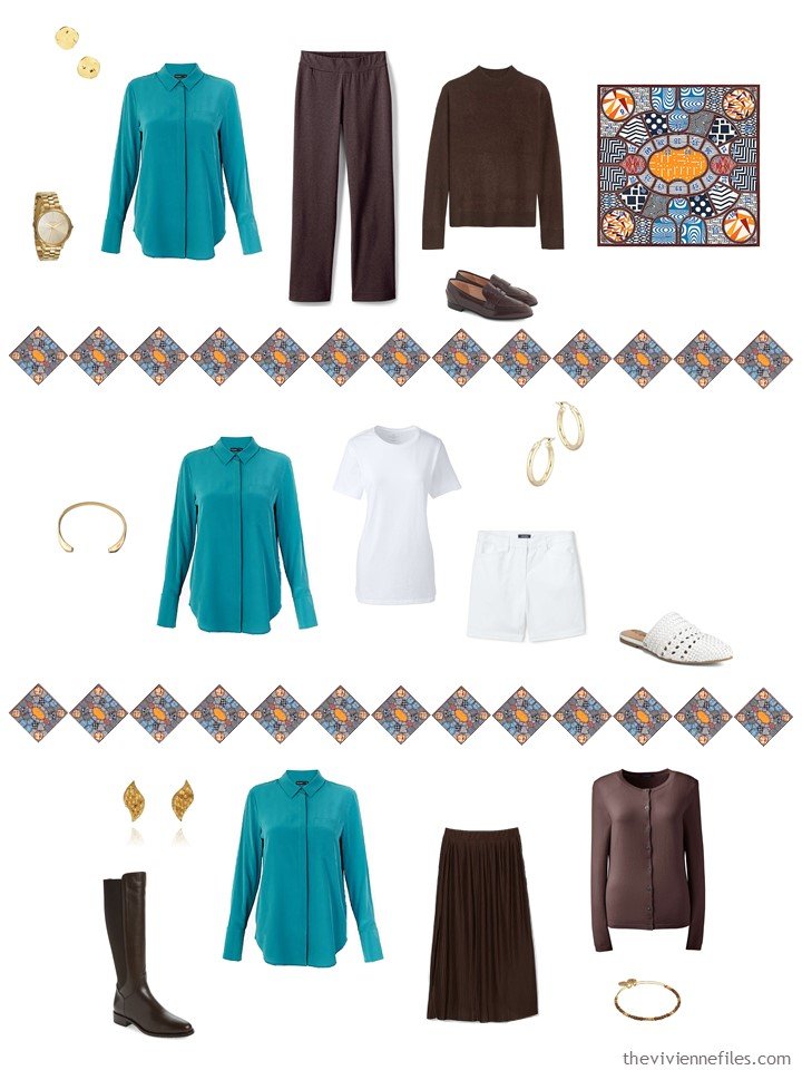
- The turquoise sweater? Turquoise never really made an appearance in cooler weather, and with brown, it is classic. This is a case where, if you find a garment that you really love, check out the other colors offered. There’s no fashion law that says that you can’t have 2 of the same item!
- The brown blouse gives our heroine a dark solid interior column, over which she can wear any of her cardigans. It’s worth looking for pieces that give you that column; nothing is easier to wear on those mornings when everything is falling to pieces around you.
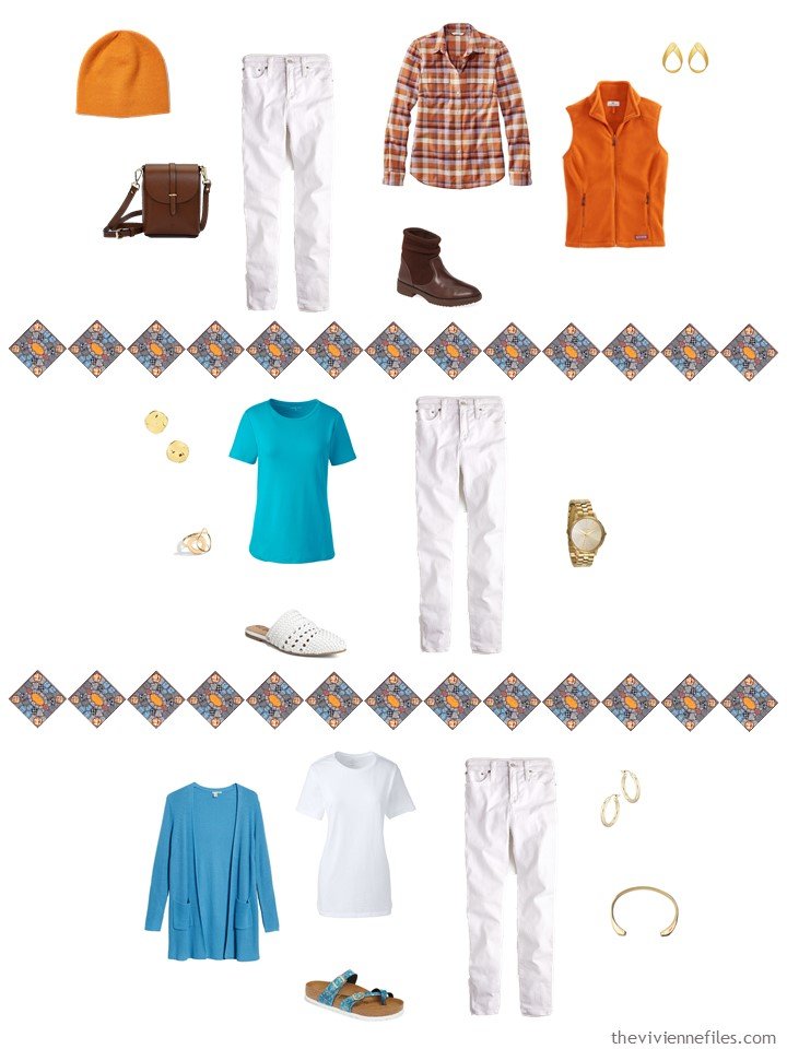
- White jeans? Well, this wardrobe needs to be lightened up, and white jeans are classic. With both of our heroine’s new sweaters, transition to spring will be a piece of cake..
- The turquoise blouse is another effort to inject some brightness and light. It can be worn under the turquoise sweater, or any of the brown sweaters…
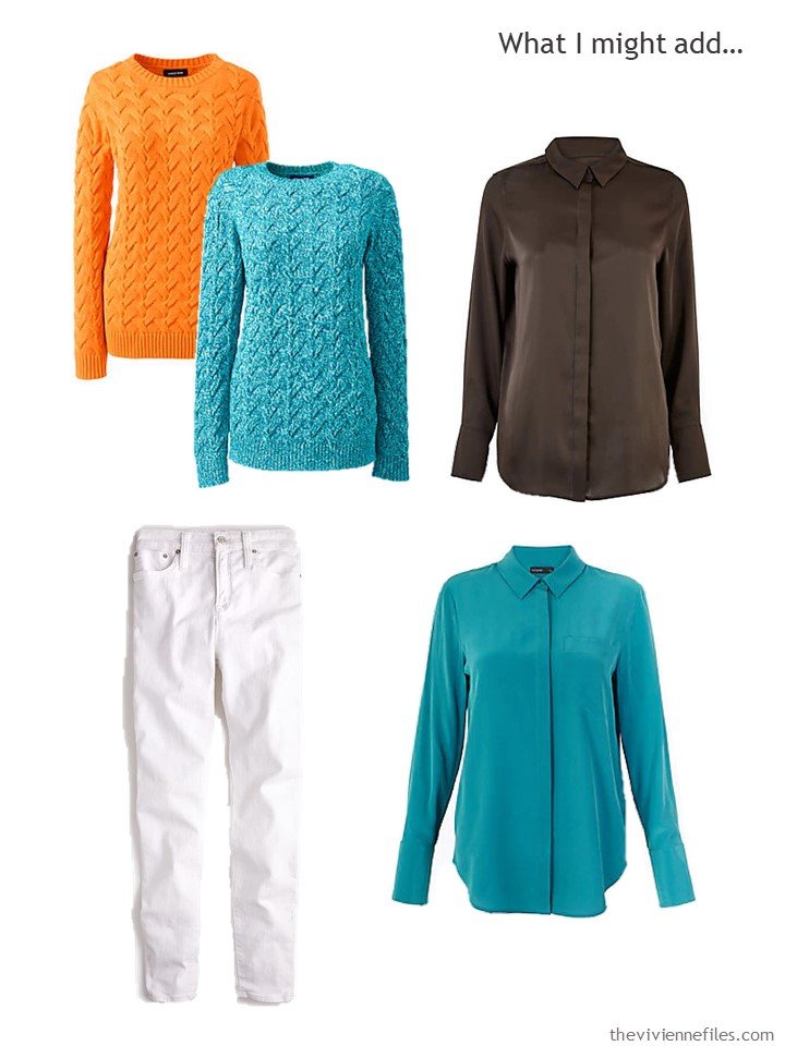
sweaters – Lands’ End; brown satin blouse – Marks & Spencer; white jeans – J.Crew; turquoise silk blouse – Marks & Spencer
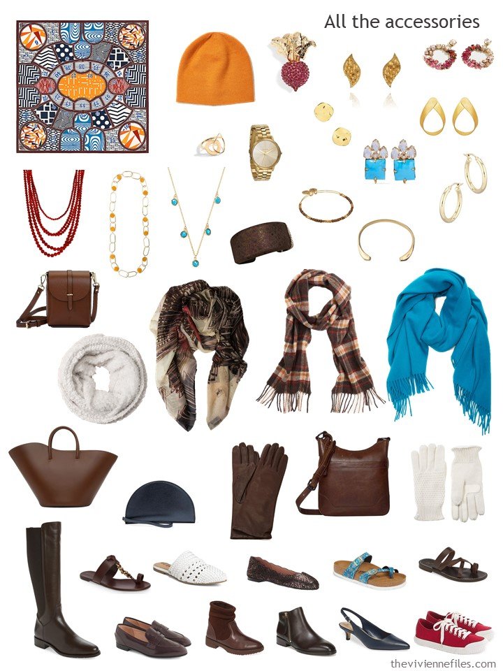
I love these accessories. Our heroine’s collection of necklaces in red, orange and turquoise is just plain fun, and there’s nothing more luscious than good brown leather…
Why these pieces?
- The scarf pulls together orange and brown pieces; with a new orange sweater, this felt right. Plus it’s a gorgeous scarf, AND it benefits the Metropolitan Museum of Art!
- A brown hat? Woman does not live by orange hats alone…
- Sunglasses. Of course.
- Even though this heroine has 3 handbags, her only real “evening” bag is navy! A bag to wear to dress up her brown outfits made sense, and
- Pumps to wear with her brown skirts. When you see nice brown leather goods, grab them!
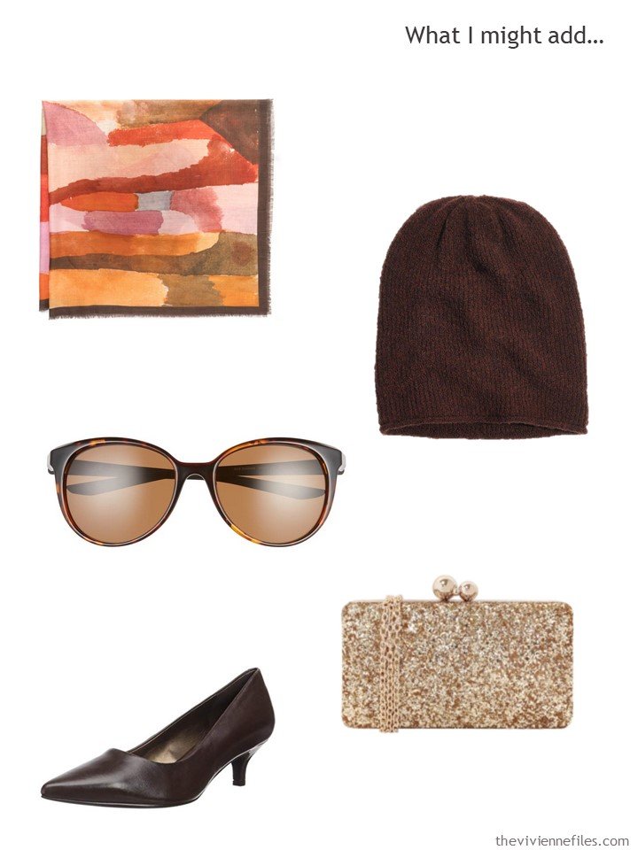
scarf – The Met Store; brown knit hat – Madewell; sunglasses – Nike; pumps – Trotters; evening bag – JNB
All of her new pieces fit right it…
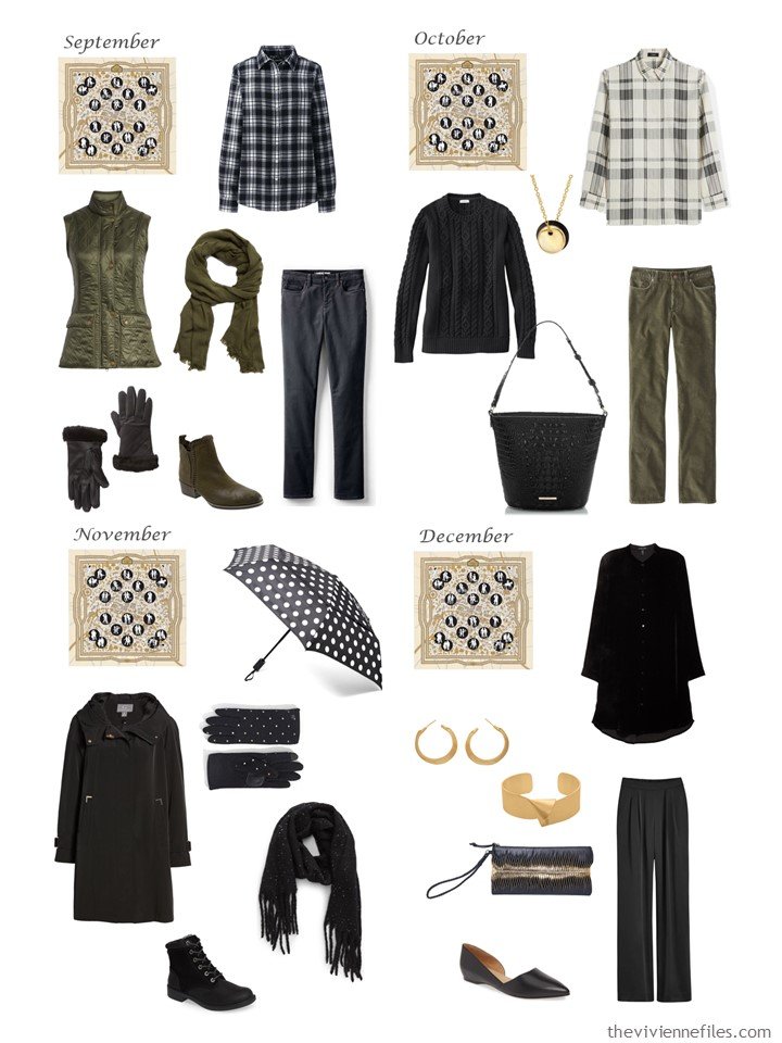
And finally, we come to my most… audacious… effort for the year!
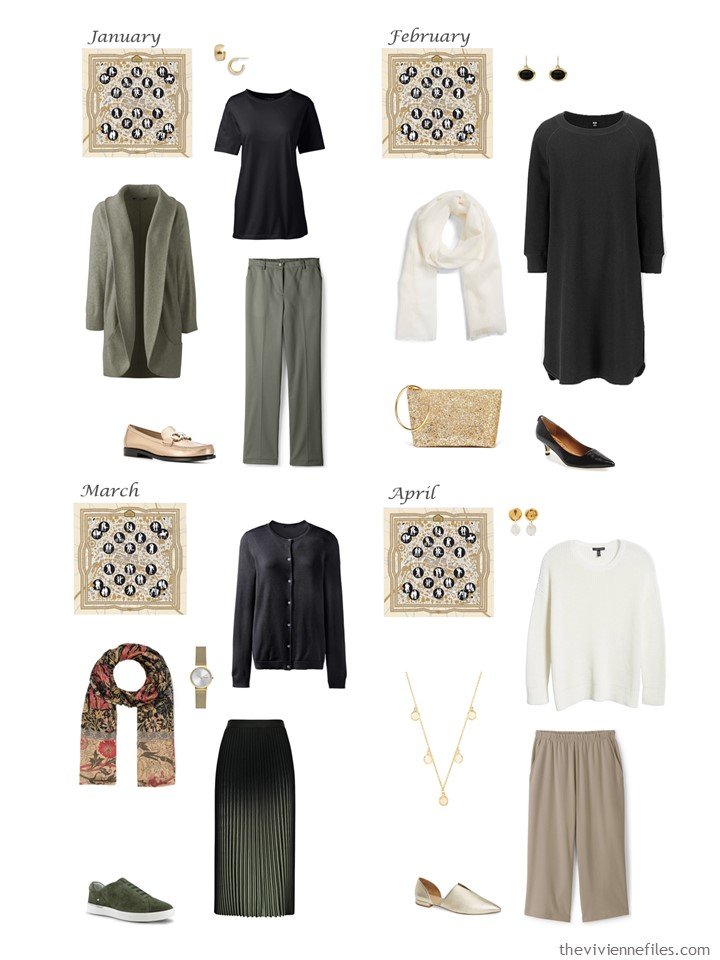
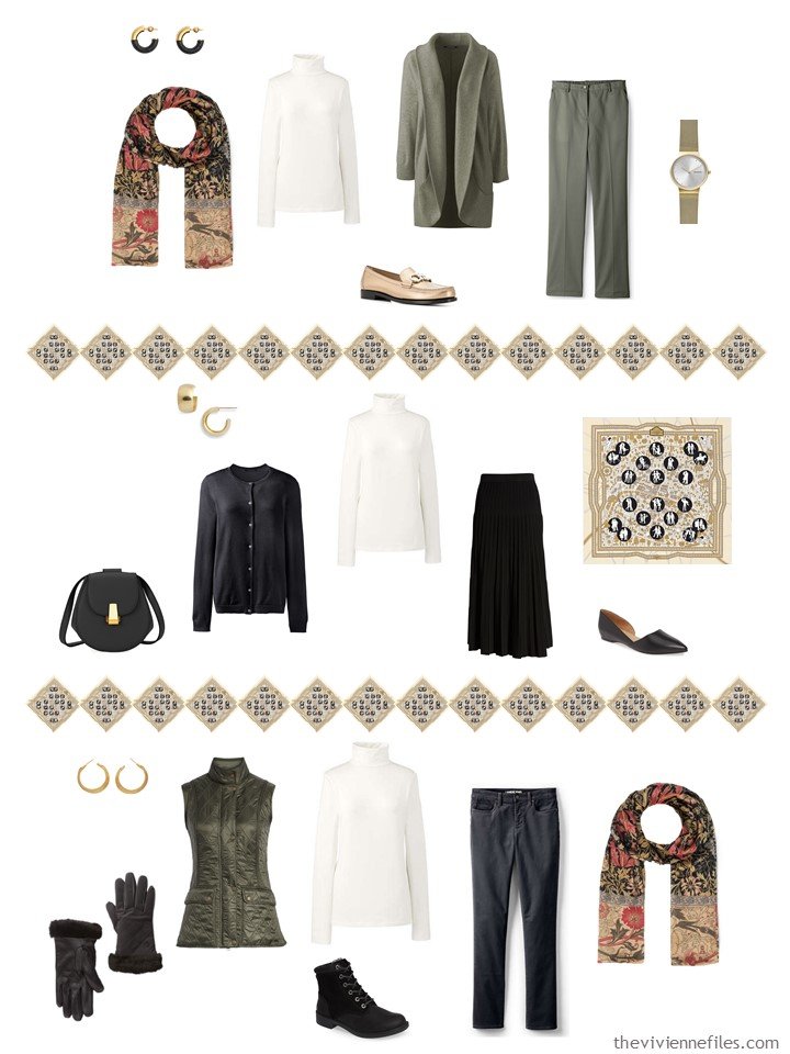
First up, WHY did I not notice that there’s a pronounced element of camel in this scarf? Camel would have been glorious here…
Secondly, WHAT is that weird yellow that I included? Why did nobody point out that I had been running with scissors on that one?
However, I’m still okay with my completely off the wall addition of green to this wardrobe!
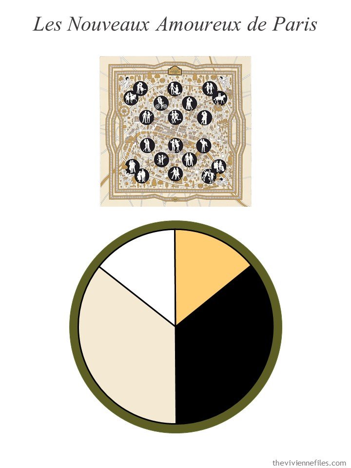
scarf – Hermès
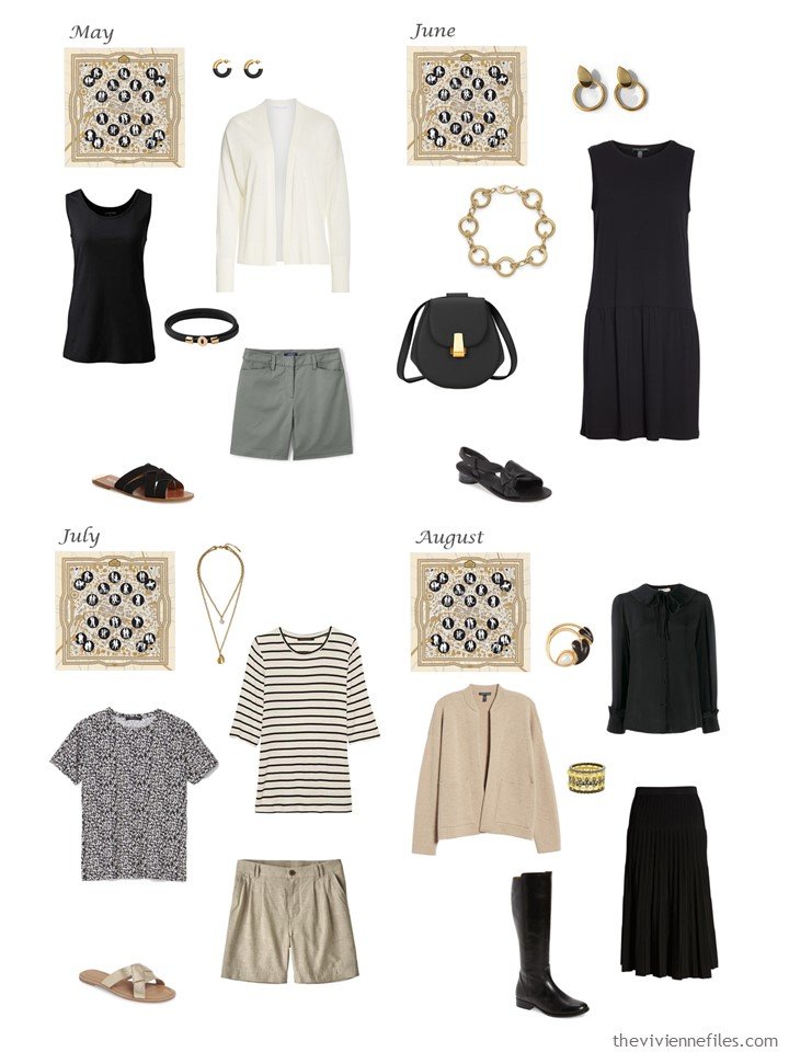
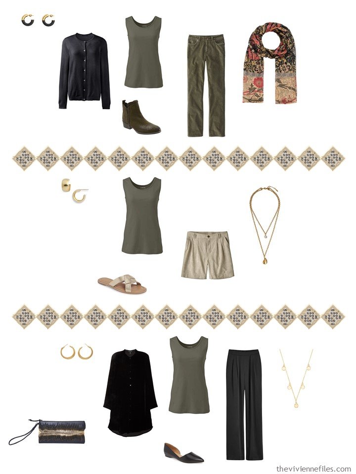
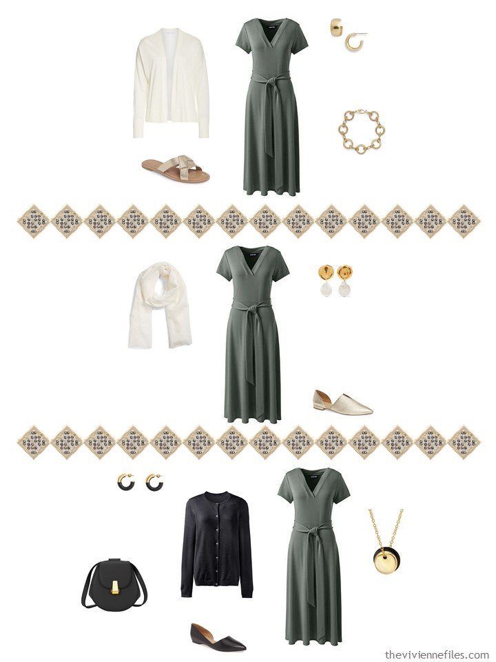
I should have made the decision to stick with just ONE shade of green for this wardrobe. Green is difficult to find in nice garments – but that’s no excuse. This dusty sage color that I started with in January is nice… Patience, and discipline!
I love all of this! I could have found a more timelessly style dress for June, but that’s a small quibble. And I have to pat myself on the back for the consistency with which I found our heroine jewelry that echoed the circle theme in the scarf!
These last 4 ensembles are all good – I might wish for a more dusty shade of green in September and October. But you know, sometimes you have to compromise. It’s not optimal, but you have to be realistic about how far and wide you’re willing to search for the perfect piece!
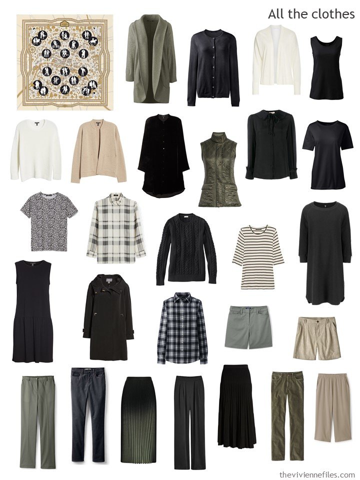
Oddly, even though some of these colors might make me look 3 days dead, I still love this wardrobe! Maybe that’s a reminder that I’m a muted sort of dresser. (at least I’m muted in some aspect of my life!)
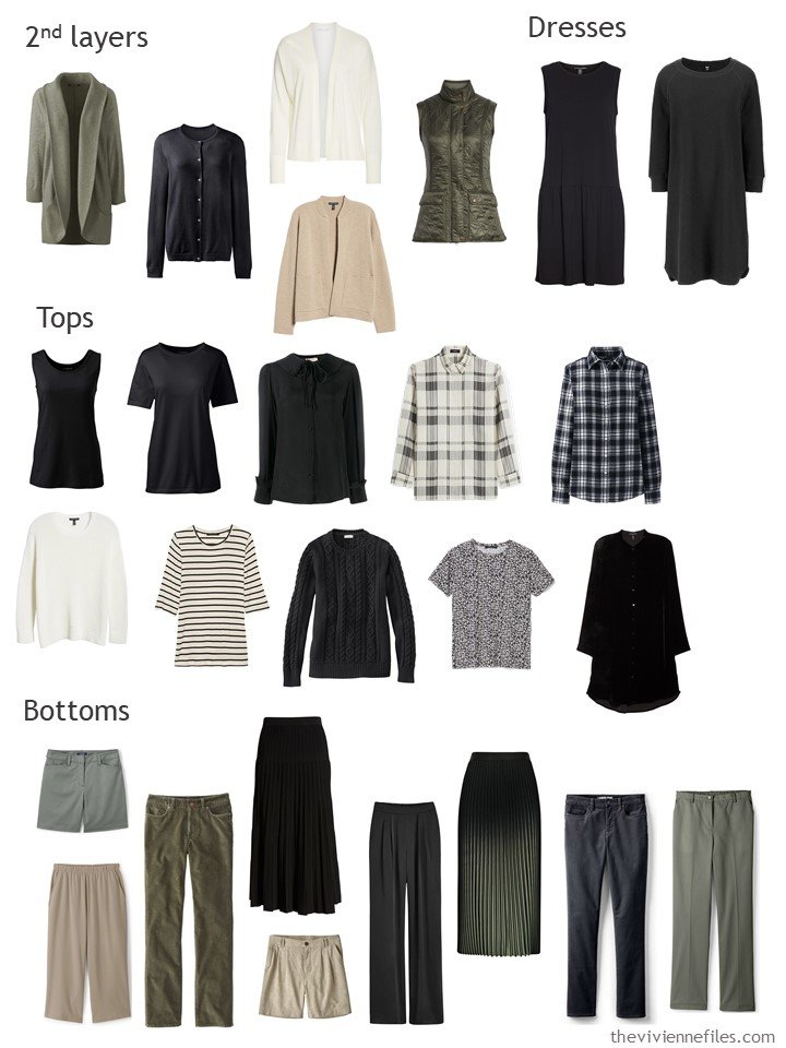
Sorted, the balance is good. Lots of black though…
You can easily guess that I’m going to add things that will lighten and brighten this wardrobe, right?
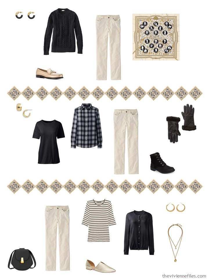
- The cream turtleneck can be worn under everything! This heroine should also keep an eye out for a couple of cream or ivory tee shirts – long and short sleeved…
- The dress? This is perfect for warm weather, is a perfect match for her green cardigan, can be worn with her other 3 cardigans, and ISN’T BLACK!
- A tank top is versatile – those of us dressing for cold weather but still over-heating sometimes can wear these all year.
- The antique corduroy pants are so pretty. So long as the cool weather isn’t wet and sloppy, these pants will be a lovely break from a sea of dark colors.
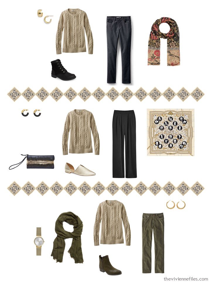
- And I’m always a sucker for a nice cabled sweater. I’ve had this sweater in black for AGES, and wouldn’t trade it. In this stone color, this sweater goes with virtually the entire wardrobe.
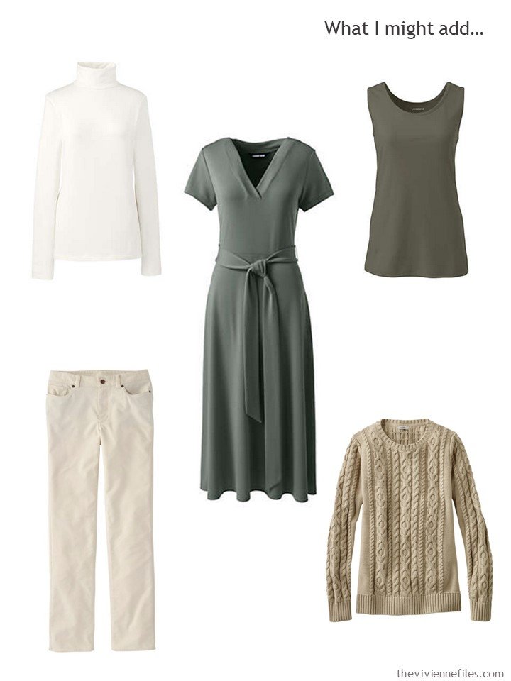
ivory cotton turtleneck – Lands’ End; forest moss tank top – Lands’ End; dark balsam dress – Lands’ End; antique white corduroy pants – L.L.Bean; stone cotton cabled sweater – L.L.Bean
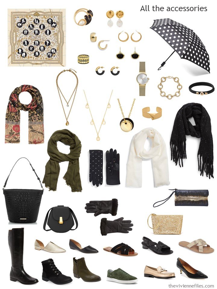
As for accessories – these might be my favorites of all that I’ve done! The juxtaposition of gold and black really appeals…
But there are always a few places where gaps can be filled…
- THIS SCARF! IS PERFECT! And it’s not expensive. The touches of beige in it will pick up the stone color of our heroine’s new cords…
- And while I’ve been faithful to the idea of circle-themed jewelry for our heroine, this necklace was not to be refused. Talk about perfect colors!
- Sunglasses. Yes. Always.
- Accent socks. What a great muted green…
- And I love these loafers.
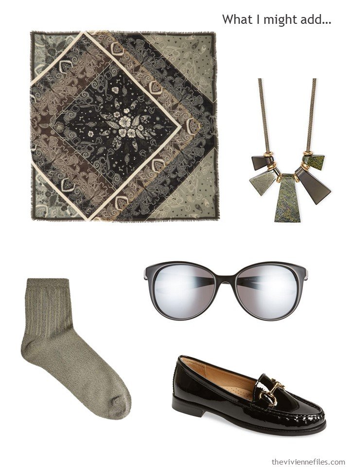
scarf – Treasure & Bond; olive necklace – Kendra Scott; sunglasses – Nike; socks – Topshop; loafers – Carvela Comfort
Our heroine’s new clothes give her all kinds of new outfits – always the most fun of bringing home something new!
I’ve certainly learned a lot about how I will approach these wardrobes in the future – being more sensible about choosing the colors with which I’m going to work, and picking a “leather accessory” color from the beginning…
And you? Would you wear any of these?
love,
Janice
p.s. Five years ago, we looked at the possibilities of a tiny travel wardrobe in camel and emerald!
Like this article? Save it to Pinterest!
You hit upon several points that I discovered during the WTW exercises. First, color choice is critical. I found if I don’t get that right all my other efforts are ineffective and wasted. The neutrals choice is key, I think, as you show here. And then there is the focus and discipline part. Not to get side tracked. Sometimes that is so hard. My favorite wardrobe you have shown is the last one. Love those colors. And it makes use of black which is easy to find and a great neutral. Camel would have been a great addition. Great job all around and I look forward to next year’s exercise.
Happy Holidays!
I absolutely love the first wardrobe because there is so much color variety within a capsule wardrobe. I find the second wardrobe too repetitively neutral.
Dear Janice,
I do learn a lot from your break it down and analyze posts. Very instructive and educational. I am also one who leans toward sensible choices. However, I am learning that maybe it’s a great idea to buy that fabulous dress or shoe or whatever that doesn’t go with everything but does pull together that perfect outfit for that special occasion. Maybe some people need the lesson “dial back”, but others of us need the lesson of “go for it once in a while.” ? xo
It’s all about balance!
hugs,
Janice
Janice,
Perhaps it’s my monitor, but the overall color that comes across in the first posted scarf today appears gray, as if seen from a distance, as the general background color with the brown as the border, with accents of orange, red, and turquoise. Obviously there are navy patterns in there too. Co-neutrals of navy and brown— I love the idea , as long as the accents are solid colors. The problem occurs when trying to find bridging print or patterned pieces beyond the scarf. That gives two dark bottoms to work with and going off on separate blue or brown days for variety ! I like to pack dark bottoms, but get bored with just one color to work with ! So simple, why didn’t I think of that ?
Dear Janice,
What a remarkable woman you are! These wardrobes are so creative and inspirational. I’m wondering if 2020 will be the year that I pick a color scheme and stick to it.
Thank you so very much for sharing your insights and discoveries with us!
Wishing you all the best for the holidays and the New Year,
Tina
Oh Tina, THANK YOU! Today’s not my best day, and your comment made it all better!
hugs,
Janice
I loved the last capsule a lot! The camel and soft green with creamy off white and black are gorgeous together. It’s another one that drew me as time went on.
Now as I look at the final additions I think it’s my favourite. I’m switching to this one.
The right shade of camel is elusive. If it’s got a bit of pink or grey undertones I can wear it but the true golden tones are best on those with spring or fall colouring.
That green I love unreservedly. It would fit fine with navy, greys and black. White and creamy white would be perfect with it.
I really like the last scarf addition, that dress and that statement necklace topping off this terrific capsule.
Janice you are a true genius with colours and you create something for everyone.
At the risk of incurring the wrath of everyone here, I prefer the new scarf additions to the original Hermes. The Met Store William Morris Compton scarf in the last wardrobe is probably my favorite piece of everything you’ve shown in this series. May I put in a request to include a muted, watercolor-y scarf in next years series?
Hi Janice,
I have been a fan and avid reader for several years now and leave comments only occassionally. I would humbly ask you not to discount white as a neutral. I know that you have readers all over the globe. Some of us live in warmer climes than Chicago. (I once lived in Connecticut and so I know why you have so many pieces with long sleeves. Now I live in New Orleans, LA and try to picture most of your wardrobes with shorter sleeves, or sleeveless. I gets cold here in mid-December and warms up in late February.)
My favorite wardrobes are the first and the last. I can wear the cool colorings of black/white/tourquoise/blue easily. And since reading your blog, I have fallen in love with olive green since that color shows up in my eye color (brown with a little bit of green).
As always, thank you for your beautiful work. Merry Christmas and Happy New Year to you and Belovedest. And big hugs. (((())))
I can see why you chose white as one of the neutrals for Jeu du Soie wardrobe, as it’s fundamental in holding all the patterns together. And it’s been interesting to see how a wardrobe with a white neutral might come together. Useful for folks in warmer climes. Les Nouveaux Amoureuses was my other favourite for the year (beside the grey/peach from the previous post). Again, these aren’t my colours but I’ve responded to the coherence of the colour and clothing choices. Less contrast, too, which suits me. So as ever, you’ve really helped me to think about guidelines for making my own choices. I hope that next year you’ll continue with the final analyses because they’ve been as useful and interesting as your thinking month by month when you explain the additions.
All good wishes for a happy time during the festive season and good health in the new year. From sadly hot and burning Australia,
Robyn x
Thank you for providing us with such thoughtful analysis and pretty outfits. I have learned so much from seeing (reading) how you think through each piece. I still need to winnow down my closet a lot more but your posts give me a goal to work toward. And by including so many pretty accessories I am reminded that jewellery, shoes, scarves and bags are important to finishing an outfit as well as adding zing. You are a treasure!
Thanks for your inspiration in these wardrobes but one day could you do a warmer weather wardrobe where jumpers are never worn in summer – not even in the office. Great website and I have learnt so much.
I’m a new reader and haven’t poked around much in the archives. I’m finding you assessments of these wardrobes interesting.
Just a suggestion for next year…If you discover during the year that you made a mistake in the color scheme (e.g., Navy should be a neutral rather than accent color or orange and red accents limit flexibility) go ahead and change it immediately after acknowledging the “error”. After all, that’s what you would do in real life.
There are so many items I want to buy someday.