July 24, 2019
Camaïeu is a kind of color palette that uses 2 or 3 tints of single color to create a look with subtle contrasts. In other words, your colors don’t have to be perfect “dye-lot” matches for each other!
The woman I saw, on a sweltering day in Chicago, was wearing shades of ivory and white. She looked (relatively) cool, and really stood out in the sea of black that is the city:
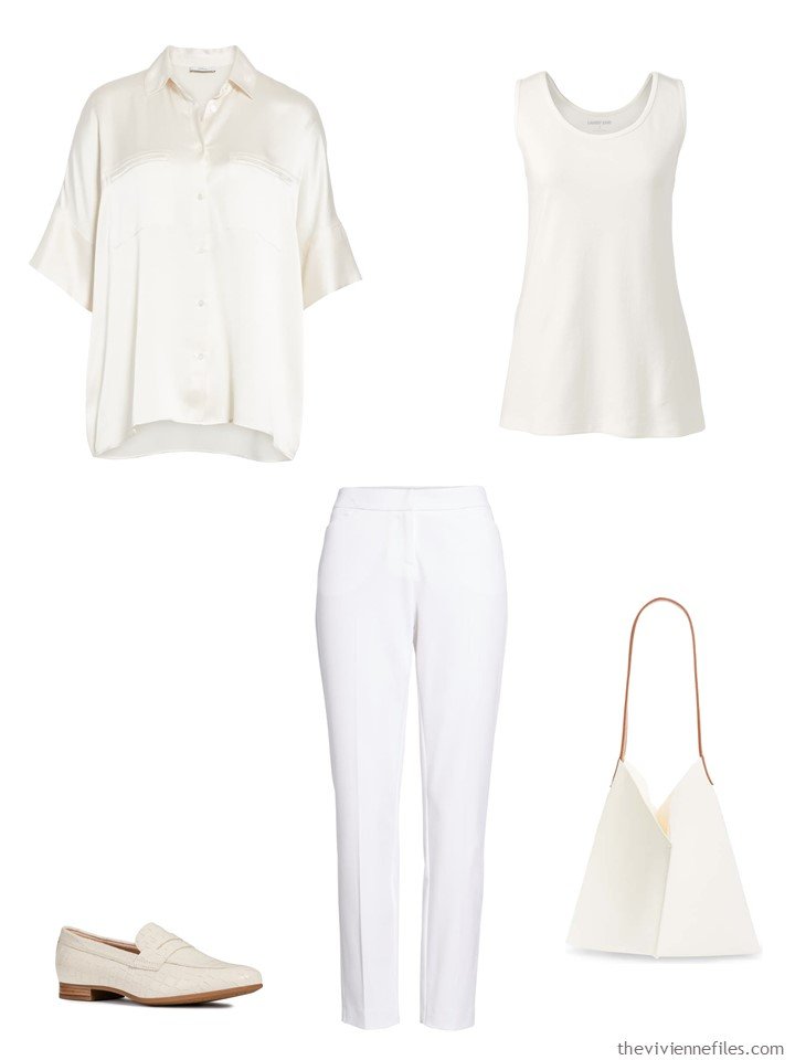
ivory silk blouse – Vince; tank top – Lands’ End; loafers – Geox; white pants – Halogen; bag – BP.
This makes a lot of sense – colors are not going to look the same if they’re in different fabrics, even if they are dyed at the same time from the same kinds of dye. The texture of a sweater is very different from that of a silk blouse – one will reflect much more light, and the color will “feel” somewhat different.
The first thing that I thought of was those elusive brown and camel colors that you almost have to just grab when you see them, because they’re so uncommon:
yes, these pants are mad expensive… and screamingly beautiful…
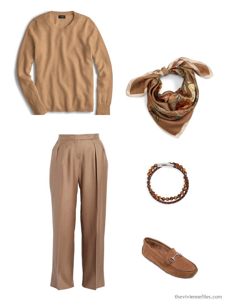
sweater – J.Crew; scarf – Sole Society; pants – Max Mara; bracelet – Jonas Studio; shoes – Minnetonka Moccasins
This idea works really well with grey, so long as you stick with either a blue-ish grey, or a yellow-ish grey. I suspect that most of us who like grey probably instinctively are drawn to either the cool or the warm versions of grey! (and note, this is a fleece blazer – all of the “outfit-building” structure without all of those pesky stiff, constricting “menswear” details…)
I can heartily endorse these grey Blondo boots – I have a pair in black that are absolutely comfortable, waterproof, and look good. What else could you want from boots?
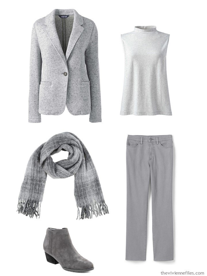
cardigan – Lands’ End; sleeveless top – Lands’ End; scarf – Max Mara; boots – Blondo; jeans – Lands’ End
This idea might be really useful if you have an accent color that varies from garment to garment within your wardrobe… The bag and scarf help everything sort of blend together and look intention. If you’re going to buy a luxury bag, it had better contribute to the overall function of your wardrobe, I’d say!
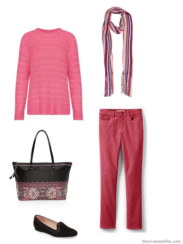
sweater – Anine Bing; scarf – Missoni; bag – Etro; flats – Patricia Green; corduroy pants – Lands’ End
I’m always going to see how far I can push the idea… This sweater puts you in a perfect position to wear blue and purple together without the slightest hesitation!
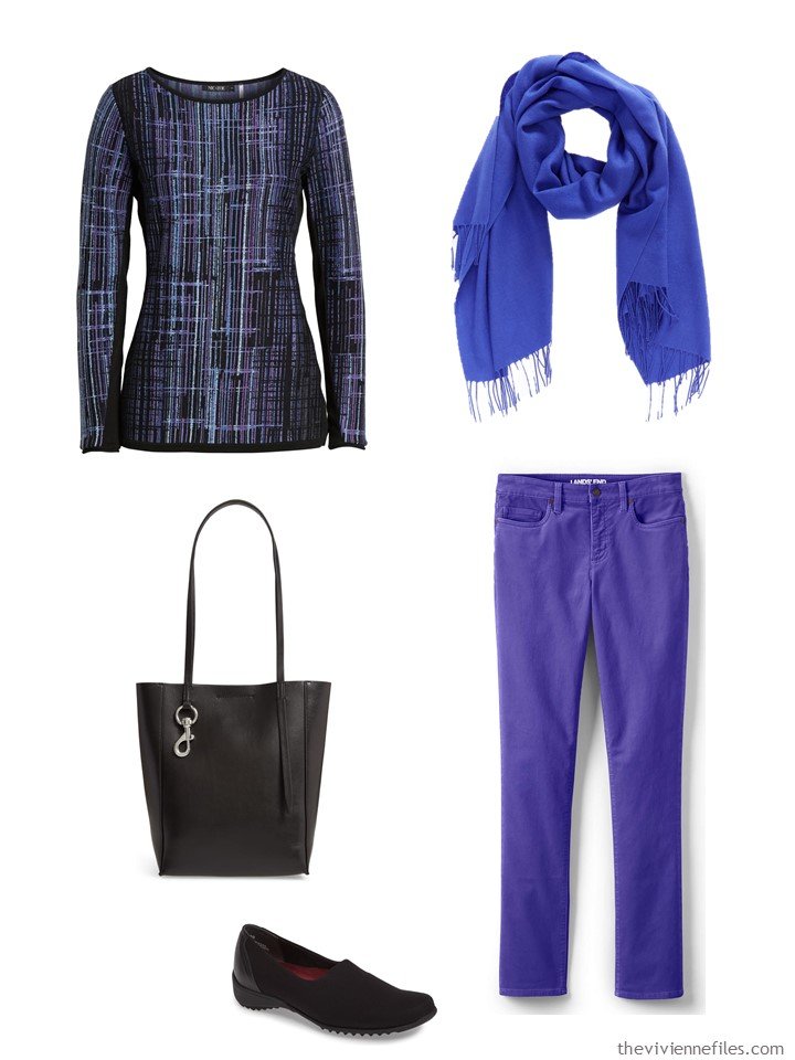
sweater – Nic+Zoe; scarf – Nordstrom; bag – Rebecca Minkoff; loafers – Munro; corduroy pants – Lands’ End
And yes, at one time, this word was synonymous with the cameo found in jewelry. With that in mind, I thought that this last outfit would be appropriate!
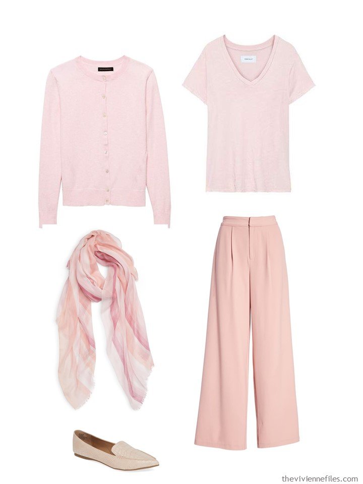
cardigan – Banana Republic; tee – Current/Elliott; scarf – Nordstrom; shoes – Steve Madden; pants – Endless Rose
This idea might open up some really interesting possibilities in the right closet, eh?
love,
Janice
p.s. 5 years ago I was admiring Chic Sightings of women in navy tunics and white pants….
Like this article? Save it to Pinterest!
I absolutely wear beige with white, but only if they look like two different shades and not like the beige item is just dirty/yellowed/old.
Other times, colors that seem similar have enough different undertones that they look just wrong when mixed. I have some camel boots that look caramel brown next to black but that look orange and awful next to other browns.
Gray is another example. It seems like gray with gray would work, but a cool gray with a warm gray just looks wrong.
I see lots of people doing monochrome outfits, especially in shades of green/olive/sage and red/orange/coral. It can work for sure.
I really love this. Another option that looks really sophisticated IMHO is navy/black.
As said above I agree with most of what you have said, but those undertones can really be pesky. Different shades /tints of the same color work – but if the undertones are different, it isn’t really the “same.” I find it is hit or miss when I buy something from a different brand unless I have the other garment with me.
So what I do if I bring something home (or it is delivered by the nice UPS guy :-) is a good evaluation under the best natural light I can find. And be brutally honest – do these look “right” together or not? And if the answer is no – is it necessary to wear them together, or will they each have a place in my wardrobe even if they don’t look right together? If that answer isn’t satisfactory, then it goes right back into the box and is returned.
I hate doing that because if I order something, I have a sort of romance with it .. I WANT it. I had a fantasy about how it was going to perfectly fill some hole in my wardrobe, and it’s hard to let that go. But the sad truth is that if I can’t answer those questions in a satisfactory way, I’ll never wear the new thing and it is just going to be closet ballast. Better to part with it right away and get a refund.
That kind of discipline is SO important when spending money – you wouldn’t buy a jar of capers just because they were on sale (unless you’re crazy about capers, in which case do what makes you happy!). Similarly, we don’t keep buying curtains once we have our windows covered, nor do we keep buying rugs after our floors are covered. So shopping for clothing needs to have that kind of logic too. I’m posting about this on Friday, so you’re living in my brain!
hugs,
Janice
I love this analogy, Janice!! Can’t wait to see what wise advice you impart on Friday.
❤️
Exactly ! A better explanation than what I just offered below !
Janice,
Thank you so much for addressing this — it has been a mental conundrum for years when attempting a culling event in my closet , based on color ! When I have 2 similar, but not exact color matching garments, I wear them together, but only if there is also a value difference. An example would be a plain cardigan with a smooth texture, and a knit top underneath with the tint being just a bit off in the top as my problem child. Instead , I would wear that same cardigan with a top underneath that is a tint of the cardigan color . I feel they should look different enough from each other that it looks intentional, and not that I just got dressed in a too dark closet ! The level of texture in the outer garment makes the difference to me . However, I think that a heavily textured cardigan and a plain woven shirt underneath it, both in the same color, look wonderful together, proving your point!
I have also found that I need to match the shininess or the matte texture in my bottom with my top, when aiming for a column of color. I once wore a matte skirt with a shiny tank, and then a lacy topper, and saw my error later on photographs. The shiny tank broke up the vertical line, despite both tank and bottom being the same exact color !
Tone on tone always looks rich and elegant.
I like putting a dark charcoal grey with a pale cool taupe but the taupe has to have that pinky greyish undertone for it to work. It can be a bit like a winter white with the essential mauve pink into grey tinge.
I just bought a deeper taupe mushroom shade jacket that I think is working with my black/grey/navy core.
Undertones are a minefield which is why the jacket is hung on a white door and I have been looking at it in several lights with the navy/grey/black & white/cream shades that I plan to use with.
So far it’s nice with everything including all my usual colour accents but a slightly too golden pale taupe purse. That’s not good together. But all my others are going great.
Beautifully said! Thanks for sharing,
hugs,
Janice
His is a really helpful post! I’ve found that I almost can’t go wrong in mixing different shades of grey but then I always buy the cool grey tones. Not as successful mixing different shades of navy. The subtle difference in navy shades puts me off- unlike with grey. Many years ago I wore black and there are different “shades” of black as well! But with black, it doesn’t seem to matter. I did not understand this but there we are! Looking forward to your Friday post, Janice. Maybe you can shed more light on this conundrum. Janice Collins Coyle , Washington DC
I agree – blacks are easy to mix and grays in my closet tend to look good together, but mixed navys are nearly always a problem. Pinks are often problematic, either yellowish or blueish, and they do not look good together – nancyo
This is so true regarding navy. I had no problem with black, but I got old and retired and wanted something different. This is the main problem I have with the four by four capsules. I have many navy Ts, but I cannot make them work with navy pants. They look fine with denim. And tan. But I cannot shoe horn this into a four by four.
The reasons is that navy often has different undertones too. I keep buying grays that don’t have the right undertones, but somehow I’ve managed to buy navy garments of different shades but with the right undertones, even when I buy them without anything to compare them too…
Any advice on how to work with brown? Just bought a couple of pieces labeled “clove” — a very dark brow, almost black. Is it just cool vs. warm? Some browns are greyish. I tend towards chocolate in all forms, but shopping is hard.
It’s got to work for you. If you like the way things look together, then you’re fine. It’s hard to really come up with strict guidelines because all of us have different preferences and tolerances for things; what I love might make your skin crawl! I hate to be so vague, but it’s really all in your heart and your eyes…
hugs,
Janice
I feel most like myself when I dress this way using my neutrals, shades of medium and ash gray and shades of indigo blue. It just always works, probably because I’ve been more careful with my shopping the past few years. But I’m thinking now about layering accents—I had an outfit several years ago that layered shades of warm pink, like your last ensemble, and I really loved it. I’d love to see more discussion and examples!
Grey is a challenge. I love grey and want to move toward it more as I age. However, in additional to warm vs. cool grays, there are green vs. blue grays! I have a grey dress shirt that looks is very green and specifically does not go with certain blue-teal accents but goes fine with green-teal ones.
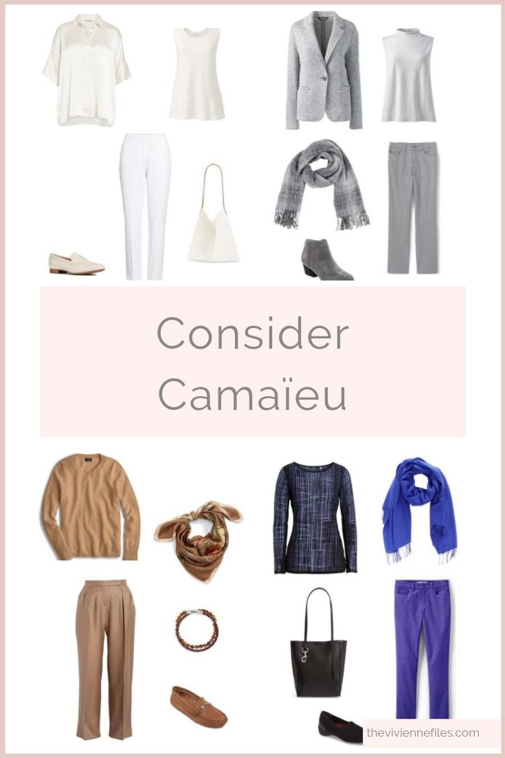
Looking at the four outfits together, you could do a fair amount of mixing and matching. It could be another approach to building a wardrobe, for those of us who find it hard to stick to a small number of colours. You could have maybe a dozen complete outfits, in a dozen different colours, chosen to complement one another, and still not have a massive number of clothes. As you say, interesting possibilities!
This is really tricky, the underlying “tones” beyond the (warm/cool) need to be the same.
The difference between a warm “yellow white” and the “pink white” — both are “warm” but different. And this changes depending on the light. I have “matched” tones in my bedroom, and then under kitchen or bathroom light. But looked horribly “mismatched” under office lighting.