November 16, 2018
Of course, there are no new colors. And for what it’s worth, these colors don’t necessarily show up in store any more or less than any other colors…
That said, I still love looking at these color every 6 months, and giving some thought to what I might add to a wardrobe in order to really solidly bring an accent color into an otherwise neutral wardrobe. (I’m always happy to do another post showing these pieces worn along-side a Neutral Common Wardrobe, if that would be helpful)
And yes, I’m going to evaluate all of the “4 Outfits based on a painting” posts that I’ve done. They take a while!
In my next life, I want a job at Pantone naming colors…
First up is Fiesta, which is a nice bright red-orange. I think this would be lovely with navy:
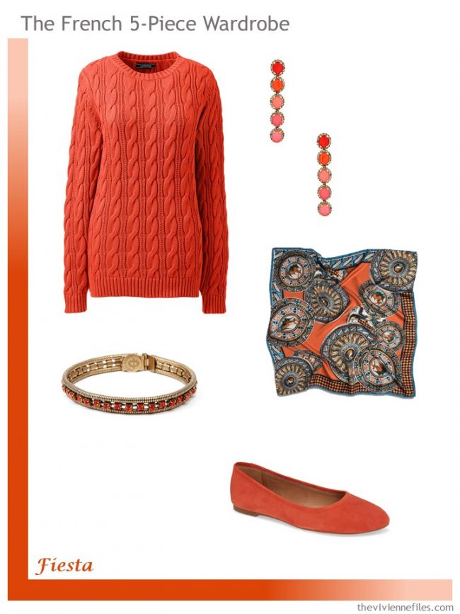
sweater – Lands’ End; earrings – Elizabeth Cole; bracelet – Loren Hope; scarf – The Met Store; ballet flats – Madewell
I have no idea why this is called Jester Red, but it’s beautiful, and would be great with black, navy, grey, beige…
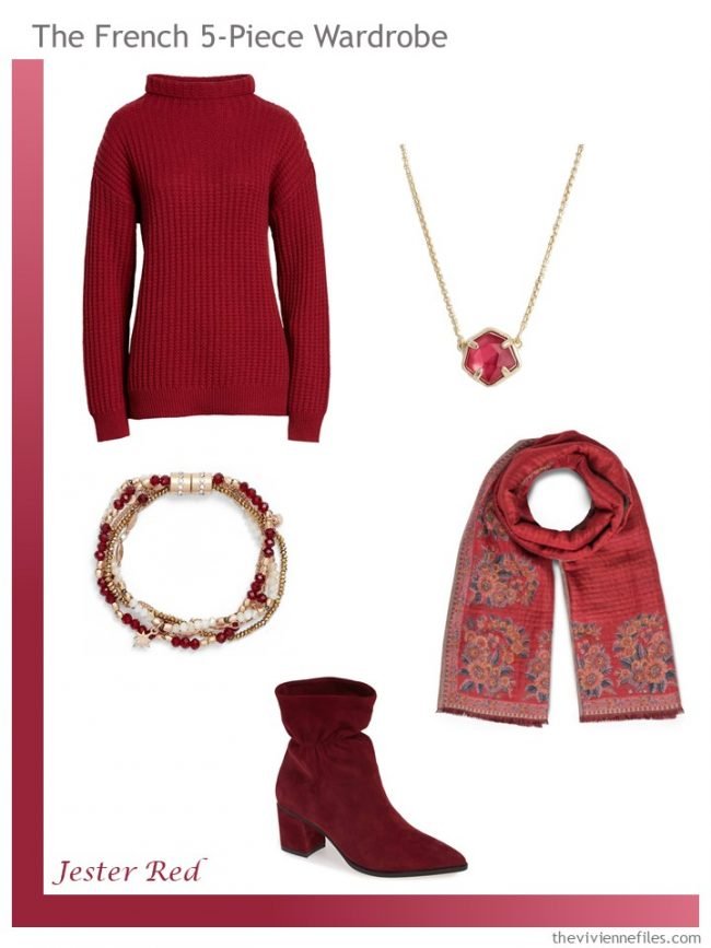
sweater – BP.; necklace – Kendra Scott; bracelet – Treasure & Bond; scarf – The Met Store; boots – Sole Society
I LOVE these pieces… If I was a beige wearer, this would tempt me to distraction! These colors are tough to find, but this is a real statement…
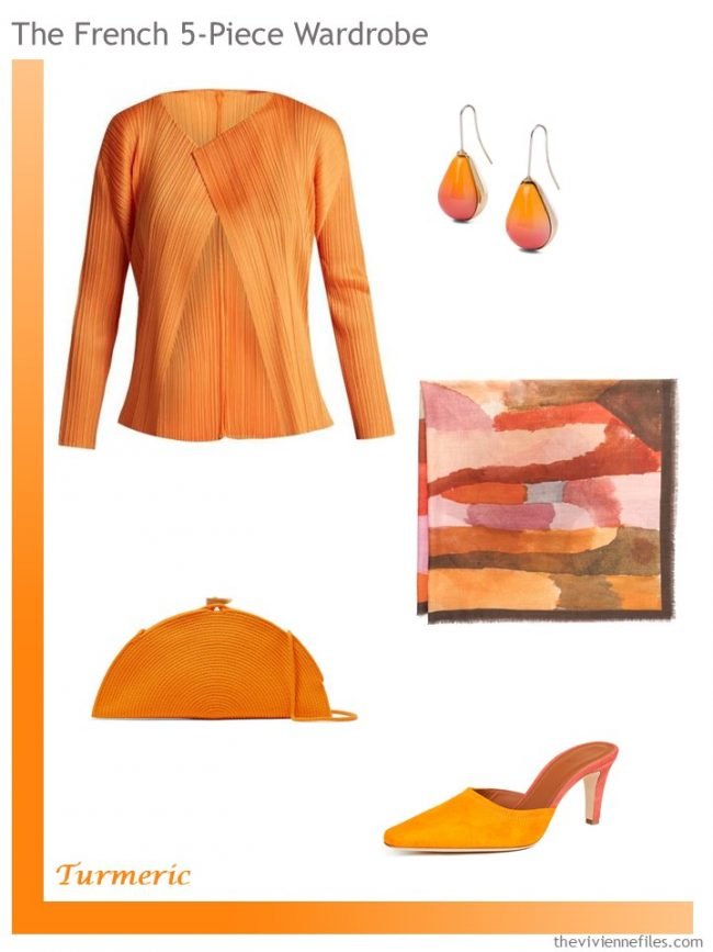
jacket – Pleats Please Issey Miyake; earrings – Loewe; scarf – The Met Store; bag – Catzorange; mules – Malone Souliers
I’m not quite sure what the implication is in naming this color “Living Coral” as opposed to just plain old coral. But it’s a really pretty color, that would look lovely on most people. And I think that this is one of those accents that can be worn with any neutral…
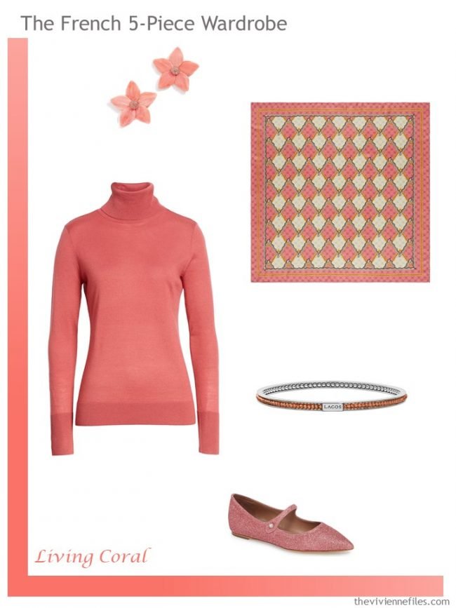
earrings – BaubleBar; sweater – 1901; scarf – Gucci; bracelet – Lagos; flats – Tabatha Simmons
And this color name is particularly odd. Is there such at thing as a pink peacock, or is it just something that someone Photoshopped? At any rate, it’s pretty, and would be delightful with navy or grey…
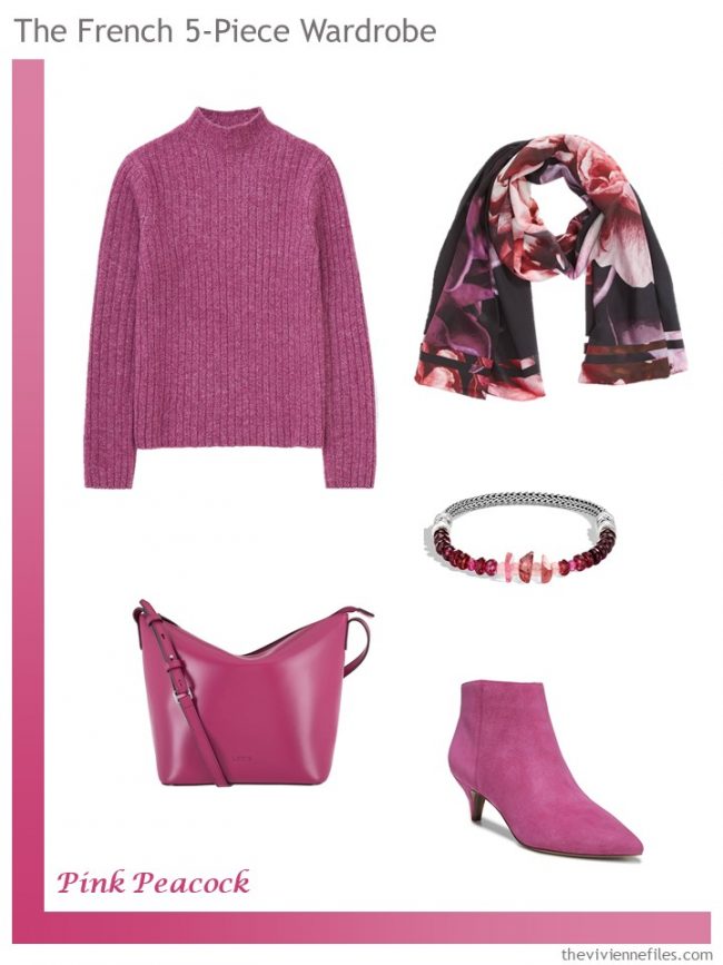
sweater – Uniqlo; scarf – Ted Baker London; bracelet – John Hardy; bag – Lodis Los Angeles; boots – Sam Edelman
If you like to wear green, you have my sympathies. This color was enough to almost drive me away from this entire post, or to just leave this color out completely and pretend that it wasn’t included! But I persisted, and was a bit flexible, and I think this came together beautifully. Picture this with brown and beige…
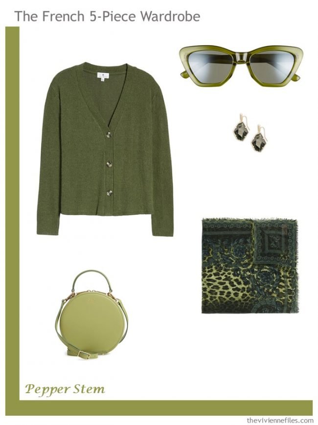
sweater – Socialite; sunglasses – BP.; earrings – Kendra Scott; scarf – Versace; bag – OAD New York
I don’t wear yellow, but I’m always really attracted to it… Maybe time for a rethink? This would be lovely going into cold, dark days…
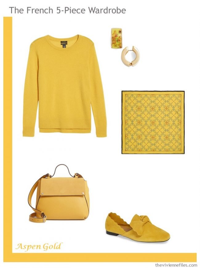
sweater – Halogen; earrings – Erwin Pearl; scarf – Victoria Ragna; bag – Treasure & Bond; flats – Klub Nico
One of the more entertaining things about Pantone seasonal colors is that there’s always an orange-red, a bright blue, a lovely shade of yellow… I guess when there aren’t really “new” colors, you can’t expect a lot of variety. I rather love this color too… (and note the square-ish knit in the sweater paired with the grid patterned scarf…)
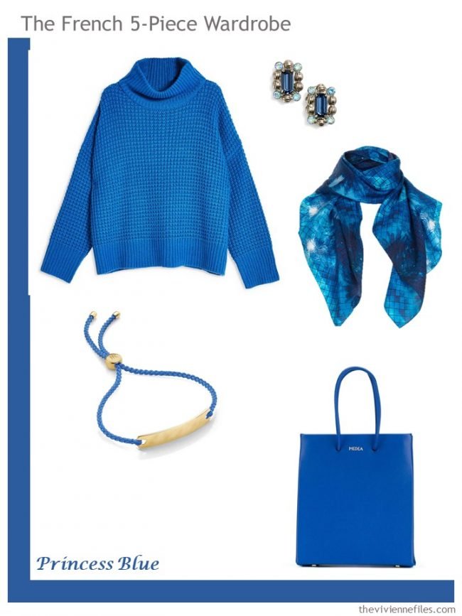
sweater – Topshop; earrings – Sorrelli; scarf – Pam Weinstock London; bracelet – Monica Vinader; bag – Medea
I don’t often, at all, use animal prints on The Vivienne Files, but this cardigan was just impossible to resist. This is a color that might be particularly lovely with black!
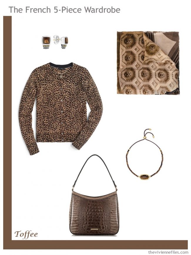
earrings – Lagos; scarf – Faliero Sarti; cardigan – J.Crew; bag – Brahmin; bracelet – Kendra Scott
This color was maddening. It’s not really THAT far off of the Aspen Gold… And when you’re dealing with lots of clothing manufacturers who aren’t particularly good at subtle color gradients, I ended up making 2 French 5-Piece Wardrobes that are pretty similar!
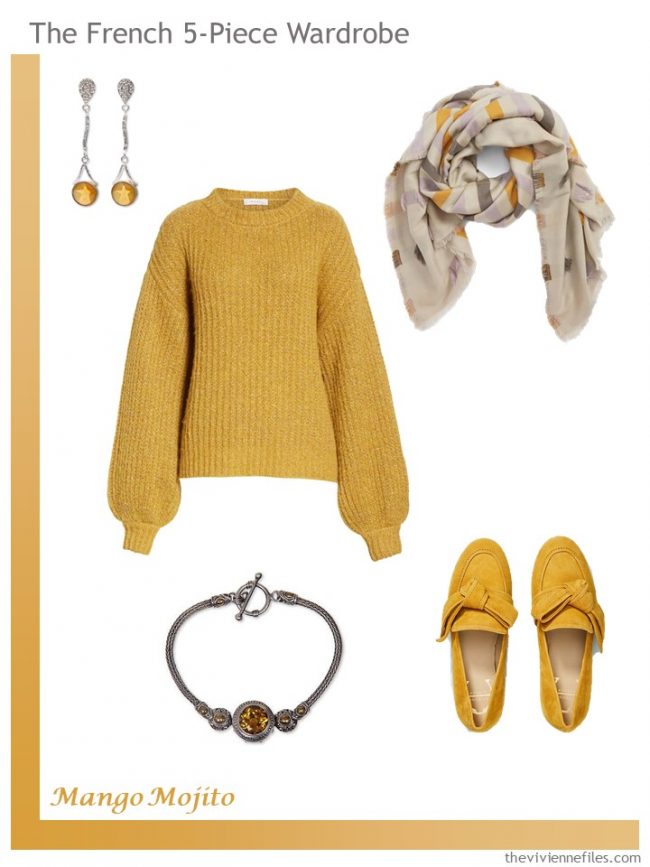
earrings – Telma Camargo de Araujo; sweater – Milly; scarf – Madewell; bracelet – Ni Wayan Astiti; loafers – Etienne Aigner
This green was, happily, a lot easier to find than the first one. I love blending these soft shades… This would be lovely with faded denim, wouldn’t it? I might have thought of a better name, though…
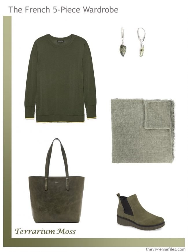
sweater – Banana Republic; green amber earrings – TJMaxx; scarf – Faliero Sarti; bag – Botkier; boots – Mephisto
This made me laugh… I love this shade of pink; it’s so nice to see a pink that’s cool rather than that warm, beige-ish color that’s been foisted off on us for the last couple of years…
But this is NOT lilac. Nope. Nope. Nope…
That said, I might kiss someone I don’t like for this ring!
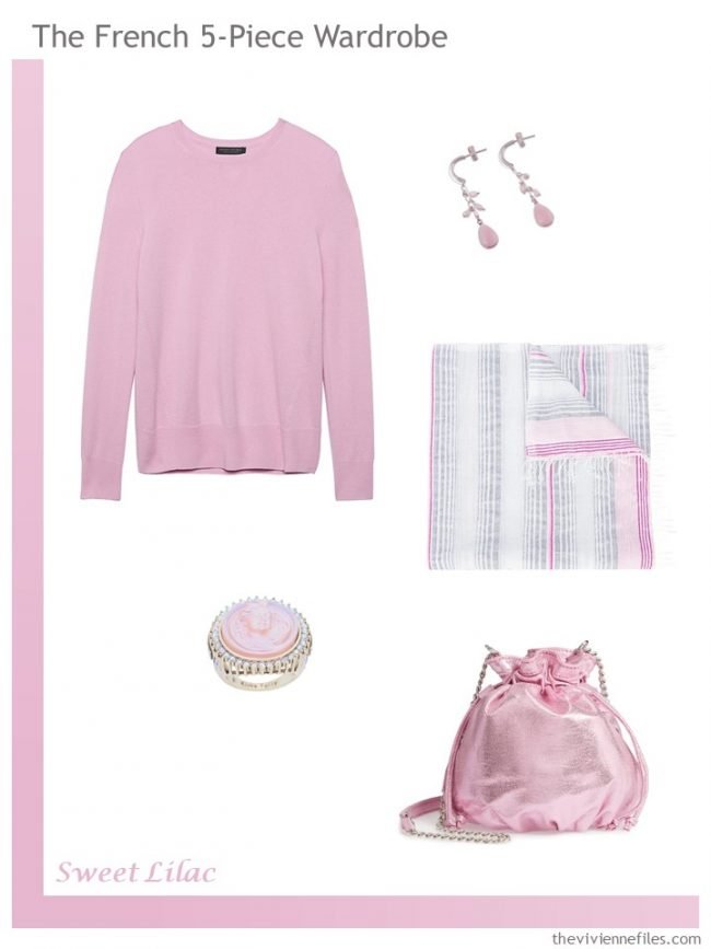
sweater – Banana Republic; earrings – Toberio Gonzales; scarf – Lemlem; ring – Kirks Folly; bag – Chelsea28
If you were going to be given a little cluster of loveliness in a new color, which would you choose?
I keep changing my mind…
love,
Janice
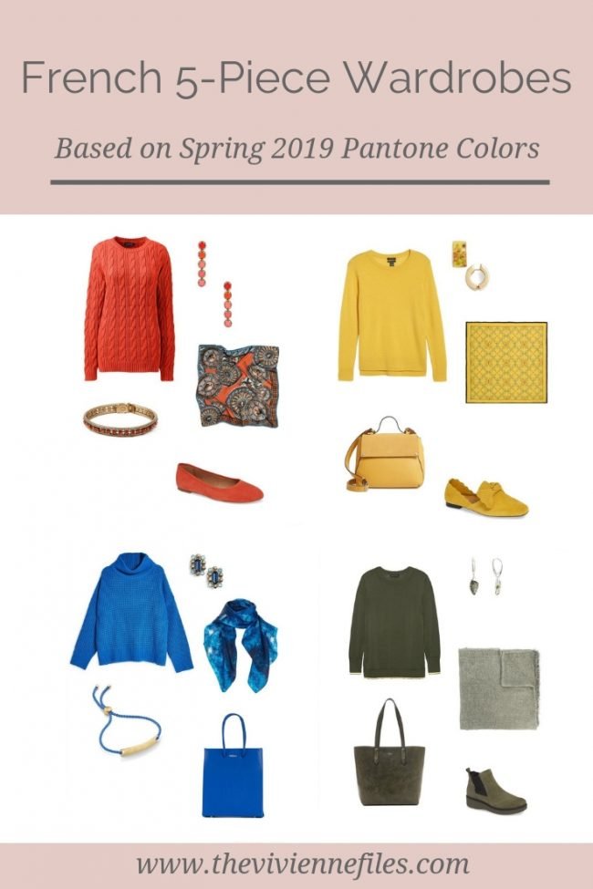
Like this article? Save it to Pinterest!
Thank you Janice for covering the new Pantone colours in the French 5 piece format which is always one of my favourites. I would love you to add some neutral common wardrobe outfits as I always find them useful and inspiring.
I would have liked a cool green, but both offerings are essentially different shades of olive which I can’t wear. The yellows are similar and that the Mango Mojito is slightly greener and darker than the Aspen Gold – either way, both would make me look ill.
I never wear brown or orange and the blue is too bright (cobalt?).
If I had to pick just one cluster it would have to be the Pink Peacock (at the moment), but I also like the Red Jester, Living Coral and Sweet Lilac.
Jester Red, Jester Red, and, oh yeah, Jester Red. But all of the wardrobes are lovely.
I will probably be the odd one out in this discussion: my favorite is Pepper Stem. That yellowy green is always on my short list of favorite colors and easy to add as accessories. Would love to see it with the neutral common wardrobe – thanks Janice!!
It’s my favorite too! I love it! :)
I’m so happy to have readers who love this color – I almost clawed my eyes out working on that one!
hugs,
Janice
I’ve just bought a light weight padded jacket in bright red-orange, and also a merino polo neck jumper. It does look lovely with navy, but I am wearing it with dark purple-navy trousers, shoes in same colour, lighter purple and tan scarf and a tan handbag. Written down, it seems a bit much, but seems to look fine! I love that leopard cardigan. Linda M
What lovely colors, Janice. Finding them in clothes, however, could be a challenge. Still — it’s so nice to see pretty hues again. Thanks for finding and featuring them.
Loving the Pink Peacock! Definitely one of my colors and I think it will look great with denim and navy.
Janice,
I discovered that I was having emotional reactions to some of the colors that I knew intellectually were not the best for my own personal coloring. Funny how instinctive we can be ! I actually love the muted warmth of Pepper Stem — something for everyone, huh ?
Me too!
Style sister, pat
“And for what it’s worth, these colors don’t necessarily show up in store any more or less than any other colors…”
I’m curious, do you have any theories on why we don’t see the colours in retail? In the past I paid attention to Pantone but now I don’t bother since I can’t find the colours anywhere in stores. I’m an infrequent online shopper because it’s so hit or miss on sizing, quality and colour.
Everything I know about fashion (very little) I learned from The Devil Wears Prada, but I think it’s just a delay. Those colors will filter down to retail, but it won’t be for a year or two.
I love the Pepper Stem! Aspen Gold appeals to me as well. I am coveting those sunflower earrings!
Love the Terrarium Moss . . . could it also be called Turtle Shell? At any rate, what a gorgeous color and fashion you showed with the color. xoxox
You would be lovely in that Terrarium Moss…
hugs,
Janice
Since warmer oceans are killing coral reefs and turning them white, I think “living coral” is a back-formation to indicate the color all coral used to be.
I’ve been thinking of wardrobes for women politicians based on their state flower or bird. The turmeric set would work well for California, especially if she could find a brooch or scarf with California poppies.
I tend to like shades of red or pink. I like Jester Red, Living Coral, and Pink Peacock. Sweet Lilac is too “sweet” for me.
I love your French 5-piece Wardrobes. The first one is my favourite. Yes, please show the pieces with a neutral common wardrobe. It is so fascinating to see how adding just those five pieces can change neutral clothes into a colourful outfit.
I just love the *word* “fiesta”! Reminds me of this most excellent poem:
“The Church says: the body is a sin.
Science says: the body is a machine.
Advertising says: The body is a business.
The Body says: I am a fiesta.”
― Eduardo Galeano, Walking Words
What a terrific thought Suzyn! Thank you for sharing the poem.
Bring on the Turmeric and the Mango Mojito! And the Jester Red! I love the “fire colors!”
Do the colors really not show up any more or less in the stores and “trends” even though Pantone kind of markets them as trendy? That is very interesting! Based on that scene in “The Devil Wears Prada” where Meryl Streep’s Miranda Priestly goes through exactly why the intern/lowly receptionist is wearing that color blue sweater, I thought that for sure these colors came from somewhere (I mean, a reason) and had an effect (to some degree) on “fashion”. Huh! I’ve been hoodwinked by mass media!
Yes, is it the chicken or the egg? Pantone says they are predicting these colors will be popular, but is their prediction causing the popularity, or had the trend already started in designers’ showrooms before Pantone announced the colors?
I like the Jester Red set. My husband was in NYC at the beginning of November on our anniversary. He bought me the Frank Lloyd Wright “Tree Of Life”scarf in the red from MoMa for my present. It has the red, & turquoise/peacock blue colors I am building in my wardrobe. Even though it is being discontinued I think it is a good match for the Jester red. My next investment is a pair of red shoes to amp up my neutral jeans in blue and black. I hope I can find the right match/blend. That is the nice thing about starting with a scarf. It is easy to wear and carry around to find matching pieces in the stores.
Oooo, those Madewell suede flats in Fiesta are perfect! If only they were available in black! You find the cutest things, Janice!
What interesting colours. Not all of them ones that I would associate with spring, but interesting. Like others here I have favourites, but not all the items would work for me, even in those colours. For instance, the Sweet Lilac and Princess Blue would work well with my neutrals but I wouldn’t want to wear pink or cobalt shoes. Still, my favourites are the Sweet Lilac, Red Jester, Pepper Stem, Toffee (loooove the cardigan), and Princess Blue. It’s a surprising range for me, so thanks for opening my eyes to possibilities!
At last! Colours ithat an Autumn can wear! It’s always so hard to find colours that are warm enough for me, but these (subject to the vagaries of the computer screen colour settings!) should do it!
I’ll second that!
me too!
The whole series was awesome!
hahahahaha… “pepper stem.” they absolutely got that right – green bell pepper all the way. and one color I would not wear, having gardened bell peppers for 3 years straight. the hassle. the bugs. no thanks!
I predict that Sweet Lilac will be big in Japan. It’s a very Kawaii color that I can see on the younger set here. Should supplant that millenial pink trend. And at 69, I’m definitely looking forward to it, too!
I love that Turmeric!! Especially the shoes. I would wear it with navy. And gold jewelry. ?
Jester Red is my favourite! Very close to the shade I love that I refer to as cranberry. A berry toned red with a hint of rust and a touch of brown.
I’ve got a few things in that which I use to spice up my fall & winter black, grey & winter white basic core. A really versatile shade that I could easily justify buying more of or spending more on an individual item because price per wear would work out well.
This shade also goes really well with my navy, grey & white spring and summer core.
A possible second choice would be that coral shade. I have a few things like that that come out for spring and summer. Not fond of coral in the cold seasons though so not as versatile.
These are such fun! I love the Jester Red color, but the pieces from the Peacock Pink are my favorite. – nancyo
Love the pink peacock. I gravitate toward shades like that that I always call orchid. I don’t have much of it but you only need a little anyway.