Let’s see how this new version of The Vivienne Files works, shall we?
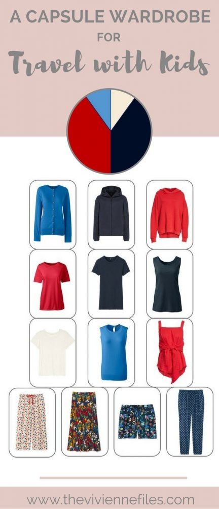
It’s a question I hear from time to time – I’m traveling with small children, and I want to pack something bright and cheery. I also get questions about packing with printed or patterned pants, skirts and shorts – I’m going to throw that variable into this mix too!
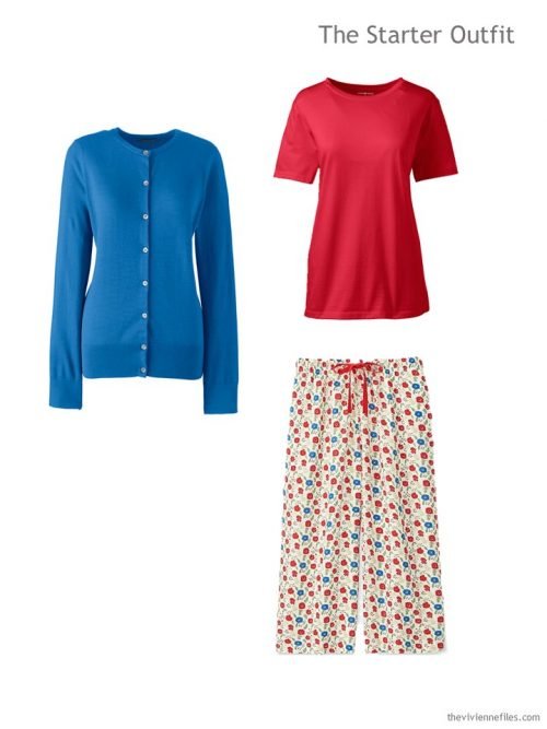
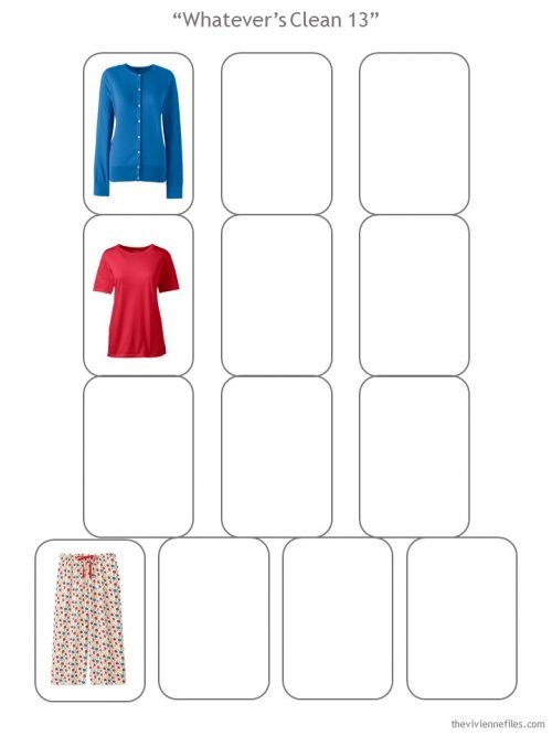
cardigan – Lands’ End; tee – Lands’ End; pants – Uniqlo
This is a pretty bold way to start a wardrobe! But it will work, if we’re intelligent and thoughtful…
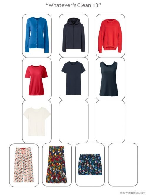
First up, let’s pull out our “Whatever’s Clean 13” template to make sure that this plan stays on track:
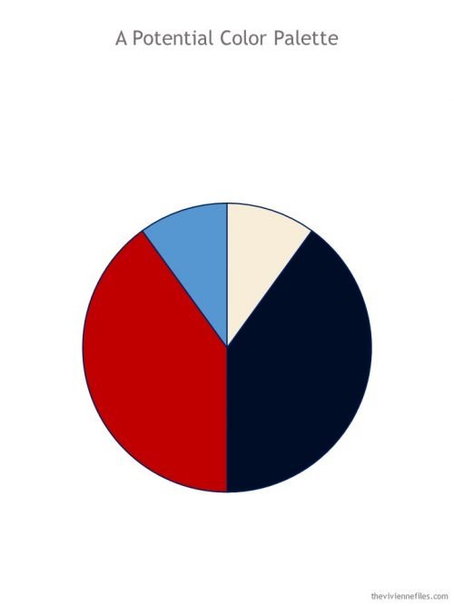
It might behoove us to come up with a color scheme, before this goes completely crazy! I’m nominating navy as a neutral for this wardrobe, because navy is a great, classic neutral for warmer weather, and because it will be lovely with both the red and the bright blue we’ve already included. Here’s what I’m picturing:
As much as it would be really entertaining to just throw brightly-color outfits at this wardrobe, I’m going to be disciplined and build a nice core of navy first!
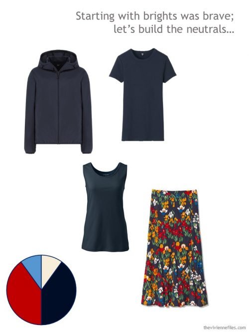
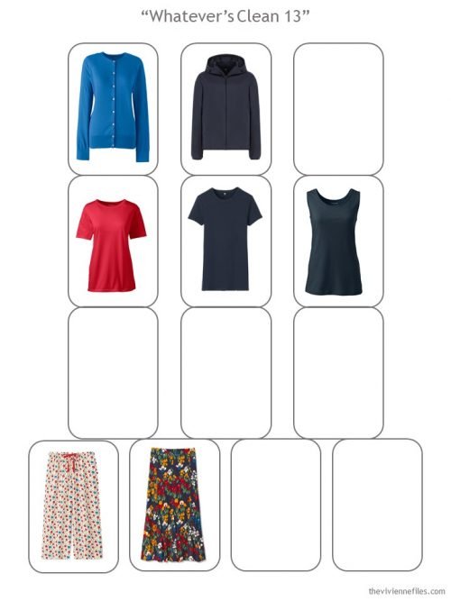
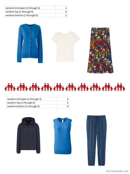
pocketable parka – Uniqlo; tee – Uniqlo; tank – Lands’ End; skirt – Tory Burch
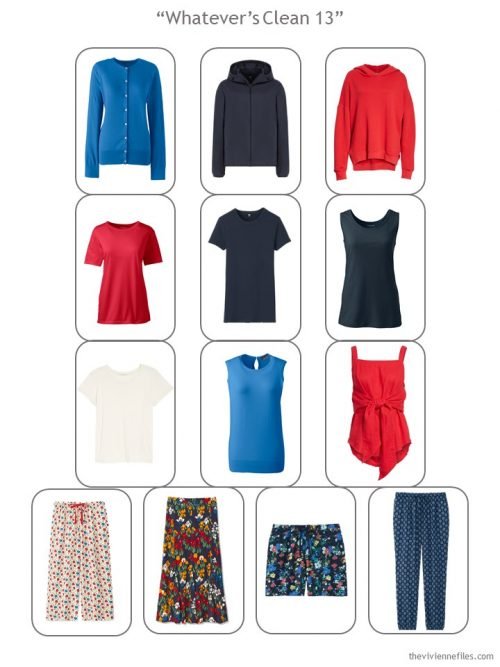
Now, when we look at the template for our “Whatever’s Clean 13,” it starts to look like a coherent wardrobe:
Hmmm, what does our heroine need? Shorts? A neutral tee shirt? Maybe another sweatshirt? (this of course depends on where you’re going, but if you’re heading to… say the Wisconsin Dells, sweatshirts could be handy!)
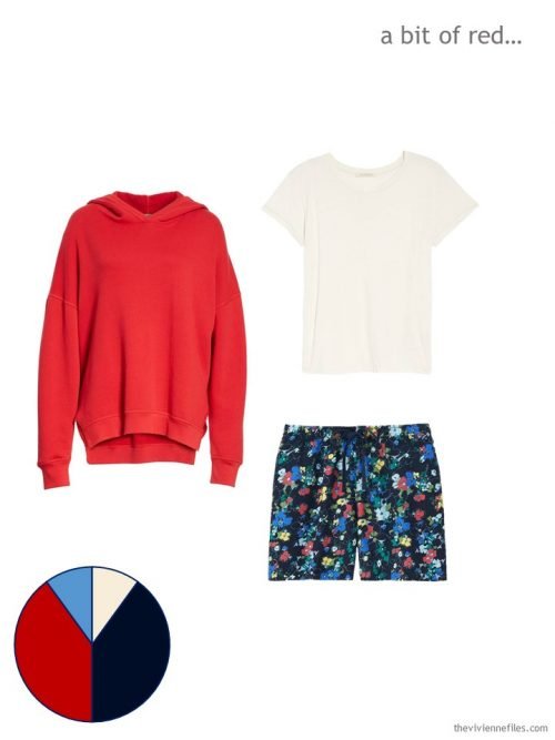
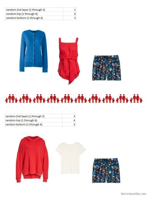
sweatshirt – Joie; tee – Ragdoll; shorts – Uniqlo
Where are we now with out wardrobe?
Our heroine has room for 1 more outfit, or 2 tops and a bottom… Let’s get her a pair of long pants, eh? And something else in bright blue to pair with her lovely cardigan… The 3rd piece? Something that catches our eye!
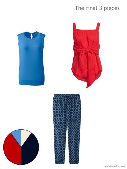
sleeveless sweater – Lands’ End; tie-front tank top – BP.; pants – Uniqlo
Our complete wardrobe isn’t something that you’ll see every day, but it’s very practical in terms of versatility!
Of course, I’m going to test this out to see if it’s really “Whatever’s Clean”! A few random numbers will give us a clue…
Thanks for your patience as I migrate The Vivienne Files onto this new, exciting, slightly daunting platform – if you see anything that looks weird or horrid, just let me know!
love,
Janice
Like this article? Save it to Pinterest!
Looking good!
Fabulous! enjoying the look of your new and improved web site.
karen
Hello Janice, congratulations, the site is very beautiful, ans so is this capsule wardrobe.
Carry on!
Nice clean look to your blog, but missing are the blogs YOU follow– I like to click through those, too.
Never mind– found them under “Start Here.” Thanks for all the work you do!
Yay, Janice! The new site looks great to me. Congratulations!
Glad to see you are back! This wardrobe looks like fun and so appropriate for young moms.
The new platform is lovely!
Sorry, I just hade blogg that have that box Read more instead of having everything following each other, which gives a Better flow. I like your blog but usually i stop reading blogg that are Mads that way. It is to much clicking back and forth if you want to read more than one post. Hate it
I feel the same way. I like to have all the posts laid out, without having to click extra times on “read more.” And I agree with a couple of people below about the low contrast between font color and background.
Also agree. I just stop reading—usually it’s just an opportunity to pelt you with more ads. Also, on my iPad display, the central image is cut off at the top and bottom, so I’d have to click on that too if I want to see the whole thing.
Yay! You’re back!
Love the new website – “clean” design and so easy to navigate and find things (unlike the old search function which was a bit clunky). Thanks so much.
My only complaint – there are so many pop-up ads all through the content. I know bloggers (especially you) deserve to have some revenue for all the time/effort you spend, and they are just so super-annoying. Plus, we’re reading a blog about how to thoughtfully purchase, and they are encouraging us to mindlessly shop.
I’m not getting any pop-ups at all.
I agree they are super annoying but it sounds like they might be coming from a different web page you have open or something running in the background on your computer instead of Janice’s site.
Unless of course everyone else is getting them and I’m the odd one out.
Huh! Pretty experienced commuter user and no other programs running in the background – we are dedicated Apple users and have great security software – is anyone else having this issue of pop-up ads in between the content?
Any many thanks, Janie – overall, love the new design and so appreciate the work and thought (and so often humour) you put into every post! You’re amazing.
Site looks good on my iPad, but I usually view it on my computer so I’ll check it from there. I like the idea of this but can’t get over those first pants looking like pajamas, and not in a good way. The red shirt that ties is lovely but I can’t see wearing it under a cardigan, or a sweatshirt, it would bunch up. Oh well. I am just trying to imagine the scheme with different garments, I think it would work well. The problem with a very small wardrobe is that if one piece doesn’t work well with others, it’s much less functional. I think she’d have to change that red shirt if it got cool.
I’m finding the contrast between the color of the print and the backgroumd hard to read.
Enjoy the blogg
I agree. It must be the newest trend because I have found this problem with some of the other blogs I follow.
Fabulous wardrobe!! I love the color and prints, and now I’m dreaming of the Dells, lol.
So far also living the new site, especially on mobile!
*loving, darn phone! :-)
Where are the blogs you read that used to provide links to?
Your website is a joy, but I miss the chronological index. Is there any chance that the index could be made available in some way? (The chronological index makes it easy to see how your ideas evolve and and to spot topics other than those related to developing wardrobe capsules.)
It makes sense to “up” your level of tech/marketing on your website to support your ideas. I wish you all success.
The chronological index is under Articles on the banner – click archives
Love the new blog. So much clearer for me to read. As for this post, I was reading it thinking I would prefer cream as the neutral rather than navy but when it was all finished it was clear to me that navy was soooo much better in providing versatility and letting the statement pieces shine. You are the best.
Looks great! I don’t mind ads as I know you work hard at this and it has to pay the bills!
I know the “read more” button has a purpose too. It’s a small thing in return for all your wonderful advice/analysis/stories/art :)
Glad to see you up and running on your shiny new platform.
The site looks good but could you make the text black? Grey is hard to read.
I’m happy with the new look and navigation, Janice. It’s neat and crisp! Congrats to you, the designer and the IT Crowd.
Robyn x
The new platform looks great, however, I miss not having the date at the top. I often use that to track whether I’ve read it or for referencing a particular post.
Found it! Very small print at the bottom. Glad it’s still there.
Snappy layout, but I miss the Links ?.
Site looks lovely! And I’m hoping the commenting will be much easier.
Happy to see you’re back and posting again! I like the new look of your blog and am glad you kept those nice customized borders between outfit options. Always enjoy your blog and eagerly await your posts. Your blog helped me consolidate and coordinate the clothes I already have, and also to make the right choices when purchasing new items.
What a nice surprise ! I love the new look of your website !
Looks great!
Altho’ I do agree with someone above that a darker color for the text would be easier to read.
Thanks for all your lovely art :)
Happy to see you’re back and the new site looks très chic. I’ve already planned two Whatever’s Clean 13 wardrobes for my two holidays with my children this summer – but I am open to editing them! I will have to try the random number generator method to check them as I know I have a skirt and top combo that isn’t ideal in one pf the packs.
Wow! This looks amazing.. and the wardrobe is so FUN as well as cheerful. You’re in the big leagues now! congrats. Janice Collins, Washington DC
So I found your favorite blogs list, and the site looks great. But I must say I will REALLY miss being able to click on a color in the side bar and seeing lots of those great ideas linked from various posts. I also really miss the ability to search posts chronologically. Darn!
Take a look at ‘Archives’ for the chronological list. I use that too!
Glad you’re back! I agree with some of the other folks – I miss the tag cloud, and on the blogs you follow, it was nice to see their actual current post title in the sidebar, because that was how I decided which ones to read. I don’t follow the others every day like I do yours! :) But the search is SO much better – thank you!
Feedback on the new blog—
– The home page took much longer to load than the old site.
– It looks great!!!
– I do think the read-more is worth the extra click. Scrolling through full posts to get to one a few days old is never my favorite thing to do, especially on mobile (though I generally read on my computer). Since I get email alerts about posts, I also can click straight through from there if I haven’t already seen the new posts from my morning checks :)
Thanks for continuing to share your wonderful visions with all of us :)
The new website is easy to navigate and I have found everything I was used to seeing at the old site. I like the arrangement of the new “Whatever’s Clean 13” template. I did find the more specific directions in the old template helpful. However, I can see that this one is maybe open to more creative thinking in choosing the items to put in the template.
I agree that the gray print is difficult to read.
So glad you are back. Every day this past week I would go to look for you email, then remember that one would not be coming.
Your new site looks very fresh, I love the new headline logos with the closet hanger. Not having any color contrast problems with legibility, and on my desktop computer it all looks quite easy to navigate.
I do very much miss the way the “blogs you enjoy” were formatted on the former blog, with just their names and the indication of what/when their most recent posting was. The new format for those, with their blog logos? instead and no other data, means that I am not likely to go check them out, which was a minor side use that I did when I came to see your content first each day. I know that is the theory of why to not include that data, but it is missed.
The other thing that is more troublesome is that when I look at your blog on my phone, which doesn’t have ad blocking, there are as many ads on a blog post as content. When I am trying to read your post, that I assume you have carefully written and illustrated, between *each* paragraph is a large ad for something, not even related in content to your blog. It makes it very hard to even understand what points you are trying to make, when I keep having these large ads for fitness clubs, or vitamins, or cookware, none of which are things I have purchased or have interest in purchasing. I mind less the other ads on your blog, which are narrow bars either above or below the content, but the presence of many large ads distributed in the middle of the blog content mean that I will *never* want to view your blog on my mobile.
I hope that the glitches of transfering to a new host will soon be sorted out, and that we can continue to enjoy your great point of view for many years to come
Janice – well done with other the new format! Love it! Change can be hard – especially since we knew where things were and now with the cleaner look, they are tidily put away!
I like the gray type – it’s easy on the eyes. (I’m on the cusp of 60, so no yung’un here.)
Your blog is my daily morning read – am in awe of the work you put into it. I had a blog and know the amount of time and effort it takes to keep up with regular posts, pix, updates, and to respond to comments. Well done!
I love the new site, the old one made my browser freeze when I tried to open a lot of pages (“ooh this looks interesting, and this, and this, and this!”).
Also love the capsule! Am now pregnant and can’t fit into almost anything of my normal stuff, so need to consider a new summery capsule for the next months! Maybe this should be it!
Looks good – but yes, I did find the links to the various items to be very useful. I was also going to mention “Blogs I Follow” but now understand where to look.
Janice, the blog looks so spiffy! Neato! And here’s my two cents (well, maybe 20 cents): 1. I agree with others, it is a bit washed out–I think darker type may help that? 2. No one has mentioned this, so I will: the links don’t open in a new page; they replace this page. I much prefer a new page to open so I don’t have to reload your page when I come back to your blog after checking out an item. 3. The list of your past posts on the right is kind of info-heavy? By that I mean, it’s pretty to see a picture with each title, but for ease of use, I’d rather see many titles at a glance–I think just the titles, sans pics, would make it easier to see the list of them without needing to scroll down. As is, only 5 titles fit on one screen; I’d rather see fewer graphics and more titles at a glance. (I hope you wanted this kind of feedback–I’m not complaining, just analyzing!)
As for this wardrobe–I was put off at first by what I could only see as PAJAMA pants at the start. But, holy smokes and what the heck, by the end the whole wardrobe was absolutely adorable! I couldn’t wear it in a million years–those pants WOULD look like pj’s on me, I know it–but truly, I can see it would be just so so cute on some! I’m jealous! You’re a magician, Janice.
I agree that I would rather the links open to a new page! I dislike having to find my place in the original post after visiting another site. I was going to mention this as well. However, I do appreciate having a bit of a picture with each past post, as the post titles no longer include the color scheme in them but rather the name of the artwork or similar. This way I can see whether I’d be interested in the color scheme without clicking through to the post to find out. As for this wardrobe, I’m intrigued by the red shirt with the tie in front–I’ve been wondering if I need tank tops with more structure to them, as knits are kind of saggy on me. I may have to check out more options like this.
Janice,
The new format is wonderful! Very clean. And I just love the new logos, especially the one with Vivienne spelled out in the hanger wire. How clever! I would like the date more prominently displayed so I know right away if I have missed something.
Keep up the good work. Your blog is the first thing I read every morning. Well, I do look at the weather if I’m playing golf!
First – Lovely wardrobe. I own a lot of prints and I love seeing a whatever’s clean that uses so many print pieces. This wardrobe could be easily modified to fit my lifestyle and (all skirt) wardrobe. It’s even in colors I wear (though I’m slowly switching to a more toned down red).
Second – WordPress is great once you get the hang of it. I help out on my husband’s Bible review site and haven’t had any problems that my husband or son couldn’t help me figure out fairly quickly.
Third – I love the new site. It’s crisp and clean and easy to navigate. Personally I have no problem with the text color and don’t think I’d like stark black quite as well. My husband (who writes about WordPress for a living) suggested that making the font slightly larger might be your best solution for keeping your design and helping some find it more readable. I’m good with the read more button and amount of ads also. (I’m not getting any pop-ups or alerts for blocked pop-ups so if my system settings are blocking some I should be getting I can see where some would have a problem.) I’m glad you kept the month-by month archive and blog list that are easily accessible with a single click from the top navigation. My only complaint is that the blog list no longer includes a feed of their latest articles. I will probably be visiting them much less often since there is only one I visited unless an article title caught my interest.
This capsule looks great and is just what I need! Thank you for that! I hope you will look into this topic again in fall and maybe even during the holiday season.
Like the new layout and enjoy reading your blog.
Uh oh, your buttons directing to newer post or older post are MIA, as is the list on the right of past blog entries. Hopefully these will appear in another day or two… (iPad user here, in case that makes the difference)
Finally! A wardrobe that doesn’t feature black and grey as the neutrals, or have a monochromatic look with beiges. I love the Navy and bright colors. The specific pieces may not be “me,” but it helps to see a coordinated wardrobe in colors I could imagine for me. Thank you!
One question. Would you ever consider sneaking in maroons or a deeper beige, maybe for cooler season wear?