September 11, 2017
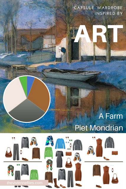
When I think of Mondrian I always think of those black and white grid patterns with little patches of a primary color or two, but in his earlier days he was much more traditional...
Colors are always what catches my eye - I loved the strong blue, the almost acid green, and then the much calmer neutral rust and grey...
"Uses of Color in Distinctive Branding" Whoever names these conferences needs to get some imagination - how stodgy can you get? This doesn't sound at all appealing.... But she has been writing the book on distinctive color uses for decades; it will be interesting to see what these young people think they can teach her!
Her approach to color has always been to do the "wrong" thing, so ... View the Post
