November 2, 2017
Remember an absolutely amazingly beautiful rose scarf that I used here back in November of 2015 from a company called Kathkath? Well… I’m delighted to be able to tell you that the scarf is now available in a modal and cashmere blend, as well as in a rectangular shape!
And they have new scarves available – oh, do they have some gorgeous things!
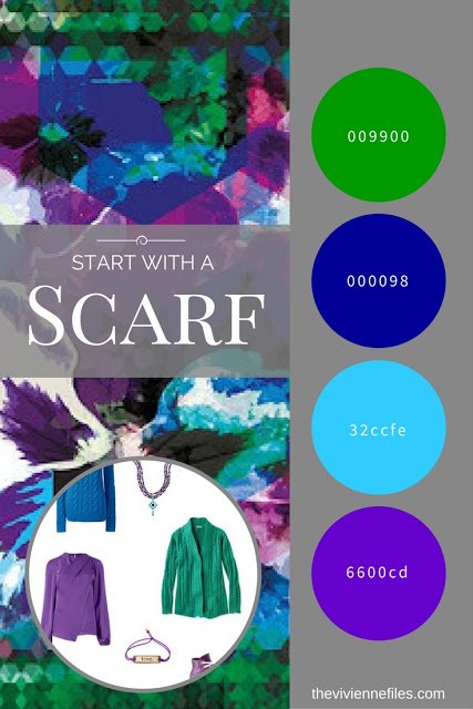
The first scarf that caught my eye (but not the only one!) was this – the Hope Scarf. One of my dearest friends loves pansies, and this reminds me of her… and these colors are so ideal as a change of accent color for black; many of us would like a change from using red as our accent color.
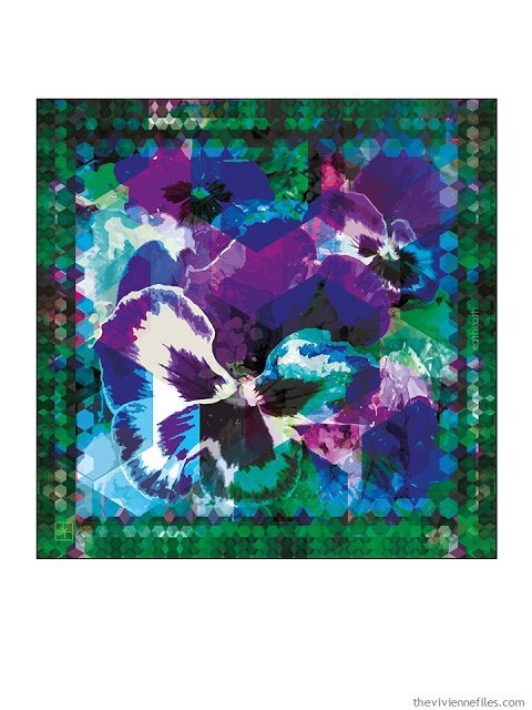
The Hope Scarf by KathKath
Looking for these colors in clothing can drive you mad (there’s a reason I work from home, alone!), but they’re worth seeking out, because they make a strong but tasteful statement…
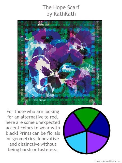
The Hope Scarf by KathKath
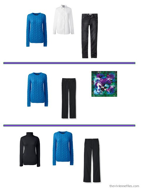
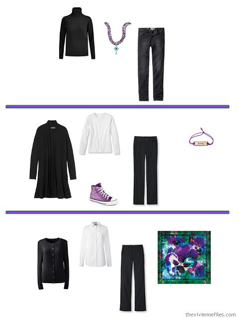
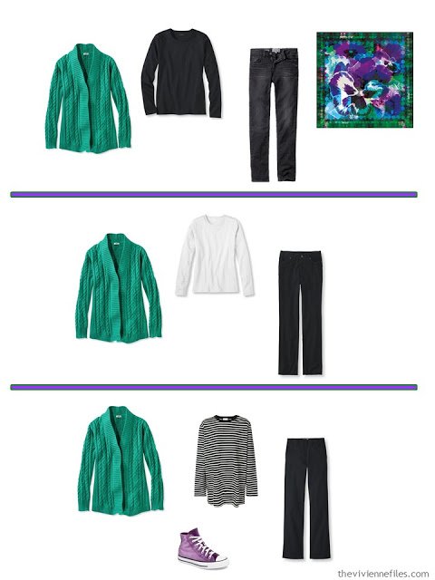
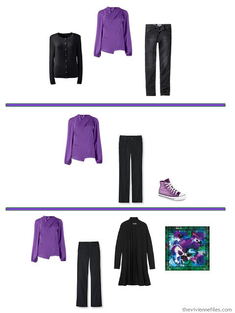
I shifted this Common Wardrobe just a little bit, with the addition of a black cashmere turtleneck, and a graceful black open cardigan. This wardrobe, just like this, offers a lot of possible outfits, and serves as a workhorse base for accents:
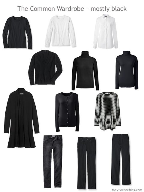
black tee – L.L.Bean; white tee – L.L.Bean; white shirt – Lands’ End; black v-neck sweater – J.Crew; cashmere turtleneck – N.Peal; cotton turtleneck – Lands’ End; long cardigan – Banana Republic; cashmere cardigan – Lands’ End; striped tee – Faith Connexion; black jeans – Fat Face; black cords – L.L.Bean; twill pants – L.L.Bean
It would have been somewhat straightforward to find tee shirts in these colors, and that might be the best route to take if you’re not certain that these colors are really right for you. However, I thought that I’d look for sweaters, and a blouse, and then a few accessories that were… off the beaten path! The little message bracelet comes in a wide variety of messages, and is inexpensive enough that you could get a few of them and change from day to day, depending on what encouragement you need, or what message you choose to send. (made in the US, proceeds provide clean water to the Central African Republic – you can’t really go wrong…)
And yes, velvet athletic shoes. This heroine is not a shrinking violet! (or pansy…)
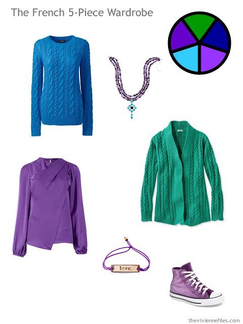
blue sweater – Lands’ End; necklace – Jay King; cardigan – L.L.Bean; purple blouse – Marks and Spencer; love bracelet – MUDLove; sneakers – Converse
Even though you might not expect to see all of these color with black and white, they all seem to work well. Having the scarf (and the necklace, bracelet and shoes) to visually tie things together never hurts!
If you see other scarves on the KathKath site that you would like to see “wardrobed,” just let me know….
love,
Janice
Like this article? Save it to Pinterest!
I like these vibrant colours with the black. Very striking, as you say, not for the shrinking violets….
I LOVE LOVE LOVE KathKath. I have two of their scarves, LookingPink and Riad, that I wear all of the time. Amazing quality and the most beautiful colour combinations.
I like Cee Pluse' idea of the Red Tulip with navy. I am considering purchasing that scarf in long modal cashmere to wear with winter outerwear. Here in the northern hemisphere, these winter months are cold and dark. It does not help that our slushy sidewalks appear flooded with dark, somber-clothed pedestrians, too. A splash of warm colour might cheer things up!
I love this color wheel, and these are my colors. I pair them with navy, rather than black, but that's an easy substitution to make. I see magenta (fuchsia?) in the scarf – I would use that rather than the paler purple. Fabulous! Thank you, dear Janice.
THESE ARE MY COLORS, TOO! I am a "cool winter" and I usually wear black or navy as pants or skirts. I used to be an olive green/earth tones kind of girl, but once I paid to have my colors "analyzed" with photos of my skin and eyes and face, it turned out that these are my colors, and since then I get a lot of complements, and feel so confident and know exactly what to look for when shopping. It's hard to find these colors in springtime, though, but the other 9 months of the year it is not hard (for me). Thanks for doing this combo! Sometimes I pair it with a bright berry pink or fuschia or I've seen it here listed as burgundy…
The best colors, with black, my favorite. I have turtlenecks in those colors that I use with my basic black, gray, and red winter clothes. Thanks for a great post!
LOVE the tennis shoes!!!!
You could SO rock those…
hugs,
Janice
Violets are my birth month flower, but definitely not the shrinking kind for me! I enjoy all of the bright accents. And the KathKath scarves are beautiful. Could you please do the red tulip scarf? I would love to see a navy basic wardrobe accented with those vibrant shades of red, orange, and yellow. As a teen I had a favorite wool skirt in a houndstooth pattern of navy, bright red, and muted orange, and to this day I love that color combination. There is also pink and a little green and purple in the scarf if all of those hot colors are too intense, but the only way that I can wear navy is if it is paired with a much warmer accent color. I can't wait to see what you come up with next!
I vote to "wardrobe" the topographic scarf. I love the watery colors in that one.
I don't like these colours with black (for me) – I'm sure they look great on someone else.
And I will look on their site for a scarf as they seem beautiful.
Hi Janice,
Wonderful post! So nice to read the feedback from people.
Thank you so much.
Kathy and Kathryn aka KathKath Studio
It's easy to say nice things about your scarves – you do stellar work! Thanks for sharing the beauty you create with us all!
hugs,
Janice
These colors- swoon! They are the ones that are the basis of my wardrobe. Thank you for providing ideas for a fresh look. I adore those velvet shoes…
Beautiful scarf and gorgeous colours but not, I think, terribly French. IMHO experience, from living in Paris for nearly three years, French women rarely wear Crayola colours. The colours they wear are always cut with grey or beige. Those lovely bright, clear colours that we N. Americans love are rarely worn by anyone over twelve. For the French woman discretion is paramount. Anything that can be seen from twenty feet away would NOT (pardon my shouting!) be considered discreet, nor even adult. That's one of the reasons that black, brown and grey are so popular in Paris, and why black is seen throughout the countryside. I adore your blog and read it religiously. Your wardrobe ideas are wonderful, especially the ones built around your Hermès scarves (not that I can afford any!). The colour combinations and the colours themselves are always so gorgeous. Thanks for all you do. Best regards from Toronto, Canada
I think it might be more of an urban/rural difference – I know that you don't see bright colors on the streets in Paris, but once you get into the smaller towns, especially in the south, you do see more. AND I think it's more common in the warmer weather… it's interesting – someone needs to write a Master's Thesis about this!
hugs,
Janice
I know this may be a dumb question, but… what do the numbers on the colors mean or where do they reference from? I love this color combination and your blog!
There are no dumb questions on The Vivienne Files – house rules!
Those numbers are the digital reference for recreating the color in the "hex" system. Check this site outhttp://www.color-hex.com
It's sort of fascinating; you can type in almost random numbers and letters and get a color!
hugs,
Janice
I love these colors and that scarf is gorgeous and happy!