I got back from Paris yesterday evening (although I’m writing this on the 18th of September, so anything’s possible!)…. Before I went on vacation I was looking around the internet for color inspirations and to see other approaches to color combinations – especially those outside of the fashion world.
So I suggest you get thee to a site called Design Seeds and enjoy yourself. Bookmark it and visit often, because they’re always changing up the featured combinations, and they’re always beautiful, if not always to one’s personal preference. But what a source of ideas…
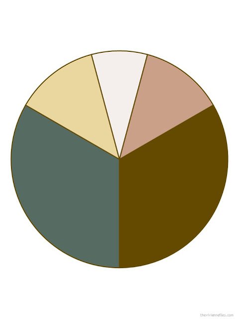
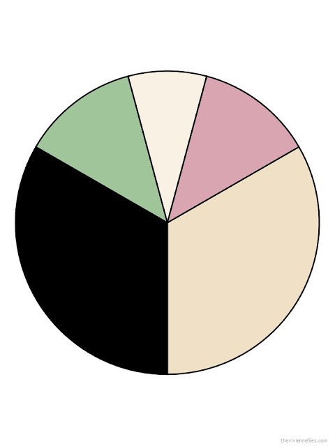
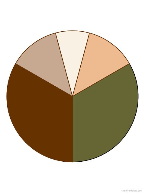
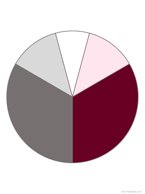
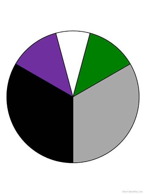
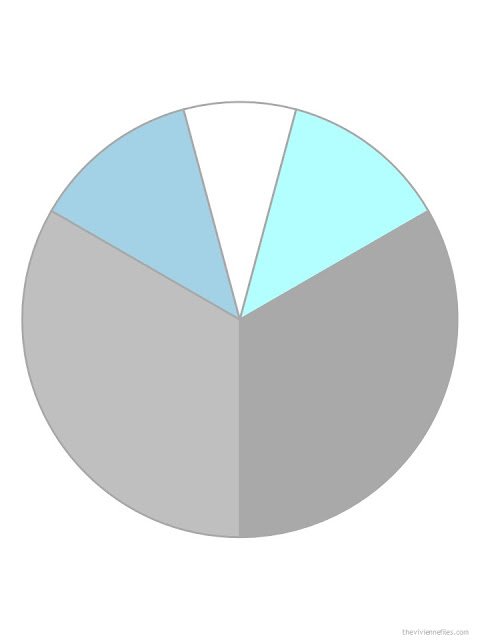
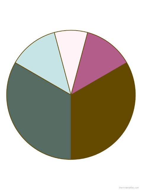
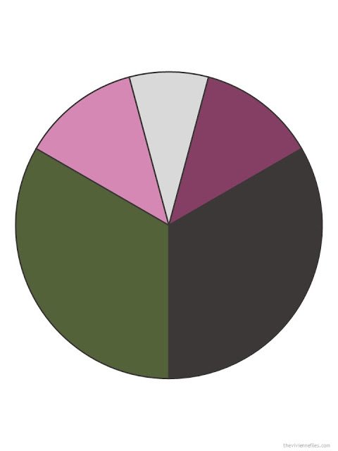
I cooked up a few new combinations – some taken directly from that site, and some that just came to me:
I’m curious to hear which of these appeal, and which don’t. I think that one can learn a lot about personal preferences and tastes from seeing combinations like this – divorced from any photograph of beaches or flowers – and just reacting without any other agenda. You could surprise yourself!
And just in case you haven’t seen this video – let us never take color vision for granted. I labor every day over finding just the right scarf or sweater, and here’s a man who would have no idea what I was seeing….
I was moved to tears by his unashamedly childlike reactions…
love,
Janice
PS – If you’re looking for more color inspiration, check out the Pantone Color Planner and other documents in the Planning Documents section of the website.
Like this article? Save it to Pinterest!
All these are wonderful – please do more! For me, the first was the best. I selected on immediate, gut reaction, not through analysing how it would work in any particular context, but I do think it would make a great capsule palette.
There must be a term for those who are overly obsessed with colour. I know I am!. I loved the design seeds site, which I hadn't come across before. A favourite of mine with beautifully palettes is http://www.color-collective.com.
Alice
The blues and greys speak to me….probably associate with sea/sky/nature. Though all palettes are interesting.
That was an interesting exercise. I actually liked palettes that were not related to my own personal colouring (light, warm & soft). #2 reminded me of Art Nouveau – just reminded me as I have no experience whatsoever. I like #4 with pink & grey and # aqua & grey. I seem to be going through a green aversion phase especially muddy greens. There is a term for those obsessed with colour… Hugs to others out there! Carol S
I would love to see #8 with gold jewelry and cognac accessories.
I recently discovered by doing an exercise on Pantone colours that I can't differentiate some colours (my house colour at school years ago was 'maroon' and to this day I don't know what colour that is, so really I shouldn't have been surprised).
So now I like to study colour websites/palettes really trying to 'see' them and design seeds is fantastic. Thank you so much for the link.
Also, I saw this article about a study done by MIT on words in different languages for colour and it appears that there are more words for warm colours that for cool colours. I have no idea of the significance of this but found it fascinating. https://www.sciencedaily.com/releases/2017/09/170918163433.htm
My favorites are combo's 4 & 8. I know that what suits my coloring doesn't do the same for most people.
One of my clothing theories is that if you wear the colors that suit you, that don't suit most people, you will be complimented for your clothing even if you buy very inexpensive items. And when those colors are in fashion that is the time to buy.
4, 5 and 6 are my favourites. I find the first 3 to be interesting combos but not my colours. 7 is one I'd consider although I'd want to add a clear white but not 8.
I do appreciate that they offer some new and interesting combinations.
I really just want to get into Fall clothes once and for all so I can get my colours sorted. The temperature is going up to 26C (about 83F) again today and I'm having to flip back and forth every couple of days as to what I wear.
Janice,
Welcome home ! I'm grabbing the tissues after seeing the joy on that man's reaction to seeing color — what an incredible gift ! My husband misses all of the glorious Autumn colors as he is red/green color blind. I wish I knew where to get those glasses ! As to choices of combinations above, 1 and 3 resonate with warmie me !
I found this site this morning. There may be other manufacturers. http://enchroma.com/shop/
Abigail,
Thank you !
I've looked into these for both of my sons who each have a different version of color blindness. I was very exited when I first learned about the glasses, but not so much after doing some research. Here's a link to a pretty good write-up from GeekDad's experience. https://geekdad.com/2015/12/enchroma-color-blind/
The biggest thing I learned is that passing the Ishihara Test (the circles with different color dots) does NOT mean your color vision has been corrected, only that a difference in shading is now visible so that you can see the numbers. The same effect can be achieved by wearing tinted contact lenses (and much cheaper!)
I love the grey/blue/aqua – wow I could live in that one all year round with the addition of a light pink. I also like #2 if the dark neutral is navy not black. Interesting exercise as most contain colors I can't wear but are attractive for someone else. I'm in the same boat, Margie, switching back and forth between summer and fall clothes as weather changes here daily! Janice Collins, Washington DC
Enchroma Glasses, I think, based on the youtube selections when the video ended.
Thank you !
#6 (the gray and blue) is so beautiful. BTW, there are some doctors in Washington state working on a gene therapy for color blindness. They have successfully cured monkeys and are ready to start human trials.
The first wheel reminds me of camoflage, not my favorite. My interests are with #3 aand #8.
#3 is my favorite, followed by #1. I think the only one that does not interest me is #6, because I am not fond of blue or grey, rarely wear pastels, and prefer more color contrast to keep things interesting. As you say, however, I am just grateful that I am able to see and appreciate color, and your advice to never take color vision for granted is spot on. Now to check out the Design Seeds site!
I have come to the conclusion that I am attracted to berry reds, turquoise greens and bluish greys. I have just spent an hour on the Design Seeds site which is just full of beautiful inspirational pictures and colour samples – what a find! The only complete colour pie chart that I like here is #4. Sharon, U.K.
The olive and purples of #8 are the combo I'm wearing lately and I crave it. I thought olive and warm red were going to be my fall capsule look but it just feels a bit much for every day. I can wear the olive throughout the year but now that it's chilly outside I'm loving purple with it. Look as I might, I can not find a scarf with both colors. Have you seen one with olive and purple?
There are some on Etsy and this site from NOVICA
https://www.shopstyle.com/browse?fts=purple+olive+scarf
I found myself most drawn to the greys, blues and pinks. So that would be #4 and #6. Popping over to Design Seeds now.
For me, #6 (gray, white, aquas) is beautiful!! And #7 appeals too. If it were to be the basis of a wardrobe capsule I would add black instead of the brown and white instead of light pink (thereby making it entirely different!) #8 is great except the green would need to be teal (or charcoal) for me – nancyo
And #3 should be good for me, but two tone pink always bothers me for some reason. – nancyo
My son is color blind and has the color corrective glasses. He doesn't like seeing in full color though. The color red is almost headache inducing to him. When he was little his favorite color was yellow. Turns out it was the only "true" color he was seeing. He still manages to function as a graphic artist.
I love the pastels of palette no. 6. I don't think they would make a very sophisticated wardrobe though.
Love the colour palettes. Will definitely go to Design Seeds and check it out. Love the man seeing colours for the first time. Made me think of my dad who was severely colour-blind. They say that children of the colour-blind can have a heightened sense of colour and I think I fall into that category. Colour moves me like nothing else.
Love what you do. Appreciate it always. Thank you.
That's fascinating – I've never heard that before. My father was absurdly color blind, to the point of my mother putting together his wardrobe like Garanimals! Maybe that's how all of my skills started!
hugs,
Janice
Garanimals was a great concept – it's how my husband managed to dress our children back in the day!
My son is color blind and before he went off to college last year we spent a few hours putting together outfits which he then snapped photos of with his iPhone. He referenced the images until he could remember which things worked well together. This year he has a capsule wardrobe that we worked on together over the summer and he literally can't make a mistake getting dressed!
Janice, I know the Vivienne Files focuses on women, but a capsule wardrobe for the men in our lives would be nice to see. Seems like I'm always packing for my husband when we travel!
Loving wheel one and wheel three! (Redhead)
And the video was very moving. Thank you!
#1 and #3 stood out for me.
I was immediately drawn to #4. Although I'm generally averse to red, I'm finding that shades of burgundy are really tickling my fancy this fall.
Not to be contrary, but I am not particularly fond of any of them. Each has one, or sometimes two, colors that I don't like or aren't "my" colors. I guess I am so used to my Cool Winter colors that I may not be able to look at new combinations. But, what a wonderful exercise – to focus on the colors, not the clothes. Anxious to hear about your trip and what items worked well.
I love that site. I’ve had it book marked for years.
Hope your Paris vacation was a bag of chips and more! And combo number 4 is the one I like.
Another great post. I found it very helpful to look at the color wheels without any garments to sway my opinion. And I just love Design Seeds – that woman is insanely talented and the photographs are incredibly beautiful!
The grays spoke to me …the burgundy, pink and gray…this has great possibilities I had never put together, though I own all the colors, I have always used them differently
and the two colors of blue and gray. I might like a stormy blue or denim blue better than the pale aqua for winter but the lighter tones would be nice for spring when it is still cold but you want some lighter colors.