September 29, 2017
This is always one of my favorite little mini-events of the fashion year – when Pantone tells us what the “new” colors will be. Of course we all understand that a new color is a physical impossibility, but I still enjoy seeing what they’re thinking, and then looking for some accessories that might reflect these colors (more or less!).
It’s especially fun for me because I tend to go back to my old template to reuse it, and I can see how very much alike some of the colors are from season to season. This color could easily be the Grenadine from last fall – it even comes first in the list, just as Grenadine did… (Frankly, I would have rearranged things a bit so that the similarity wasn’t quite so obvious!)
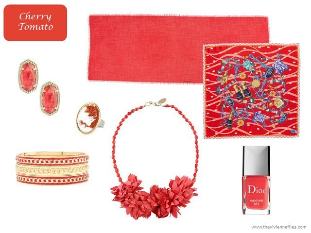
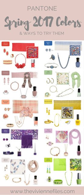
earrings – Kendra Scott; bracelet – Charming Charlie; ring – Materia Prima; necklace – Simona Barbieri; solid scarf – Nordstrom; square scarf – Mantero; “Aventure” nail polish – Dior
As is true with most of these colors, I’ve done by best to match them but have had to make some essential compromises. And yes, this IS the same scarf as the Cherry Tomato one – it just so happened that this really fun print came in these 2 colors!
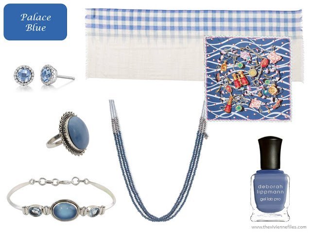
earrings – Lafonn; opal ring – Aparna; bracelet – Shanker; necklace – Lonna & Lilly; rectangle scarf – Eileen Fisher; square scarf – Mantero; “My Boyfriends Back” nail polish – Deborah Lippmann
It would be wonderful if this color becomes more readily available – I love it. I’m really tired of “blush” – that “frozen shrimp 3 days past their sell-by date” color…
Amazing earrings, by the way…
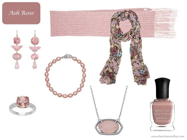
earrings – Irene Neuwirth; rings – Kohl’s; bracelet – Honora; necklace – Lord & Taylor; solid scarf – Acne Studios; floral scarf – Patricia Nash; “Modern Love” nail polish – Deborah Lippmann
Not everyone is going to like this color, but it can be lovely…
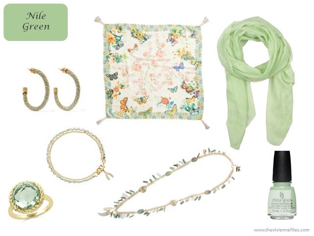
earrings – Rosantica; ring – Bloomingdale’s; bracelet – Astley Clarke; necklace – Rosantica; print scarf – Johnny Was; solid scarf – 19 Andrea’s 47; “Spring Jungle” nail polish – China Glaze
Another color that might be tough to wear, but definitely makes a statement! And while I’m not usually a big fan of tassel earrings because they’re made of fabric and thus don’t last an hour. However, these are made from beads, and they are pretty amazing. (and they come in a pile of colors…)
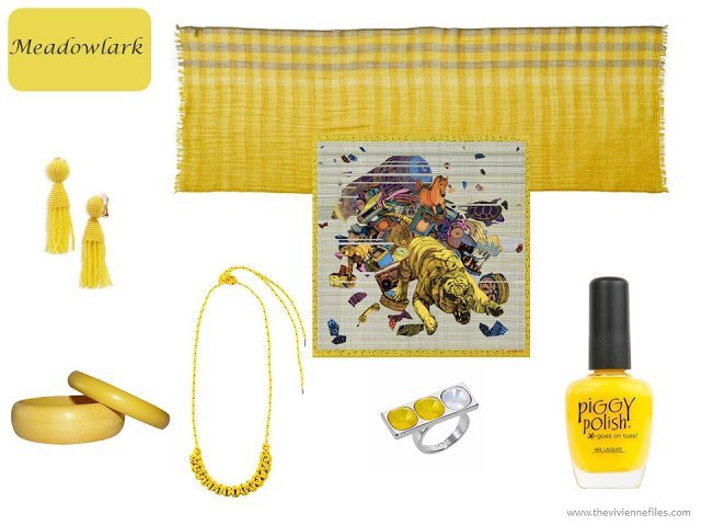
earrings – Oscar de la Renta; bracelet – One Kings Lane; macrame necklace – Isabel Marant; ring – Nadia Minkoff; rectangle scarf – Eileen Fisher; square scarf – Pig, Cow and Chicken; “Casual Friday” nail polish – Piggy Polish
Although I don’t remember seeing a dahlia this color, I think this is beautiful…
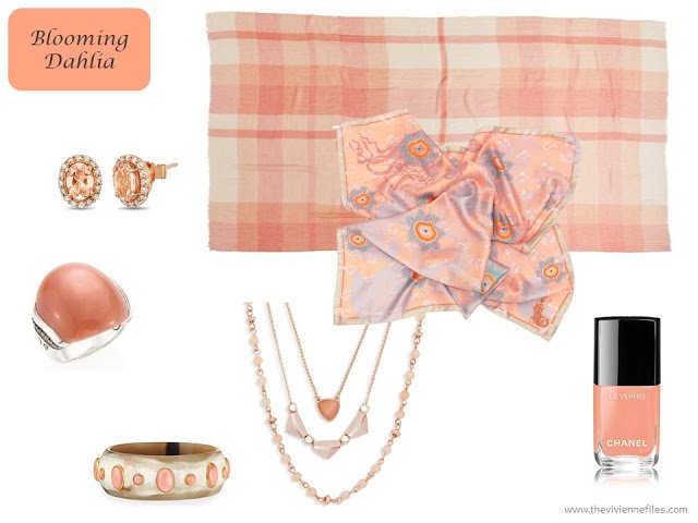
Morganite earrings – LeVian; moonstone ring – John Hardy; bracelet – Ashley Pittman; necklace – Vera Bradley; checked scarf – Nordstrom; square scarf – Irene Paris; “Coquillage” nail polish – Chanel
A real, true purple color has been maddeningly hard to find in almost ANYTHING for quite a while; I search for purple and get maroon or burgundy or red… Crossing my fingers that this color becomes available in some clothes – I could see a sweater in my future. Maybe.
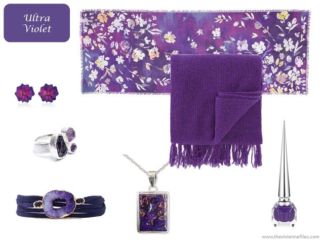
earrings – Sabbadini; ring – Poppy Jewellery; bracelet – Charming Charlie; necklace – Alok Jain; solid scarf – Ami Alexandre Matiussi; floral scarf – Nordstrom; “Lova” nail polish – Christian Louboutin
I tried and tired to find pieces that reflected the slightly more red hue that Pantone suggested, but when I realized that I was going to grow old and grey in that pursuit, I edged just a hint more toward brown… I think this is such a lovely color – especially for those of us with brown eyes!
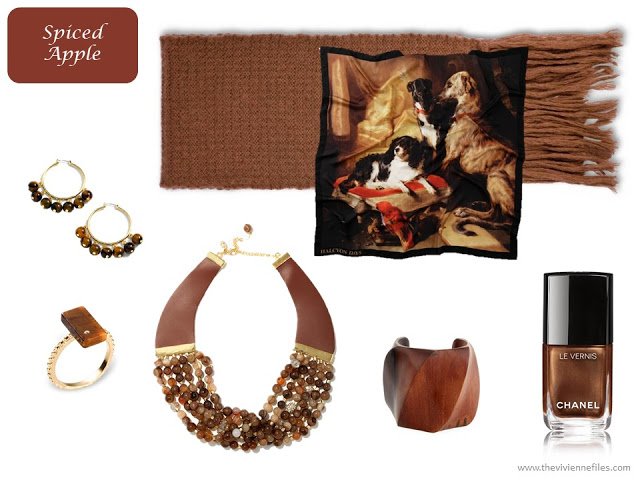
earrings – J.Crew; ring – Ona Chan; necklace – Charming Charlie; bracelet– Viktoria Hayman; square scarf – Halcyon Days; solid scarf – Stella McCartney; “Cavaliere” nail polish – Chanel
This is a rare pastel! The cool overtones here are beautiful with navy or grey – this is another color that could make a welcome return to the clothing and accessory markets of the world.
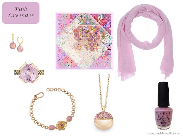
earrings – Honora; ring – Maiko Nagayama; bracelet – Emma Chapman; pendant – Candace Covelli; square scarf – Irene Paris; rectangle scarf – Tonet; “Lucky Lucky Lavender” nail polish – OPI
They call this “Almost Mauve,” but I call it “almost no color at all”! I will be interested to see where we might find this color in the future…
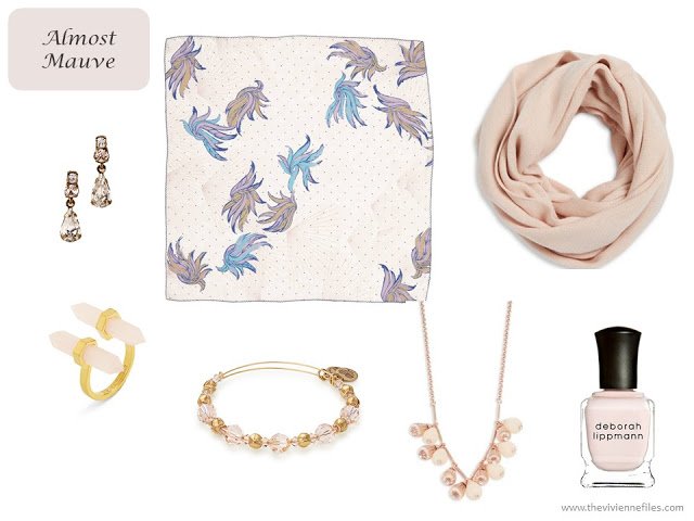
earrings – BHLDN; square scarf – Treasure & Bond; infinity scarf – Calvin Klein; ring – BaubleBar; bracelet – Alex and Ani; necklace – Ted Baker; “A Fine Romance” nail polish – Deborah Lippmann
Cross your fingers that this color catches on – it would be wearable with most neutrals, and is almost certainly universally flattering. I’m so happy to see cooler pinks that aren’t fading-away pale…
And yes, I would wear this nail polish just so I could tell people the name of the color!
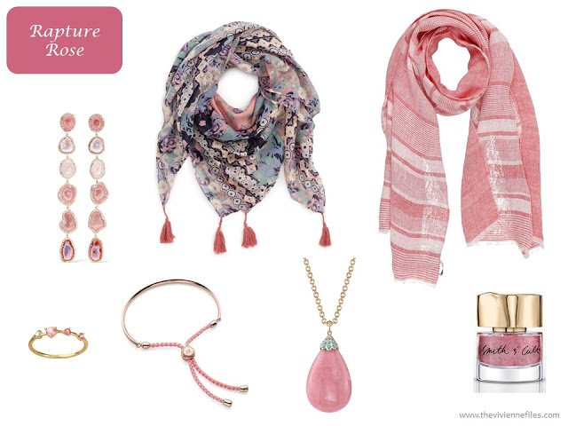
geode and diamond earings – Kimberly McDonald; tassel scarf – David & Young; striped scarf – Mattabisch; 4 stone ring – WWAKE; bracelet – Monica Vinader; opal necklace – Irene Neuwirth; “Gay Ponies Dancing in the Snow” nail polish – Smith & Cult
This is a really difficult color to find, and I suspect that most of us find it difficult to wear, too. That said, if you like it, go for it – you won’t fade into a crowd, and you won’t see anyone dressed like you. There’s a lot to be said for that…
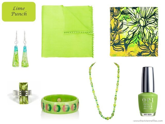
earrings – Rosario Leiva; ring – Tis TiK; Bakelite bracelet – Mark Davis; beads – One Kings Lane Vintage; solid scarf – Bajra; square scarf – Unpaired; “To the Finish Lime” nail polish – OPI
My favorites, right at this minute, are Rapture Rose and Spiced Apple. Which do you find most appealing?
love,
Janice
PS – For more color inspiration, you can find the Pantone Color Planner and other documents in the Planning Documents section of the website.
Like this article? Save it to Pinterest!
Just think, until I started blogging last year I would have thought that Pantone was a misspelling or a modern mash of Pantaloon. I thought that M&S just plucked colours from thin air. And now I find myself relieved that Blush has been recycled with a touch of blue, so that I can wear Ash Rose without looking like a decrepit zombie. I like Ultra Violet, which I see as the ultimate old lady colour for someone like me, most flattering on aging skin. But after much brainstorming around and highly paid Ideas table the team came up with the idea of splitting "ultraviolet" into two words?! And then after more burning of the costly midnight oil that same team's lightbulb moment was to add a "e" to "nil green". Oh, how I have missed my vocation!!
You've come up with some fabulous accessories which would bring a new lift to any girl's autumn wardrobe. I can see that Lime Punch being a knockout with navy, grey and brown neutrals, as well as the ubiquitous black. Thanks for putting this together, Janice, hugs, x.
Nile Green! Of course they are not 'new' but it's fun to browse through them. I wish they would be more forthcoming with appropriate palettes mixing these with others – but perhaps you could? Nile green with navy, or the spiced apple, would be interesting.
Alice
I'm glad that "grenadine" aka "cherry tomato" are still to be found in stores! That orange-y/coral-ly red is good on me – in small accessories doses! Also like the warm "spiced apple" – nice! I'll just go dig through my scarves and earrings now…. thank you, Janice!! Chris from Indy
Janice,
Palace Blue, Blooming Dahlia, Ultra Violet, and of course, Spiced Apple !
Eric bompard has stocked clothes in very similar shades of violet for several seasons now.
Liked Ash Rose a lot until you showed me Rapture Rose! and Pink Lavendar would be great, if i can find anything. Lots of good choices for the black/white/gray crowd! Thanks.
I love the Ash Rose, and Rapture Rose
Nile Green is lovely and so is Spiced Apple, but I am All Over Ultra Violet!!
Blush pink is my go-to color, but I am so much a purple gal. I cannot wait to begin finding things in that wonderful purple!
You had me at Cherry Tomato. I love orangey-reds and love the way they are such a truly four-season accent color.
I love the Nile Green and the Blooming Dahlia. No need to go shopping, however, as they already reside in my closet. Don't knock Blush, though. It is one of my favorites!
Gwendolynn
I don't like the yellow. I want my yellow to be like a soft morning yellow. Nothing mustardy or too bright either. I having a hard time adding yellow to my capsule, because I can't find a yellow I like.
That said, I do like the palace blue, ash rose, almost mauve and rapture rose. All of those I can easily add to my capsule without seeming to change too much. Nile green can make it in there as well, maybe. There is an outside chance for the pink lavender as well.
Any chance you could do a "going back to work" kind of thing? Like for a mom that has been home for years with the kids, has a nice but casual wardrobe but needs clothes for an interview. What do people in their 40's even where to an interview? Not talking personally at all. :-)
There aren't too many of these that I could actually wear (probably the tomato red, palace blue, and ultra violet), but it's a fun exercise and as always, to each her own! btw, the link for the Eileen Fisher checked scarf in the Palace Blue actually goes to the similar scarf in that mustard color (which is a color I wish I could wear). – nancyo
That blooming dahlia is more what I think of as "blush" instead of the current "frozen shrimp" color. I would love to see a wardrobe (or a couple of outfits) using both the Pink Lavender and the Ultra Violet.
For a wonder, I could wear most of these colors! But my favorites are Palace Blue (it's the shade of blue I like the most, but can never seem to find, except in pajamas), Ultraviolet (must get one purple cardigan), Ash Rose (which used to be ashes of roses), Pink Lavender (I already have a lot of this), Nile Green (which I always thought was a much more yellow, acidic green–who knew?) and Almost Mauve.
I get a clothing catalog that's from a German company, and they have been featuring the Almost Mauve recently, but they call it Matte Mother of Pearl. They also have a slightly violet/purple coloring of it they call Pearl Lilac–it's another really pale pastel.
So I'm happy and full of hope that some of these colors will be in a store near me, soon! But the colors do seem to be slanted to a certain color palette–I usually can only wear two or three of the "new" colors, and this season there are only two or three colors I can't wear at all.
Definitely no Meadowlark (too warm) and Lime Punch (too bright and warm). Maybe Ash Rose, Almost Mauve (with accessories to jazz them up) and Spiced Apple (I need the touch of red to wear this). All the others get a pass with my favorites being Palace Blue, Rapture Rose and Ultra Violet.
I love the rapture rose, blooming dahlia and ash rose. These pink shades are flattering on most people and I think are lovely with light grey neutrals as represented by that gorgeous Irene Paris scarf. I'm gradually replacing my tan items for grey as I let the grey in my hair grow out. I also actually love blush and it likes me but these deeper shades of "pink" are beautiful. Also I'm happy to possibly find palace blue as it is a more muted version of royal blue, which is a bit to bright. Love so many of these accessories. Janice Collins, Washington DC
My favourite is the rapture rose – I note that Kettlewell colours has the exact same match which they are calling 'soft orchid'. My second favourite is ash rose which I would call 'mink', such a flattering shade but something you don't see very much of in the stores or on-line. Sharon U.K.
The Nile green and blooming dahlia both are pretty and I would love to wear them in the spring. And the cherry tomato color would be great for a dreary day in March!
Ooh, plenty of pinks! That's good news as pink is my main accent color. Also like Palace Blue and Cherry Tomato. Lime Punch is flattering on me, but is a minor accent color, as I only seem to like to wear a little lime in spring. The accessory collections are stunning in pretty much every color, it takes some discipline (and a budget limit) to limit oneself to handful of accent colors.
Sara K.
Hurrah for Ash Rose! I am typically *not* a fan of pink — but I have (literally) dreamed about wearing this particular shade of it. (And I am also wearing a Lime Punch tunic — with used-to-be-black grey jeans right now…)
I am all about Lime Punch and Ultra Violet :)
Spring colors in September! Well, I would buy a cozy, chunky winter sweater in the ash rose if I didn't have college tuition bills that is – sigh.
I'm hoping there are clothes in Ultra Violet this season. A nice deep purple has been one of my wardrobe accent colors for a while, but it is so hard to find anything in that color. I'm down to only two purple tops and two purple skirts.
Oh my gosh, I love most of these. Easier to say that I don't love Cherry Tomato, either of the purples, or the yellow. I prefer my purples with more blue in them (periwinkle) and my yellow a little less neon, but otherwise this is a fun bunch of colors. Really like the scarf in the Almost Mauve collection.
Ah, I've just found something that helped me make sense of the Pantone Colours. Pantone also publishes a list of base colours for Spring 2018, these being Sailors Blue (Navy), Harbour Mist (Mid gray), Warm Sand, and Coconut Milk ( a slightly grayed white). Yeah for the neutrals that make these colours sing.
Jazz
I found the base colours as well and yeah for the neutrals from me. Love to see the neutrals with the Spring colours. Hugs Carol S
Mmmmmmm. Spiced Apple and Blooming Dahlia!!
I love the new pinks, especially Ash Rose, but I'm intrigued by Lime Punch.
I love most of these colors, but I am a huge fan of color. I do hope this means there will be "Ultra Violet" home accessories in the stores this spring. I am turning myself inside out trying to find lampshades in a true violet.
I love Blooming Dahlia! As a redhead, it's one of the few pinkish shades that looks good on me–and it looks great because it picks up the "blush" undertones in my coloring. The Spiced Apple would probably suite me as well.
I’ve lost my heart to Nile Green this year. It can feel very tricky to find among the mints and limes but what a colour.