July 10, 2017
It’s time again for that most amusing of events – the announcement of “new” colors for the upcoming season!
Of course we know better than to envision that there could be a “new” color (can you imagine how thrilling that would be?), but I do think that the release of these colors is a good time to look at our wardrobes with a clear eye and an open mind. Would a new accent color – maybe just for a season or two, maybe for longer – be of benefit to us? This time of year, as our warm-weather clothes begin to feel… old? and tired, a couple of new accessories might be just the ticket to get us through until the return of cold weather! See if any of these appeal…
Grenadine
A bit more “orange-ish” than a true red, this is a cheery and often flattering color that’s easy to find and goes with virtually any neutral color you can imagine.
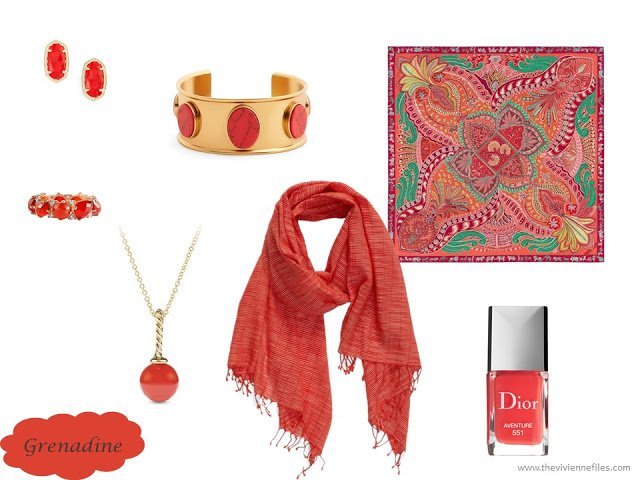
earrings – Kendra Scott; bracelet – Kate Spade New York; ring – Vessel; necklace – David Yurman; rectangle scarf – Eileen Fisher; square scarf – Hermès Le Jardin de la Maharani; “Aventure” nail polish – Dior
Tawny Port
Not easy to find, but really elegant and beautiful… I think with navy, this would be absolutely stunning. What other colors would you wear with it?
When you’re searching for something in this color, you have to look in both the red and brown worlds – it shows up in searches for both…
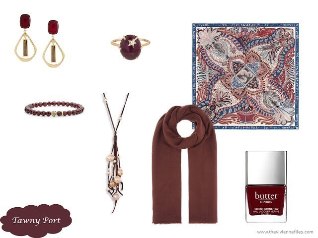
earrings – Isabel Marant; ring – Andrea Fohrman; bracelet – Lagos; necklace – Chan Luu; rectangle scarf – Isabel Marant; square scarf – Hermès Le Jardin de la Maharani; “Afters” nail polish – Butter London
Ballet Slipper
If you love pink, this is going to call your name! Pink is easily worn with any neutral color, and never fails to charm…
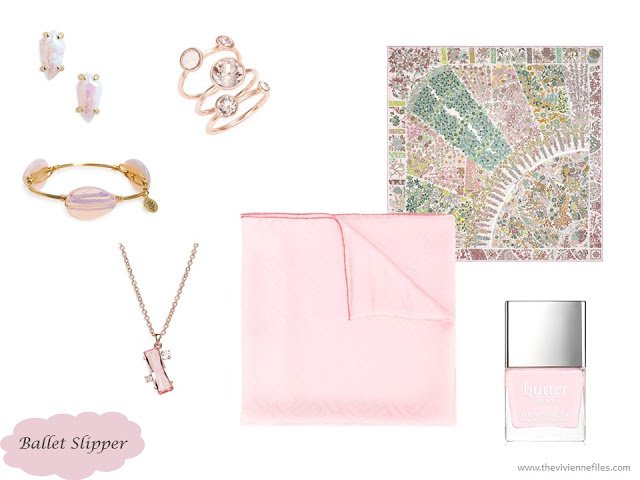
earrings – Kendra Scott; rings – Ted Baker London; bracelet – Bourbon and Boweties; necklace – Ted Baker London; solid scarf – Fendi; square scarf – Hermès Fleurs de Giverny; “Twist & Twirl” nail polish – Butter London
Butterum
Does anybody else immediately think of the LifeSavers candies of this name? It so reminds me of my father… As a color, it’s difficult to find and so I took a few liberties with tone and shade, but I think that this could be a beautiful new accent with grey or black.
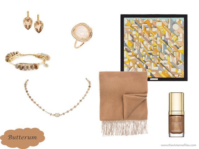
earrings – L.Erickson; ring – Melanie Auld; bracelet – Bourbon and Boweties; necklace – Ela Rae; square scarf – Hermes On a Summer Day; fringed scarf – Rag & Bone; “Desert” nail polish – Dolce & Gabbana
Peony Navy
I give up – I’ve NEVER seen a navy peony, and I have no idea what they’re getting at with this name. It’s a shade of navy – maybe a bit muted or softened, but not by much! Basically, if you love navy, feel free to load up on beautiful things… because navy never goes out of style, you can invest in something for the really long term.
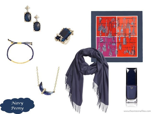
earrings – Konstantino; ring – Rosantica; bracelet – Gorjana; pendant – Andrea Fohrman; rectangle scarf – Nordstrom; square scarf – Hermès Passementerie Quadri; nail polish – Clé de Peau
Neutral Grey
Uh, grey IS a neutral – about as neutral as it gets! What do they mean here? Sometimes, you just find beautiful silver and grey accessories and leave the color pundits to their work, right?
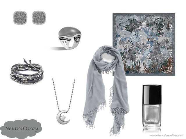
druzy earrings – Marcia Moran; ring – John Hardy; bracelet – Serafina; necklace – Alex Woo; fringed scarf – La Fiorentina; square scarf – Hermès Jardin a Sintra; “Liquid Mirror” nail polish – Chanel
Shaded Spruce
This is a color that I really hope gets some traction in the fashion world – it’s terribly difficult to find a truly bluish, dark, dark, green… I took a few liberties with the accessories because of the difficulty in finding pieces that matched the color exactly. If you admire this shade as much as I do, it is worth keeping your eyes open for the next few months to see if it becomes easier to find…
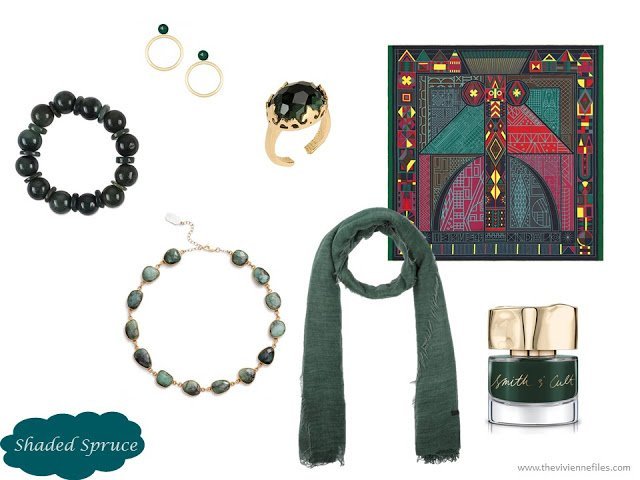
earrings – Jaimie Nicole; ring – Nadine S.; green jade bracelet – Somluck Komolmith; necklace – Ela Rae; square scarf – Hermès Ndop; rectangle scarf – Franco Ferrari; “Across the Pond” nail polish – Smith & Cult
Golden Lime
If you want to find pieces in this color, look for moss green – absolutely NOBODY calls anything “golden lime.” And if you like and can wear this color, please do so frequently, and with joy. So many of us can’t go within 3 feet of this color, so celebrate your unique coloring!
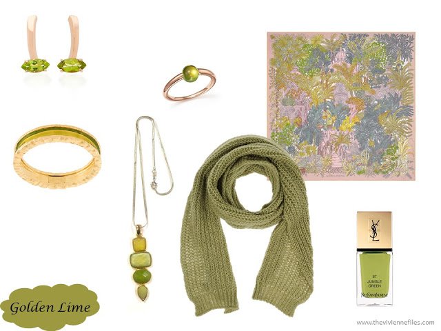
peridot earrings – Bea Bongiasca; ring – Pomellato; bracelet – Dsquared2; necklace – Love’s Hangover Creations; square scarf – Hermès Jardin a Sintra; rectangle scarf – Purim; “Jungle Green” nail polish – Yves Saint Laurent
Marina
I was amazed at how very difficult it was to find accessories in this color! I frankly cheated and took the color down about three levels, to a more pastel (and more available!) version. It will be interesting to see if the marketplace offers us more items in the darker, true “Marina” in the coming months…
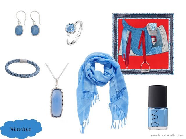
earrings – Bhavesh; ring – Lafonn; bracelet – Carolina Bucci; pendant – Babun Dey; rectangle scarf – Caslon; square scarf – Hermes Selle d’Officier en Grande Tenue; “Ikiru” nail polish –Nars
Autumn Maple
Oh how nice it would be if this color would catch on and be widely offered in clothes this fall! So many people could really use a nice injection of a rich rust sweater or jacket in the late autumn… We shall see!
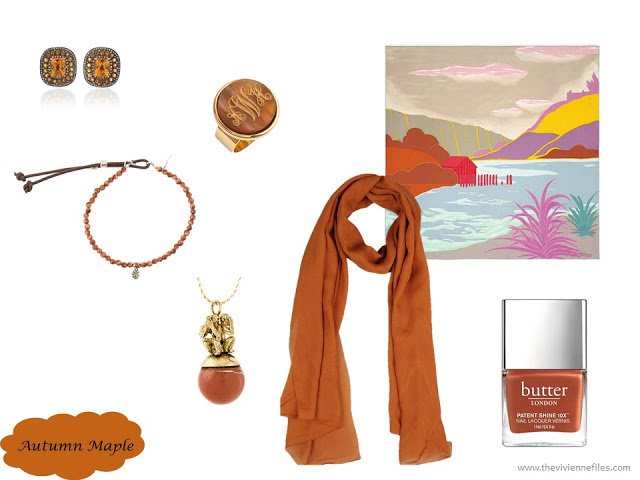
diamond and citrine earrings – Amrapali; ring – Moon and Lola; bracelet – Catherine Michiels; 3 Monkeys Pendant – Midgard Paris; rectangle scarf – Roberto Cavalli; square scarf – Hermès Au Bout du Monde; “Keep Calm” nail polish – Butter London
Are you tempted by any of these colors? I’ve just recently gone off the shopping moratorium for a few pieces in a pretty hyacinth blue, so I think I’d better refrain from any of these! Probably…
love,
Janice
PPS – And you can REALLY see how much these colors repeat if you go back to the 2015 fall colors…
PPPS – You can find the latest Pantone Color Planner and other documents in the Planning Documents section of the website.
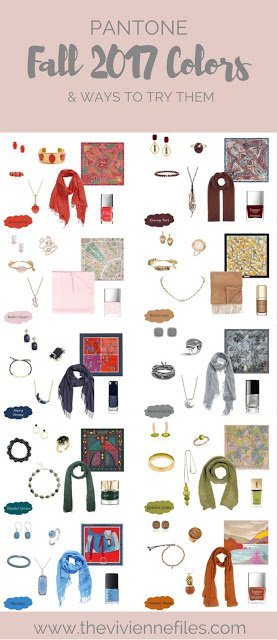
Like this article? Save it to Pinterest!
Grenadine looks a bit like red coral. Pretty.
Maybe neutral gray means medium gray–neither pale nor dark? I suppose the word "medium" doesn't sell.
Your suggestion of incorporating these colors via scarves, jewelry or nail polish is brilliant. They would completely change the look of an otherwise monochrome, neutral outfit in black or beige or whatever, while not posing a problem of having to match unusual shades.
There is quite a lot to tempt me in this selection. The colours have gone a bit muted in a way that works well for my complexion. I will be keeping my eye out for good buys this season.
I absolutely adore Tawny Port! I already have plans to add some rust colored pieces to my Autumn wardrobe…how novel..I will be "trendy" haha.
For me, that is *not* "ballet slippers". It is too clear and blue of a pink. It needs to be warmer and lean towards peach to properly be called "ballet slippers".
As for the "neutral grey", it looks to me like it is a true grey, neither too brown or too blue.
Of course, you know what they say about "opinions" lol
Love your blog! Do you ever check out Boden? They have some nice items in a color called "Drake" which looks a lot like shaded spruce to me…
I really liked this selection of colours. Unlike other Pantone seasonal selections, I think these all work well together, in fact just about any two make an interesting pairing (perhaps some posts on this??). As somebody else said, perhaps it is because they all share a soft/muted quality – no primaries or brights. My favourite is the butter rum!
Alice
The Tawny Port wood be lovely with gray.
Pink, the child is delighted. Actually, other than Grenadine, she loved them all. Daddy's favorite Life Saver, he would greatly approve!
I was having a wander in The Bay dept. store the other day while waiting for a friend and noticed a couple of those colours in the jewellery department – I called it a dark olive green but apparently it's "Shaded Spruce" and the other one was "Tawny Port". Didn't look to see if any of those other colours had made an appearance as yet but I bet it won't be long until all the Fall sweaters arrive!
I might buy a bit of jewellery or a scarf but not much more this year – "Butter Rum" might fit in with the Fall/Winter wardrobe that I already have planned so I'll keep my eyes open.
IMHO, the Ballet Slipper pink would suit me better than the "blush" shade that's currently popular. I've tried blush, but it does nothing for my complexion.
That tawny port color is gorgeous! But will we actually see it in the stores, a great question. I think grey will be the easiest to find out of this group.
https://shoppingbrake.com/
This makes me very happy, not because I will be in style with my colours but because maybe I will be able to find some basic pieces in these colours. I find it very challenging when everything is either black or light grey or very basic navy.Many of these colours are more complex and therefore more interesting to me.
Oh yes, the first two are very much me although I'd call them bittersweet and eggplant. The spruce color is lovely too..I think it's what they call here in Holland 'petrol.' I've almost never seen it in ready to wear but have achieved it by dying light green clothes with jeans blue Rit dye.
What a wonderful post! My favorite is the spruce. It's a bit like a very dark real. I've been looking for a warm winter sweater in this color ever since I saw a wool one in Scotland two years ago. I can't wear wool :( I agree with you and hope this color will catch on! And… your jewelry selections always tempt me – almost too much ;) Janice Collins, Washington DC
Re: autumn maple, Pendleton has suiting in a deeper version, calling it bronze. Looks boring on my computer monitor, but really, really gorgeous warm color in the actual print catalog.
I love the Autumn Maple color and will be unable to resist new purchases if this color shows up in fall apparel. With my skin tone I can successfully wear the Golden Lime (so agree this this is such an odd name) but the one color that would really not work for me is the Grenadine. Much as I like it, this color really clashes with my complexion. At least these Pantone colors seem to include something for everyone. And yes, Butterum immediately made me think of Life Savers candies too (my favorite flavor)!
Ah, that Shaded Spruce is gorgeous! Yes, I hope it catches on.
By "Neutral Gray," I assumed they meant that it's neither a warm gray (yellow undertones) nor a cool one (blue undertones). "True Gray," as Beckie called it.
The spruce is my favorite color ever!
In terms of the poppy blue, I think they might be referring to the center of a poppy. Here's a link to a similar color from Design Seeds –
https://www.design-seeds.com/in-nature/flora/color-flora-19/
Some of these colours are lovely. Like others, I like a more muted look, I especially like the Autumn Maple and Golden Lime. Some of those Hermes scarves are beautiful. I haven't really been a fan but I like several of these. Is this a new direction for Hermes?
It would be good if you could do one of your One Outfit Per Month series based on these scarves. Since they will no doubt be sold out by January, and since that series is so popular, I know I love it, and I know you love it, why not start now? How about using the new Pantone colours, see if they really do come up during the year. So yes, why not? Two outfits per month! Is anyone else keen? Linda M
I love this idea!
Thanks Janice for putting the new colors up. The blues and the spruce are on my list for fabric hunting this fall. Although I will note that fabric companies don't always name their colors the same as clothing companies do.
The spruce reminds me of the sitka spruce trees growing in my yard and all over the place. I will use them as my accent or almost neutral in my fall/winter wardrobe.
Again thanks for the information and ideas for incorporating into the wardrobe — I sometimes forget about adding new accessories to my wardrobe.
I bought some wonderful Johnston &Murphy loafers in this Spruce color a couple of years ago. I love their softness and fit but they match nothing I own. Maybe this will be the year I can find a scarf or cardigan to pull it all together. Fingers crossed for Spruce!
I like most of these colors (though I'm one of those who can't go within 3 feet of golden lime). I'm trying to narrow down the colors in my very uncoordinated wardrobe though so the ones I'm most hoping to see in the stores are the nuetral gray, autumn maple, and shaded spruce (as long as it's more teal than green). Gray and shades of teal are two of the colors I'm trying to use for the core of my wardrobe and rust is one of my chosen fall accents.
I actually like most of these.
I like some but would look bad in most of them, but that dark dark bluish green is a favorite, I hope I can find a few things in it! And the tawny port, or whatever the port is, might work. Hmmm. I just about to get rid of some more clothes, I find that even with a limited wardrobe I don't wear a lot of them!
These are fun! And it looks like you updated the accessories in the past two years' posts also – thanks! – nancyo
Tawny port looks like it would work with certain shades of a dusty rose.
In the world of graphics, neutral gray is equal parts white and black, or 50% gray on a scale of 100% white to 100% black. It has no cool or warm undertones.
It would be nice if fashion worked the same way! But you can often find gray garments that have had a strong dose of either yellow or blue tossed into the mix, giving them really decided warm or cool tones. I wish they wouldn't do that – it makes mixing grey garments really challenging!