April 10, 2017
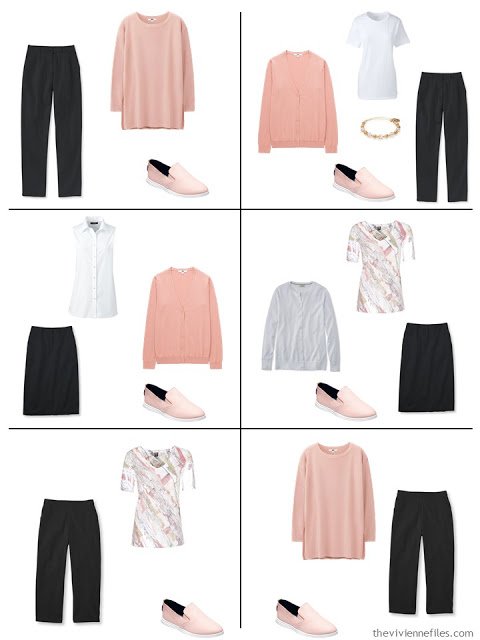
More accent colors! If greenery, from yesterday’s French 5-Piece Wardrobes for Spring, is the “color of the year,” then blush must be running a close second…
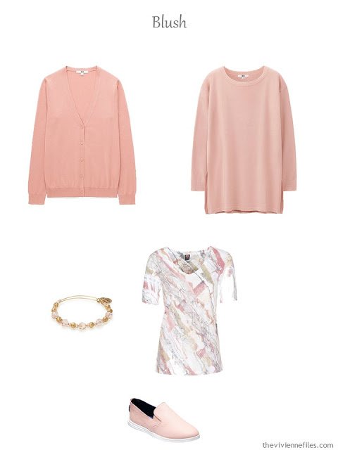
cardigan – Uniqlo; tunic – Uniqlo; bracelet – Alex and Ani; tee – Ojai; shoes – Cole Haan
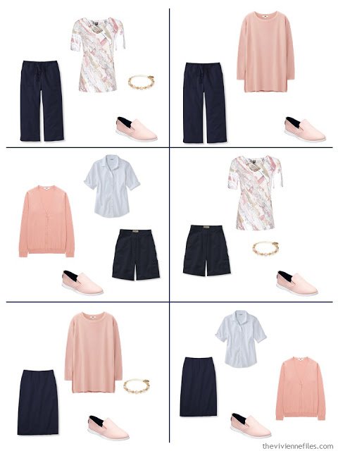
First up, let’s see how blush works with these very classic neutral pieces:
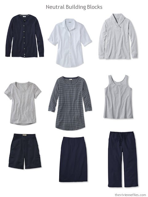
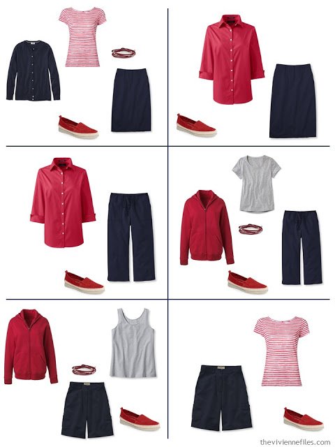
cardigan – L.L.Bean; short-sleeved shirt – L.L.Bean; sweatshirt – L.L.Bean; short-sleeved tee – L.L.Bean; striped top – L.L.Bean; tank top – L.L.Bean; shorts – L.L.Bean; skirt – L.L.Bean; cropped pants – L.L.Bean
I’d say this looks great!
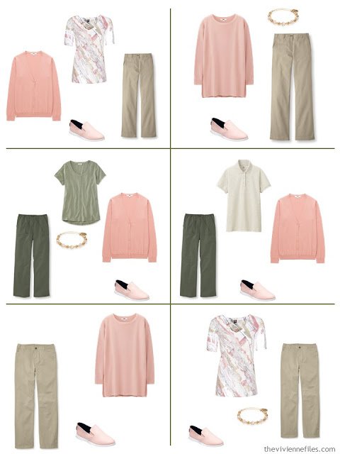
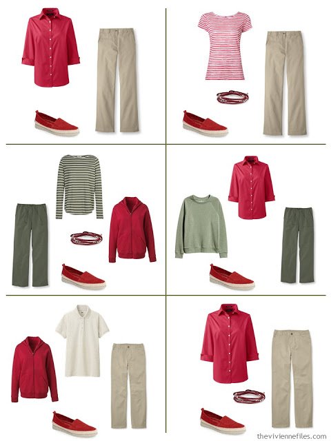
Will blush look lovely with these very organic-feeling neutrals:
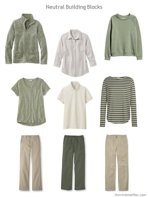
cardigan – L.L.Bean; seersucker shirt – L.L.Bean; sweatshirt – H&M; tee shirt – L.L.Bean; polo shirt – Uniqlo; striped top – Fat Face; tan pants – L.L.Bean; drawstring pants – L.L.Bean; khakis – L.L.Bean
I admit that I’m always surprised by how very versatile olive green can be…
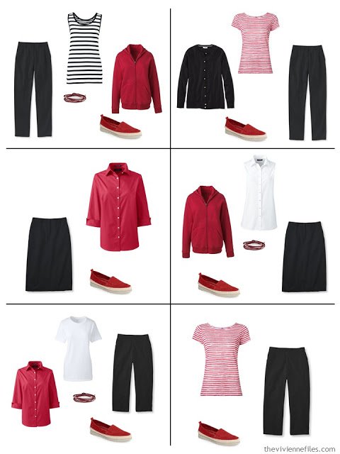
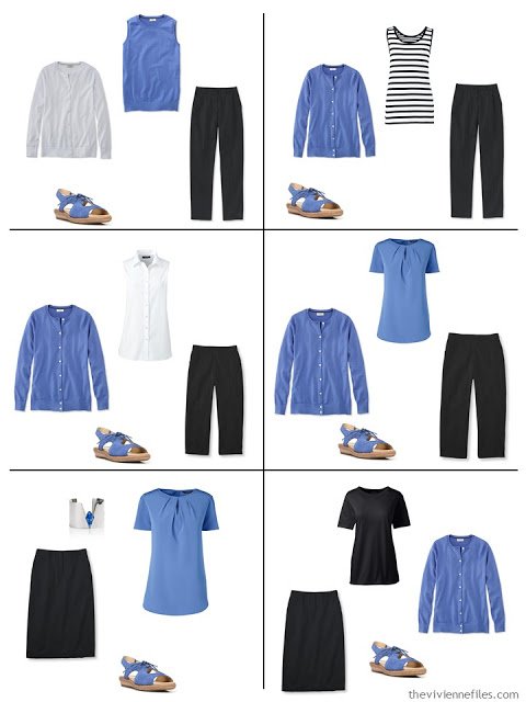
I’m pretty confident that black and white will work well…
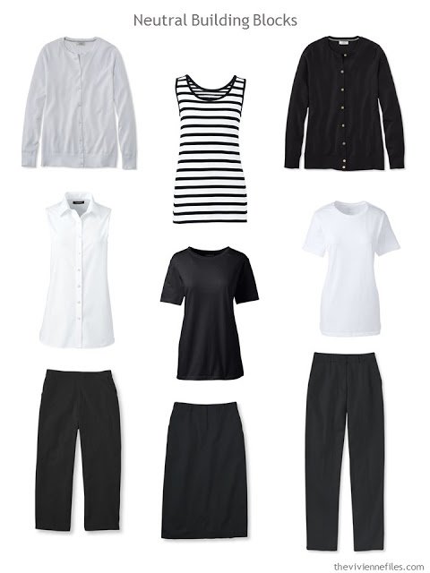
cardigans – L.L.Bean; striped tank – Lands’ End; sleeveless shirt – Lands’ End; tee shirts – Lands’ End; cropped pants – L.L.Bean; skirt – L.L.Bean; pants – L.L.Bean
It’s not an expected color combination, but I think it’s all the more effective and interesting for that!
Red is such a classic accent color, but it really never gets boring. Not many women wear it, frankly, because I think they’re afraid that it’s too bold. That’s too bad… if you’ve considered red in the past, I encourage you to bust out and give it a try. I get more compliments when I wear red than I could ever expect or hope for!
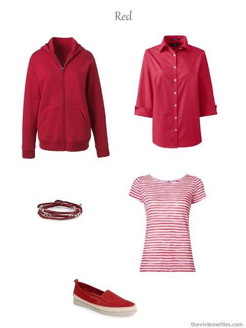
sweatshirt – Lands’ End; shirt – Lands’ End; bracelet – M. Cohen; tee – Majestic Filatures; shoes – The Flexx
Red with navy is an obvious classic:
As well as with khaki or olive green!
And of course red, black and white are 100% of my wardrobe…
I’m not at all sure if this blouse will look quite this good with the sweaters in person, but it seems to me that it matches rather nicely on screen!
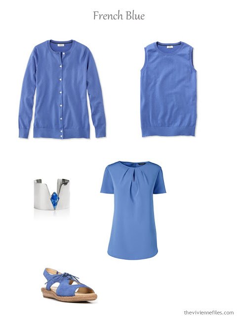
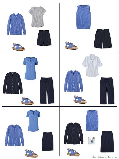
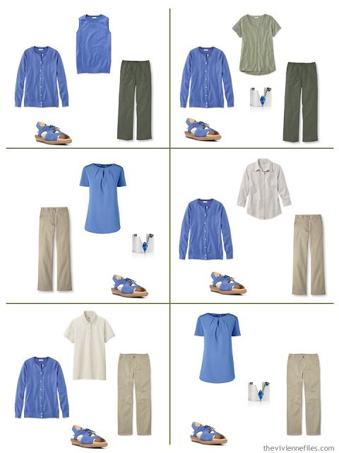
cardigan – L.L.Bean; shell – L.L.Bean; bracelet – Edge of Ember; blouse – Lands’ End; sandals – Naturalizer
This makes the navy look so different – it’s a great change of pace…
Blue really brightens up the earthly neutrals here!
It’s a good thing that I’m not buying clothes this year – this is an accent color that would be a lovely break from all of my red!
I’m going to attack three last accent colors tomorrow – and at this point I don’t have a CLUE what they’re going to be! I’m going to scroll three all of my favorite sites for clothes and see what catches my eye!
love,
Janice
PS – To read all the posts in this series on French 5-Piece Wardrobes for Spring, check out:
- Three French 5-Piece Wardrobes for Spring
- Three MORE French 5-Piece Wardrobes for Spring: Blush, Red and French Blue
- 3 FINAL French 5-Piece Wardrobes for Spring: Lavender, Coral, and Labradorite (?)

Like this article? Save it to Pinterest
Thankyou for showing a wide range of accents. So easy to visualise the combinations. Hugs Carol S
Wonderful! I love them all. The red on an energetic day, the blush on an introspective day, the blue any day!
BTW, I learned something this weekend that your readers might want to know when packing for a trip to France: Leave your backpacks at home. I took a pretty red leather backpack to carry my camera to a big wine festival here this weekend, but we went through security twice and backpacks weren't allowed. They let me pass but told me not to wear it on my back. I understand for museums–it's awful to get whacked by somebody's gigantic pack, but this was an outdoor event. My bag is pretty small and I chose it specifically to have my hands free while taking pictures. Anyway, it's going to be back to cross-body bags.
Thanks. Great info!
I am surprised by how much I immediately responded positively to the blue. Surprises are nice on a Monday morning!
Janice,
I do wear olive green year round, but I actually use it as a color, not as a neutral. While I love the blush with it , as they are both soft colors, the red with with it screams a version of Christmas to me, although the red is fine with the tan ! The French Blue is a very pretty color, but again, I'm not sure how I like it with the olive. Perhaps if there was a linking piece, like a top or scarf, with some off white in it as well ? I have found that the addition of some off white between two questionable color combinations can make all the difference for a successful combination. That might even have solved the red- olive combination for my use.
And sometimes I wonder if that objection of mine is due to a personal level of value contrast needed between colors to suit my own personal coloring. Most likely !
Great accent colors, Janice, in this helpful post. But red? Which red? I find red the best and worst of colors for my skin tone: an orangey red like a true tomato red is one of my favorite colors. But give that red some blue tones, or even worst, make it burgundy and I look ghoulish and garish. Color is one of the great, ineffable delights and mysteries of life!
I'm hoping that your sites lead you to a bright pink or even fuchsia! Also I'm with Shrebee, I can't quite see that cool French Blue with the Olive. It looks a little jarring to me. – nancyo
To me it looks modern. The combination of cool and warm colours is very current, and I like it, now that my eye has adjusted. The only time it doesn't work is when the two colours are too close, like a warm 'black' and a cool 'black'. People do wear white and cream but to me that just looks like a mistake unless the cream is very creamy rather than just a different shade of white. But the cool French blue with the warmish green above looks intentional to me, and fine.
Wendy
thanks for this perspective, Wendy. I probably need to keep my eyes open to new combinations! Now that I think about it, I had a pair of olive jeans years ago, and wore them with just about everything. – nancyo
I have some olive jeans and I've yet to find ANY color that isn't be lovely with it. I second the idea to include coral or orange in this series. Also what about a subtle lavender, and a bright green – like kelly green would be lovely. Love this series and especially like that you use the accents with all the neutrals. Janice Collins, Washington, DC
Fun and inspiring post, as always! I love that people are interpreting "Greenery" and "blush" to suit themselves rather than either trying to match Pantone colors precisely, or else crying out in disgust because they hate the colors. There is no reason to wear the season's colors at all, if you don't want to, but if something inspires you, why not try it? Kettlewell's blog has a good article this week on how to wear blush/pink for your particular coloring/season.
Today's post just reinforced my thought that I need to add more pink to my wardrobe! I also love the red, of course, as it is my favorite color, but blue is just not a color I prefer (except for denim blue, which is hard to avoid for someone who lives in jeans!). Since you've now done red, pink, yellow, green, blue-green, and blue, I think you will probably have to include some shade of orange as well as one of purple to complete the color wheel. Personally, I would add another green option since I am underwhelmed by "Greenery", but that's just me. Once again I am loving yet another of your creative series – thank you, Janice!
I LOVE these accent colours, the blue especially. I don't wear olive or khaki but I could change it to grey and it would still work. Thank you for the inspiration.
Good ideas.