April 7, 2017
Yesterday, I shared with you what I consider to be the “must have” items for warm weather. (although I don’t think I can say it enough – there is NO SUCH THING as a “must have” item; if someone tells you that there is, they are more interested in selling you something than they are in helping you figure out what you most need for YOU…)
Today starts the fun part – adding accent colors! I think I’m going to have to do this for at least another 2 or 3 days, because your suggested accent colors were many, varied, and lovely!
But let me start with the “Color of the Year” – another one of those fun marketing gimmicks that really don’t mean a whole lot, but that remind us to focus on a color that we might have been overlooking….
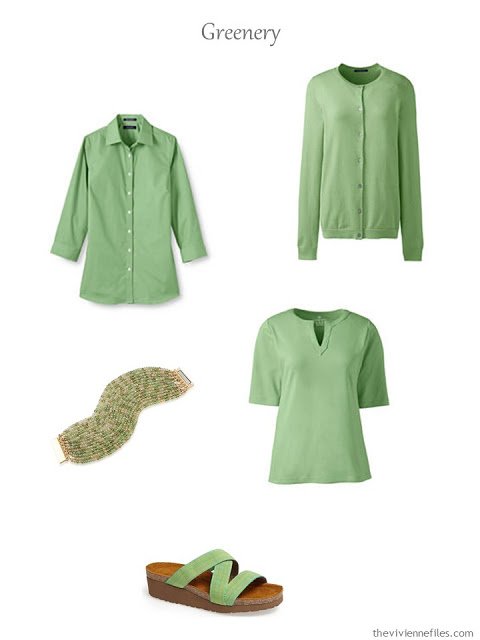
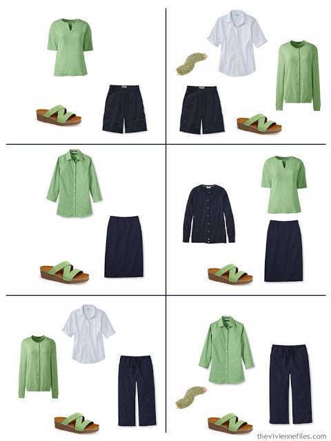
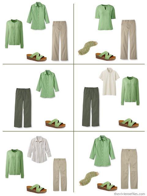
pale emerald shirt – Lands’ End; pale emerald cardigan – Lands’ End; bracelet – ABS by Allen Schwartz; pale emerald top – Lands’ End; sandals – Naot
Just in the interest of experimentation, and helping us all think beyond the expected and the usual, I’m going to take each of today’s accent colors and put them with ALL THREE of yesterday’s “must have” 9-piece wardrobes.
Remember, we had this one:
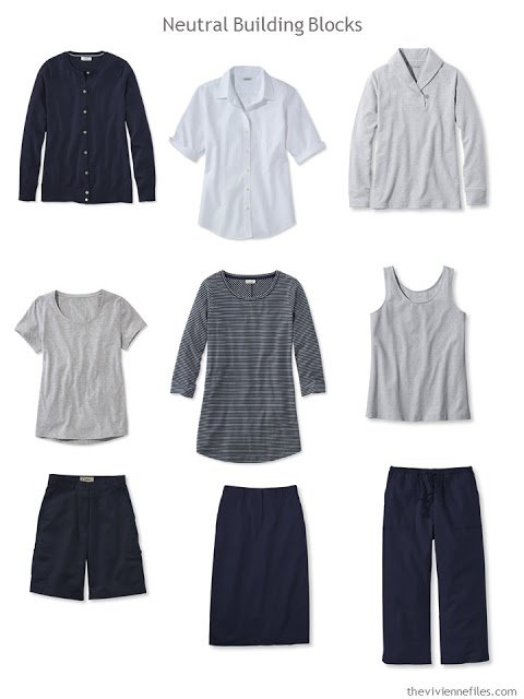
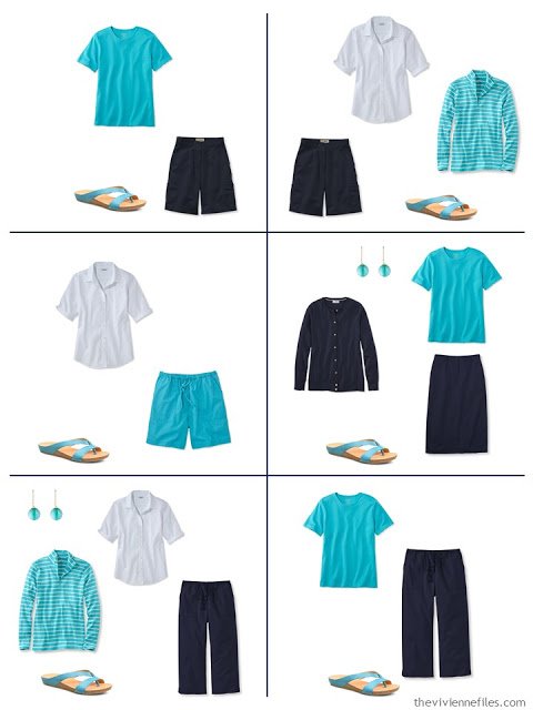
cardigan – L.L.Bean; short-sleeved shirt – L.L.Bean; sweatshirt – L.L.Bean; short-sleeved tee – L.L.Bean; striped top – L.L.Bean; tank top – L.L.Bean; shorts – L.L.Bean; skirt – L.L.Bean; cropped pants – L.L.Bean
This is a color scheme that’s classic, and works so well! (you should SEE the happy dance Chez Vivienne when I found these sandals…)
This was the 2nd of our Neutral Building Blocks, and I have to admit that I’m not sure how this will work…
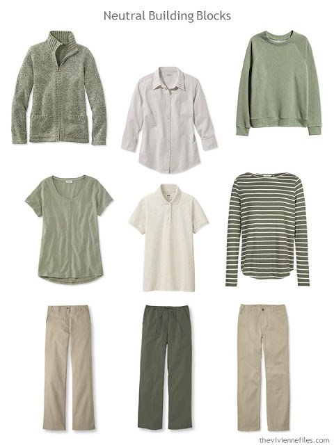
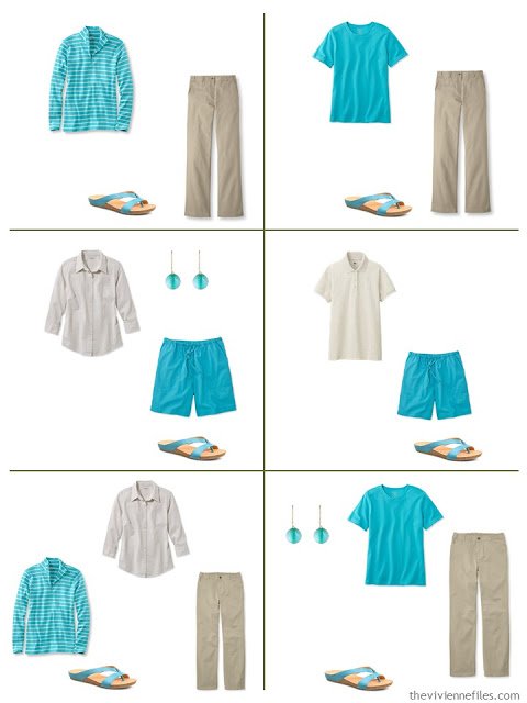
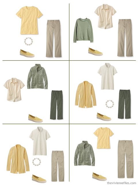
cardigan – L.L.Bean; seersucker shirt – L.L.Bean; sweatshirt – H&M; tee shirt – L.L.Bean; polo shirt – Uniqlo; striped top – Fat Face; tan pants – L.L.Bean; drawstring pants – L.L.Bean; khakis – L.L.Bean
But, in fact, this is pretty lovely!
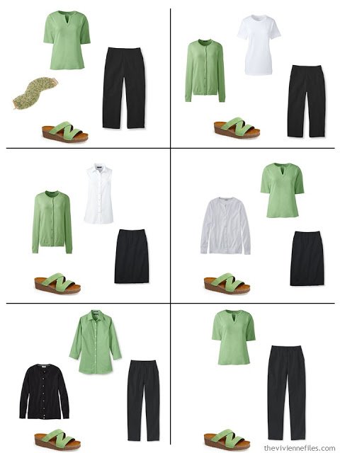
I’m pretty confident that I can put almost any color except maybe cream and off white with black and white!
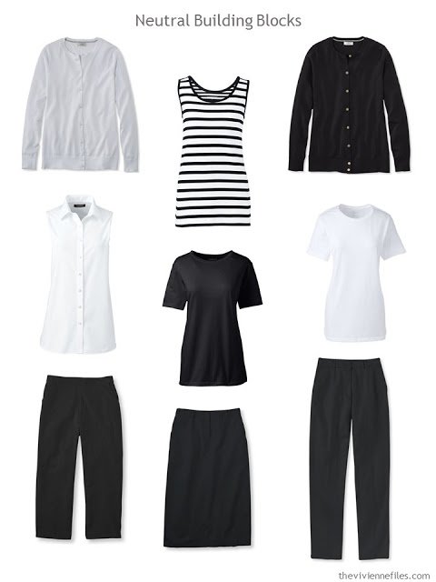
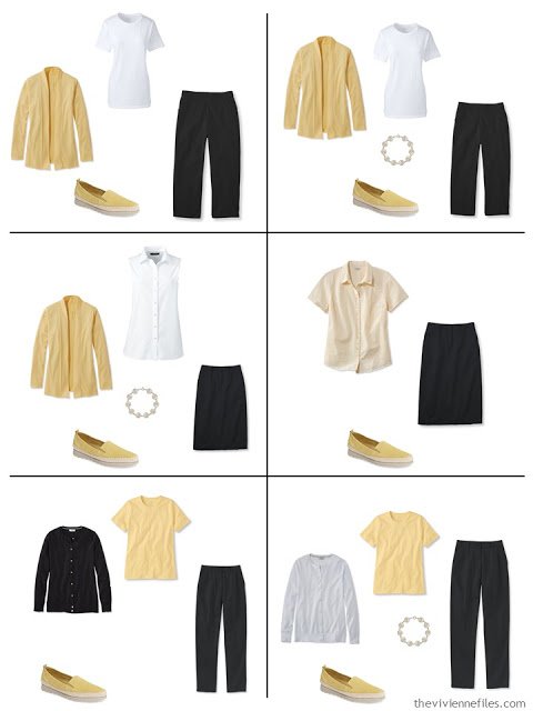
cardigans – L.L.Bean; striped tank – Lands’ End; sleeveless shirt – Lands’ End; tee shirts – Lands’ End; cropped pants – L.L.Bean; skirt – L.L.Bean; pants – L.L.Bean
This is unexpected, but I think it’s quite successful!
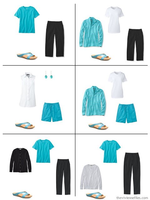
When I started looking for teal, I found things that looked like turquoise to me! And then…. I ran into things called azure. At which point in time I refuse to engage in the debate any further; it’s a beautiful color, and it’s beautiful with almost any neutral you can imagine.
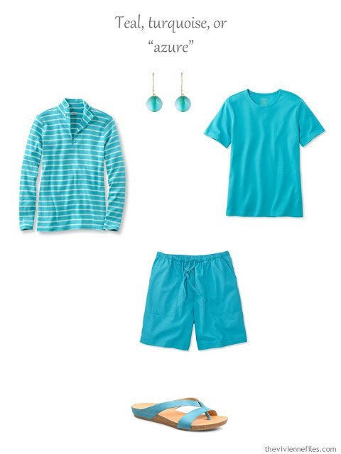
striped top – L.L.Bean; earrings – Alexis Bittar; tee shirt – L.L.Bean; shorts – L.L.Bean; sandals – Kork-Ease
Lovely with navy…
Perfect with khaki and beige…
And a great accent to black and white:
Oh, how I struggle with yellow! I look like I’m 3 days dead when I wear it (and every other woman in my family looks great in yellow…. sigh…). But it’s so pretty – such a great color for spring, and truly more versatile than I at first expected:
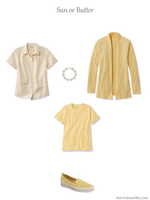
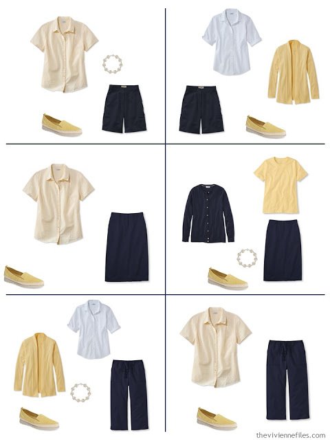
seersucker shirt – L.L.Bean; bracelet – Comach Fine Jewellery; cardigan – L.L.Bean; tee shirt – L.L.Bean; espadrilles – The Flexx
Of course it’s pretty with navy – we knew that…
It brings a nice new angle to both beige and olive, while still being very organic and warm…
And I do NOT feel that these outfits have any sense of the bumblebee about them! I so often hear that someone doesn’t want to wear yellow and black because they don’t want to look like an insect…
Tomorrow I’m going to tackle blush, or pink, depending on what I find available…. definitely red, because it’s such a universally useful accent that it’s almost a neutral in its own right. And… mmmm…. royal blue, my heart says….
What do you think?
love,
Janice
PS – If you are looking for some more color inspiration, you can find the latest Pantone Color Planner and other documents in the Planning Documents section of the website.
PPS – To read all the posts in this series on French 5-Piece Wardrobes for Spring, check out:
- Three French 5-Piece Wardrobes for Spring
- Three MORE French 5-Piece Wardrobes for Spring: Blush, Red and French Blue
- 3 FINAL French 5-Piece Wardrobes for Spring: Lavender, Coral, and Labradorite (?)
Like this article? Save it to Pinterest!
Azure! be still my heart!
Just to add to the turquoise/teal/azure confusion: there's a Canadian retailer that currently calls this colour "Aegean." I'm thinking it's the colour that we northerners imagine to be the waters of the perfect Caribbean vacation beach. (Does anyone else out there have snow today?)
We had we had a hail storm last night!! Weather these days is so unpredictable – I'm wearing both winter and summer stuff in one week . Temps today in 40s and 85 predicted for Sunday! Janice Collins, Washington DC
Thanks for finding some beautiful yellow – I'm craving it and have had such a hard time finding it. There's some of acidly neon yellows around, but I love the softer, creamier yellows you found.
Also – I'm excited to see what blush and royal you find.
Love this post! That "azure" color is my all-time favorite color for everything. I decorate with it and it's a favorite accent in my wardrobe. I just purchased a pair of jeans in this a lighter version of this color – a real "stepping out" for conservative me! I'm also really liking the buttery yellow here, which I think I can wear. I can't wear red but looking forward to possibly seeing pink in this series. I do have these basics in navy and khaki. Janice Collins, Washington DC
Wow, you hit it out of the park with these accent colors, at least from my perspective as a redhead! Turquoise has been my primary summer accent for a couple of years, but I don't have sandals that color — yet. Just about to order those!
Janice,
I concur with Tricia — great job ! It's a darned good thing I'm on a shopping moratorium, because that butter yellow just sings to me ! OK, I did buy a few scarves on Etsy, but no main garments so far in 2017. It's the year of pare down for me !
Janice,
This seems to be a week of my afterthoughts, so here's another ! I am just loving your posts on the formats of either clusters of four, or the nine neutral building blocks and their various interpretations of selected pieces, plus the 7 additional accents. I see a variety of selected items within each of the neutrals, and I am paying particular attention the the bottoms, as that is where I always have to start, as I am hard to fit. I have counted the number of neutrals items in a given color within each post of 9, trying to commit to memory the various ways this can be carried out. Just in case memory fails, however, I have both bookmarked these posts and pinned them on Pinterest to quickly refer back to. Thank you so much for providing a basis from which to work, and please continue to share your thought processes as you make these selections !!! As both a visual and a formula person, this feels somewhat like a jigsaw puzzle in small scale , or wardrobe sudoku, or slot machines. Love it !
How about PEACH?
Lovely as always. I wear a lot of azure/turquoise/teal shades. It really does go so well with so many other colors. I have a particular fondness for turquoise and coral together. I may have to try that green to see how it works for me.
Turquoise and coral are my favorite warm weather colors too! I so wish I could wear yellow!! It is so pretty!
Janice, I'm hoping that you will be doing a post that articulates your sense of what colors do and don't work together, because as far as I can tell, you and I have nearly opposite opinions as to what is pleasing to the eye. For example I routinely wear any shade of white or cream together. To me it reads like a nice subtle tonal effect. On the other hand I'm finding the "greenery" color with olive pants gives me a most unpleasant vibe. I feel like the outfit lacks focus. I mean, the olive doesn't seem tonal enough to blend or basic enough to be a neutral next to the bright green. So for me it just feels confused. Furthermore it calls to mind a zoo keeping uniform and unless actually hiking or something like that, I can't think why one might want to wear it. In essence, I'm completely confused by your sort by color and weed out the ones that don't fit posts. I mean when you simply weed out four colors that go together, in the process the ones that you see as less harmonious as a palette seem to be my preference. It's like you exclude combinations of colors according to some secret code that I have yet to crack. I have significant art training and people are always complementing my combinations so I don't think I'm clueless or you're wrong. I just fundamentally am missing something that happens so automatically in your mind that — as far as I can tell– you haven't already articulated. I have read most of the archives but if I missed it, apologies and give me a pointer please. Thank you.
J.B. Kholodenko,
The one thing I really love about Janice is that she doesn't dictate what colors MUST be used together, but provides what she sees as possibilities instead. Could your monitor possibly be throwing off the colors ? We all have different ideas of what colors might work well together, as well as what suits us individually, and though I don't always agree with everything she posts, I take from it what I know will work for me and adapt it to my needs , rather than seeing the post as limited by literal interpretation. Some of the readers here combine accent colors in a given outfit, that I wouldn't be caught dead in, but I respect their right to express themselves as they see fit.
Shrebee, Thanks for your reply. I definitely agree about the monitor issue being part of the confusion, as things can look substantial different on my iPhone vs monitor vs IRL. Additionally, I definitely am not suggesting that Janice is trying to dictate specific combinations. She has done such a variety of palette choices that I wouldn't think to say that. I'm just saying that when she decides that some items go together I have no idea what are her explicit preference first principles. For example, in the post with the striped sweater that had bold colorful horizontal stripes from the "magpie" wardrobe she said she thought it was not a great pairing with any of the solid color bottoms. I just bought a vaguely similar striped shell from Talbots, and I feel like I can wear it with nearly every bottom garment I own. I'm a florals person (and I only wear athletic clothing or pajamas in stripes). I generally want a bit of separation between different life aspects so I don't like plain stripes for street clothing. However, one lively, but also not loud, striped top is a great addition to a florals person wardrobe. Hence, I'm just asking for more explanation of why she likes what she likes. Hopefully, this is a little bit clearer. There is a lot of nuance to what I am trying to ask so I'm happy to explain my question further. Full disclosure, I studied aesthetic philosophy in college, so I'm very interested in why people like what they like.
I see, thank you. Yes, I love " picking her brain " as to her thinking and selection process, piece by piece, but once again, it is
her blog, and her right to choose whatever she does. I understand that you are just inquiring into the why of how she arrives at her choices. I think it is fabulous at how she comes up with varied colorful options for us all, when her own personal way of dressing is pretty much monochromatic and neutral ! I don't wear black, gray, or stark white, as they do nothing for my personal coloring, which is warm and fair, so I automatically substitute browns and beiges when she features blacks and grays and even navy . However, if I understand you correctly, your reference is more about combining plain and patterned items that you are not understanding Janice's choices ?
I think maybe we're all trying to find rules or strict guidelines where they really don't exist. I see women wear outfits – happy, and beautifully – that I don't feel are "color harmonic." But that's just the way it feels to me, and it could be something the references back to a garment or outfit that I had as a child that was problematic for me, or heaven knows what reason! Conversely, I've always suspected that my taste is pretty conservative, and that many people look at the things that I wear and think that they're pretty dull.
So I think that the bottom line on color combinations is to experiment A LOT, and stick with what makes you happy, no matter what anyone else says. Some people will love it, some won't, and it will all be fine because we're just talking about clothing. It's most important that we be happy with what WE wear, and that we feel that we're able to use our wardrobes as a small way to express ourselves to the world.
I feel like I'm copping out on an explanation, but I truly don't like to make rules for anyone. Be efficient and effective, have fun, feel beautiful, and take any criticism as a way to get to know another person's thoughts and feelings, NOT as a reflection of your loveliness…
hugs all around for an intelligent conversation, on a fascinating topic,
Janice
Shrebee,
How about I approach it from my personal top down example…. My goal is to maximum variety of looks with the minimum number of items. I've done Janice wardrobe math exercise (hopefully someone else can find the hyperlink) for how many items worn at once and how many times I want to average wearing them per season. I don't have the data in front of me, but say for simple math, I want to reduce from 50 tops in total closet to 25 tops. I'm including Toppers like Cardigans in the same category. So if I want to maximize my diversity of looks that flatter me, why not choose something striped? Basically I keep thinking she is choosing the most minimalist styling path for a capsule based on some dislike of certain combinations of colors with other colors or colors with patterns and I can't figure out what is driving her taste when she selects which 25 to keep. I think if I could understand how she chooses than I will be better able to winnow. I'm working with "a two out for each one in strategy" for replacement for worn items. And this is competing with the core of four duplicate the neutrals idea as well as lots of bridge patterns. This is thus leaving me stuck with 50. Whew. Maybe it is getting clearer.
I agree! I think "Greenery" clashes with olive and is going to be painfully hard to work with. -Lily
Thank you, thank you, thank you!
The posts so far this spring are outstanding – I am learning so much, and enjoying every bit of it! I'm a "pants only" girl, so the khaki and olive resonate with me. I've been wearing black/denim/grey with purple this winter – I'm thinking of lightening it with pale grey and turquoise for summer. So cool!
And thanks to your notes, I've found 2 interesting sources of clothing I didn't know had plus sizes! So thank you for J.Jill and Simply Be, I'm upgrading what I wear this year. As ratty stuff wears out, I'm replacing it with less, but better quality.
Pairing white and cream/ivory is a favorite summer combo for me. It feels very subtle and classic and for some reason it boosts my confidence every time I wear that combination. Must be subliminal psychology at work…
I can't wait to see this post with other accent colors! Thank you Janice!!
I don't think it is possible to define why one person loves a certain color combo and another does not. These things are based on our individual experiences and personalities. We are all drawn to colors as influenced by our mood, memories-good and bad-and what we feel looks good on us. Then you have to throw in what we are bombarded with in advertising too. It's just one of those things too hard to define! Great comments everyone!
Irlincks….
Please understand that I'm not trying to pick on you, but I get quite frustrated with this kind of simplistic thinking. There is a difference between proximate cause and the "one true ultimate deep cause." Whether one true deep cause for anything is knowable or not knowable is one of the central questions of European philosophy…. However, in this case, as far as proximate cause is concerned, the counter-examples are very obvious. Here goes:
Advertising, market research, and trends would not exist if it were not possible to glean any insight into people's current preferences. The other obvious counter-example goes like this. I like the Sistine Chapel,and I like Dilbert cartoons. I can't tell you the ultimate reasons I like either of those, but I can tell you that the first one speaks to me about the transcendent nature of existence, and the latter is amusing due to poignant observations of everyday life. Now, to tell you why I prefer the Sistine Chapel to Scare Coeur Cathedral in Paris, that's a tougher question. Answering a question like that is the kind of thing art historians write dissertations to discuss, whether or not they should be spending their time on that is a different story…. Alternatively, there are people for whom the Spiderman comics combine the best characteristics of the Sistine Chapel and Dilbert. For them, it reads as a transcendent story, illustrated in human-scale drawings through which they can relate to the super-hero narrative. On a superficial reading/viewing, Spiderman does nothing for me. If I gave it a lot more time and thought, I could probably articulate why I still dislike it or why my taste has change and I now see its merits….
So, what I'm asking Janice to explain are proximate causes, not deep causes (unless she feels like sharing any personal anecdotes). For an example of deep causes, Angie Cox of fashion blog youlookfab.com, is fond of red partly because she has positive associations with her mother wearing it. I'd find Janice's deep causes interesting, but I am more pragmatically motivated to understand her proximate causes. I hope that makes sense….
I'm looking for solutions to optimize time and money with ideas on how to better hone my personal fashion preferences, so I'm not actually trying to be a know-it-all jerk. I know that I constantly come across that way. My dad's a professor, deep imprinting, deep cause. Make sense?
Inlincks, I just thought of another example that might be helpful. Angie, to whom I refer above, used to hate the look of cropped pants, because she didn't like the impression of shortening the leg-line that they give relative to long pants. However, over time, she worked out some leg-lengthening workaround tricks (ankle straps, vs no ankle straps debate, etc…) that make that style appear more pleasing to her leg-lengthening priorities. She also sees them as fun and whimsical, due to all of the subtle variations possible in flair, shape, embellishment, etc. Previously, when the cuts were more plain and square, they seemed to her to be simply make people look boxier rather than curvier. Boxy versus curvy preferences gets us into biological mating territory which is beyond the scope of Vivienne Files….Anyway, the point is that because cropped pants have become ubiquitous, and there are many more variations, this is something about which she has reversed her preference and she wears nearly exclusively crops at the moment. Me, I have to wear orthopedic-type shoes and sandals, so I think cropped pants are an evil to be avoided at all costs, unless the temperature/wind comfort outranks my style priorities. That's one point where I know my own mind. Hope that brings it down to earth better….
I have a visceral reaction to the color "Greenery". As a nordic blonde, I would look jaundiced in that color. Can any of you wear it?
Thought provoking post. – Lily
Lily,
As long as it is more warm based than cool, yes I would wear that green.
Janice, I bought that Ted Baker "jewels" scarf to go with a black dress (for dinner with my daughter in Paris for her birthday!). That scarf's "pink" is definitely a "blush" shade, so if you want to tackle that blush, which is very in right now, that would be great. If you take a look at JJill, though, they have a summer-weight cardigan and other items on their site right now in a shade of pink that I also bought. If you look at that pink, you can see it's not as soft as blush, but it's a lovely shade of pink. So personally I wonder about the difference between the two shades of pink. They are very different, although similar. It gets confusing when buying accessories. Thanks!
This is mostly in continuing my post from above… I just purchased the solid pink and the floral pink tops at jjill. The pink in them is very similar one to the other, but the solid skews a little warm and the print skews a little bit cool. They would not be possible to get worn simultaneously, so I am fine with that. I feel like they both look good with neutrals around them. So I'm saying is my personal coloring is really neutral and I can do anything in the middle but not either extreme. Otherwise the clothing starts to take over and "it wears me." But it doesn't have to be a muted shade just on the edges: blue-violet and yellow-green are currently favorites. My point is that I can articulate for myself that cusp factor is a priority. When Janice does her starting from scratch posts, I completely understand her priorities. But when she goes the other direction with the culling of a larger wardrobe to a smaller one, I don't have much clue as to what her priorities are based on. There is an intuitive method that she is using. Maybe she is secretly starting with a great scarf that she remembered, or something like that and then matching that. Here's hoping I'm getting more coherent.
Understood ! I thought she was just trying to come up with four items in a group that worked with other compatible colors or patterns, and just culling excesses, whether those excesses worked together or not , to get down to a certain number of wardrobe total items. Which particular magpie post with the striped top that was eliminated did you reference – which day, please ?
You're perfectly coherent – I just need to work more on explaining how I cull the wardrobes. To some extent, after I assemble all of the clothes (really without any agenda, I try hard to keep them pretty random!) I see really quickly where I'm going to go. I might not try as hard with olive green because it's a bad color for me, and I might be pretty strongly inclined to try to keep black in a wardrobe longer than might be merited because I'm so strongly drawn to black.
I'm hopeful that as women try different methods that I suggest for cleaning out their closet, that they use their own preferences and instincts, all while working toward a wardrobe that's efficient and not excessive.
I wish we could have a drink together – this conversation could be fascinating…
hugs,
Janice
A gathering, wouldn't that be nice? No matter whether we drink tea, wine, or something stronger, it would be illuminating.
Janice,
The get together — count me in !
Janice, thanks for all of your responses. There was a bit of cross-posting so you already answered some of my questions by the time my last post got done. Anyway, the practical problem I'm trying to solve is moving to a house with a 30% smaller closet. And 50% of my existing clothes are just on the cusp of being downgraded to gardening/painting etc clothing. But I have tons of gardening and painting to do. So I'm a little bit stumped strategically. I also think that the time pressure to get organized (it's been about 1.5 years since the move) the time pressure acts to shut down any sense of intuitive preference. And yes I've read KonMarie. It's helpful for the mechanics but the joy factor doesn't compute, because I like everything I've got on a good day and nothing on a bad one. That and I like things in context more than individually. I was desperately tired of a Patagonia indestructible plaid shirt but then I did some fashion research and realized that I like it as a topper to a solid t-shirt dress but felt sick of it with pants. Great quality and fit are hard to find, so that means I tend to want to keep it even though for me it isn't actually very versatile in terms of my preferences. So I'm a bit stuck. Also stuck on account of the math logistics from the other post. Thanks for listening everyone.
P.S. My palette for travel this summer is black, grey, white and pink/blush.
Janice, this has been an excellent post provoking an interesting conversation about perception and preference. I particularly appreciate the way all of the accents worked with each set of neutrals although I probably wouldn't wear most of them. The contrast tends to be higher and the accents tend to be clearer than my coloring can handle. However, I must say, that butter yellow is gorgeous and I really liked it with the olive.
Get together? I'm in!
Purple and pink please…
I just recalled my sister' reaction to one of my favorite color combinations: purple with some red and a dash of yellow-orange. I see it as happy, high energy and fun, whereas she says oh-my-god, how angry! LOL