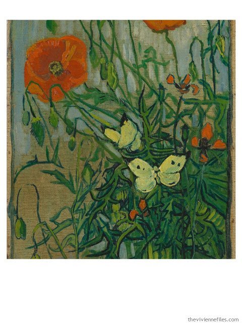
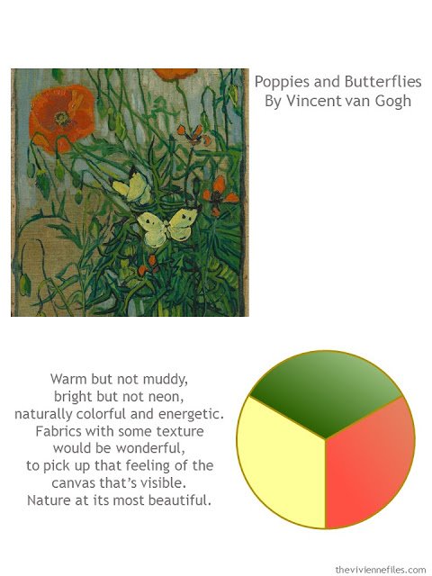
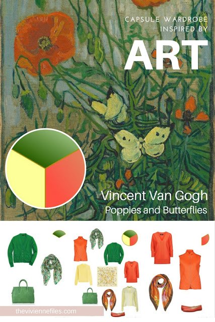
Poppies and Butterflies by Vincent Van Gogh
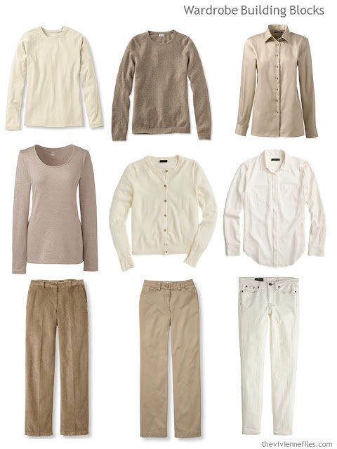
For those who worry that a “warm” wardrobe – one that’s ideal for those with Autumn or Spring coloring – might be too dark in the cool weather, I offer some ideas!
I love these pieces – you could literally get dressed in the dark with no worries about not matching! A couple of pair of warm brown/tan shoes, some lovely gold jewelry, and you’d be well set for the day.
Sand tee – Lands’ End; cardigan – J.Crew; silk blouse – J. Crew;
Camel cords – L.L.Bean; pants – L.L.Bean; jeans – J.Crew
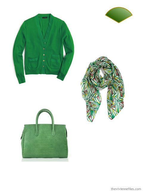
Green is the most maddening color to shop for right now! (unless it’s yellow…) There’s lots of emerald and darker shades, but this bright green was hard to spot. And I know that you’ve seen this scarf before, here on The Vivienne Files, but it’s so perfect with this little capsule wardrobe that I couldn’t resist showing it again. (it includes hints of the poppy red AND of yellow…)We need to train ourselves, and our loved ones, that it’s more than okay to see beautiful things repeatedly; it’s actually highly desirable! This is how one develops a personal signature style…
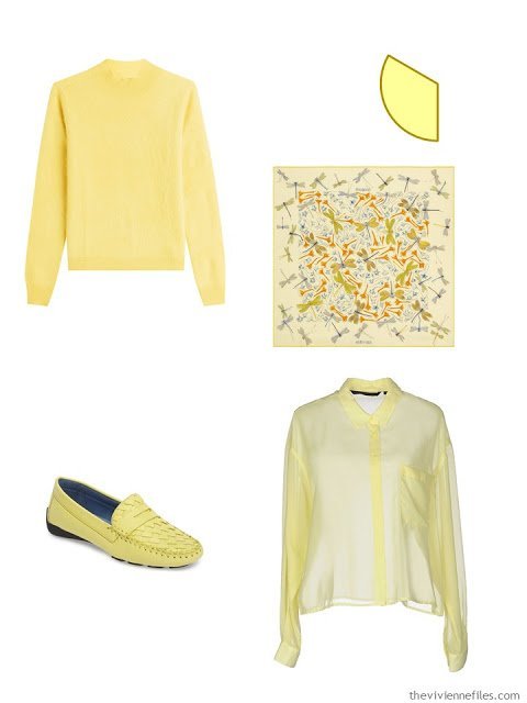
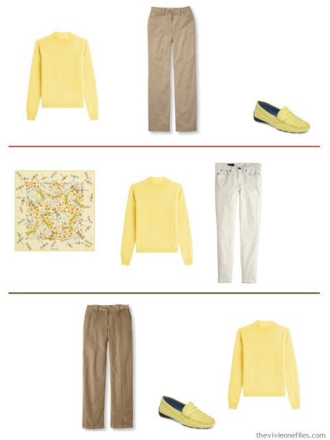
I love this soft buttery yellow; it’s very difficult to find, but worth the hunt. Once you’ve determined what your accent colors are going to be, you can always have that “note” in the back of your mind when you’re browsing stores (or websites). When you see something that’s right for you, you see it immediately!
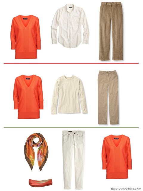
Why did it take me so long to bring a vest into the accent color “wardrobe?” It’s a perfect way to test a new color, if you’re a vest wearer…
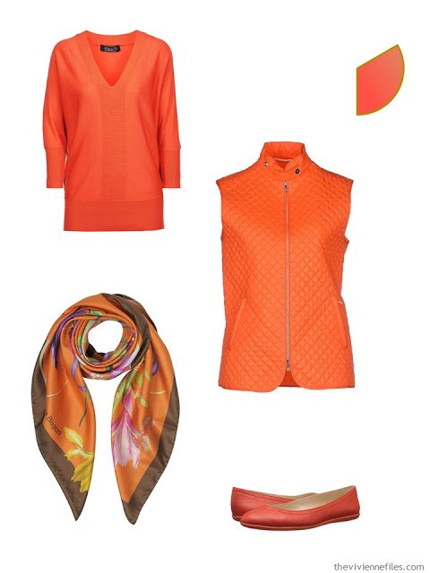
Imagine opening your closet door on a grey and foggy day to find these pieces:
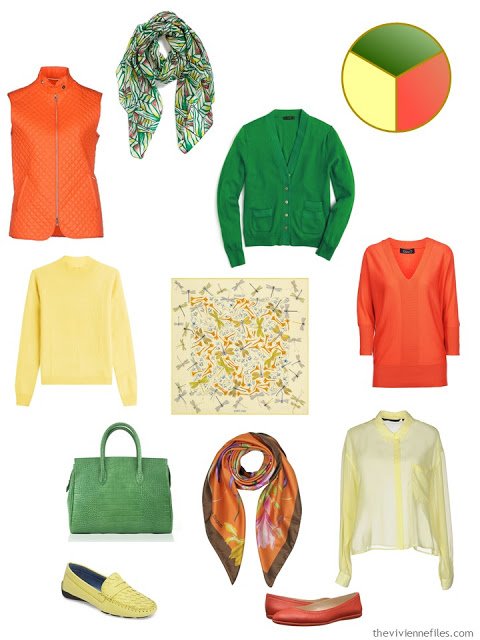
In all cases, these cheery wardrobe additions are very versatile:
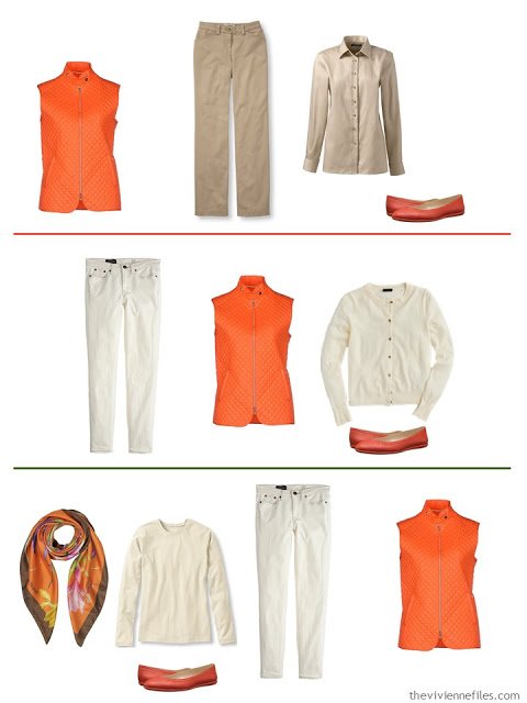
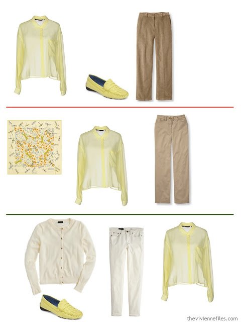
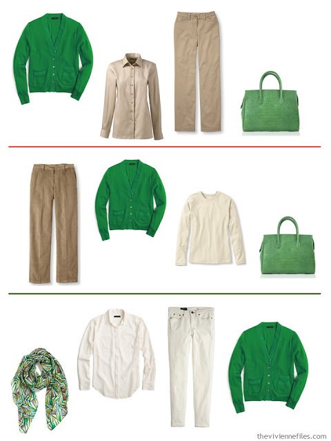
Is anyone trying out a new accent color this autumn (or spring, if you’re in the Southern Hemisphere?)
How’s it working? Are you nervous, excited, or a bit of both?
love,
Janice
Like this article? Save it to Pinterest!
Oh dear Janice, you are reading my mind!
Just before I say anything – thank you for posting early so I can start my day here! Later during the day I came back to read the comments and comment myself (otherwise I would always be the first one to comment).
But today I can't wait to say, you nailed it, this is so awesome!
It got colder and it is time to pull out wool out of boxes. Last night I decided to switch two colors so I went shopping from my boxes for winter items and I decided for green and orange. My green is olive but hunters green has caught my attention. My orange is burnt orange, and some brick red, too. It felt so awesome to switch palette (although I am in love with previous one, too) and realized yet again why it is so good to go on a "color diet" how I call it, and pick a palette of only couple base and accent colors instead of wearing them all at once. It is this feeling of having completely new wardrobe with each new capsule that is so awesome,and almost all from my closet. I kept 3 pods from my previous capsule (cream, burgundy, slate) and all items look brand new in light of new colors!! That dance of colors is beyond awesome!
Spent all evening searching for delicious new outfits for my existing items on pinterest:
https://www.pinterest.com/veselestvari/winter-2017-outfit-ideas/
I also pinned yellow on separate board for some future capsule (that is how I satisfy my color cravings – I just postpone it for another capsule), and didn't dare to go green (don't have it and don't plan to purchase anything for some time). Unboxed my olive pod instead. (Yes I am following you that long that I am just starting to unpack stuff that I packed by color.)
It was yesterday evening and this morning I can't believe my eyes – that is it! You are reading my mind, Janice!
So yes I just started making my winter capsule (started with filling in your excel file last night – extremly useful!) that includes burnt orange, olive green, some brick red, and continue to use my cream and camel stuff (and burgundy as neutral and some teal accents, will see). So as you all can see, coincidence is incredible!
Yes I am excited with changing my accent colors, and warmth of this capsule with cream and beige neutrals is awesome (I can't be nervous since I came from the opposite direction – rainbow wardrobe and nothing to wear – TVF system satisfies my love for color much more!)
<3 <3
May I come live in your closet ? Your colors are mine too ! Yes, I also change color accents, depending on the season, so that it feels like a whole new wardrobe. I too, have been a rainbow colors person, but that grows tiresome and feels like same old, same old year round, and so I have reduced my amount of color accents for each season to 3 , and sometimes 4, as I still love color ! I love how you refer to color groupings as pods !
Superb, I like this even better than yesterday's, and guess what…. the two capsules mix very well together, giving 28 pieces plus accessories. The two sets of building block pieces can be mixed (black, charcoal, stone) and the accents (green, shades of yellow, orange, warm pink) can be worn with any of the base pieces. Genius
Alice
This pallet is unexpected and upbeat! A lovely antidote to some of the dreary weather that late fall can bring. I would wear these colors proudly. Love the orange vest and flats.
My new accent colors this fall are burgundy and olive. I have never worn burgundy, and I am loving it. So easy to blend in my former neutrals of black and gray with this color as I transition to a warmer base. As I cross over to camel and brown, I can take my time replacing the core items with better quality and still enjoy the new pieces with my old neutrals.
That is palette, not pallet. What was I thinking!
Mouth watering… If only I could pull these colours off. I naturally veer off towards the 'cool' colour spectrum and my greens aren't so bold and vivid. I like how you are showcasing accent colours with warm and cool neutral basics. I still haven't cracked the neutral wardrobe yet and come from the direction of having too many coloured and patterned items in my wardrobe with nothing to wear – although I'm getting better in my choices and purchases because of you Janice and your fantastic blog. Sharon, UK.
Ah Janice,
This palette makes my heart sing ! While I do have darker brown neutrals going into Winter ( they feel visually warmer to me on the coldest of days ), during this transitional season, the lighter variations of tans and browns here feel more appropiate, putting off the depths of the coldest season. And those happy accent colors, though I need muted forms of them, well, they are just sunshine in a closet ! I do find that I have to be careful in my selection of tans — if they drift into taupe, the color just drains from my face. This post hit the ball right out of the park — again !
Love the inspiration piece and how you worked the colors. Now all that's needed is a ticket to Paris ;)
Gorgeous painting and gorgeous colors. I love bright happy colors but for some reason yellow is almost non existent In my wardrobe. I'm rarely drawn to it for some reason but your choices are lovely and happy.
I love the art! It makes me think of spring! What a great idea to use these happy colors for fall! These posts are so inspirational and informative! Great way to shop your closet and build a capsule!
This wardrobe is so cheerful — how I wish I could wear those bright colors! However, the combinations still work if I substitute my deeper, more muted shades of olive, pumpkin, and amber yellow. The Land's End cardigan that you mentioned yesterday comes in a yellow-orange shade called "squash" that I think could work for me, and I am seriously considering adding it to my closet.
It is nice to step away from dark colors for a while. And I love that painting, which I had never seen before. What a happy way to start the day!
Cee Pluse,
I, too, need the more muted warm colors you just described. I purchased an orange and white check shirt, and I can wear it if only the collar and cuffs peek out from under a cardigan or pullover sweater, but just the shirt by itself is overwhelming. Even the right colors can be the wrong colors if the intensity or the value is off for personal coloring . The same goes for too large of a print. Last year I purchased another shirt with all the right colors, but the pattern was too large for my frame, and I never felt good in it, so I blessed someone else with it by donating it to charity.
Lovely painting and an equally lovely wardrobe derived from it. – nancyo
I agree, it's a beautiful painting and you've made a lovely set of outfits from these neutrals and accent colours.
My new accent colours for this spring-early summer stem from impulse purchases: purple/lilac, deriving from a pretty William Morris print shirt bought in the Sportscraft winter sale, and green resulting from an op shop (thrift shop?) purchase of a green wool David Lawrence top. When I went rummaging in my top-of-the-wardrobe bags, lo I found a green shirt and green cardie, plus a purple cardie and t-shirt. With in-stock scarves and jewellery, I'm set to go.
But until now I wouldn't have thought of making these two (suffragette, as it happens) colours my accents for the trans-season. And I'm just do happy with them! Thank you again for the inspiration!
Robyn in Tasmania