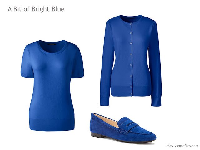
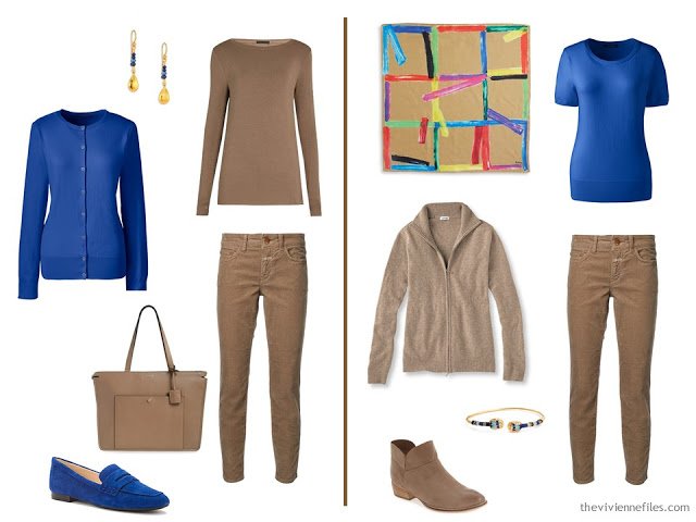
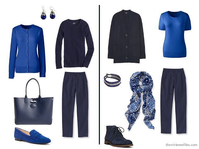
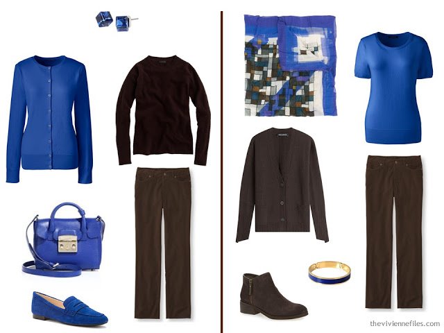
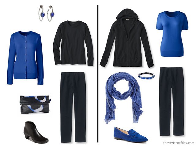
Yes, the sweaters are a twin-set. You don’t ever in your life have to wear the 2 pieces together, if you don’t want to. But it wouldn’t be crazy to make certain that both of your accents garments are compatible, if only so that you know that your accessory choices work equally well with each piece.And you might want to wear a twin-set some day. Crazier things have happened!
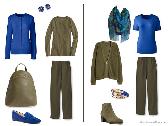
This bright blue with the olive brightens up the outfits quite a bit. For someone who adores olive but who finds it less than flattering, this kind of use of a bright accent might make all the difference.
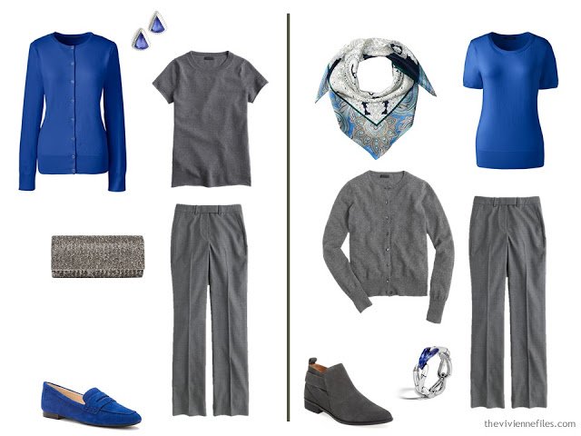
Grey and blue are colors that men wear together ALL the time, but it’s not this beautiful cobalt blue…
These two colors are as opposite as can be, and they look great together:
This is a color combination that might cause some of us to hesitate. But when you can find so many lovely scarves that deliberate combine multiple shades of blue (as well as pieces of jewelry), it’s easy to wear this ensembles with confidence.
I can still remember, with startling clarity, an outfit that I had when I was in graduate school, that was these 2 colors. The shoulder pads! The knee-length shorts! Oh, how I LOVED that outfit….But that’s no reason to avoid this color combination now; colors should know no season, nor decade! (she says, warily…)
I’m still working on bright green, and I think maybe a bright pink?love,
Janice
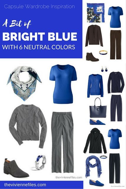
Like this article? Save it to Pinterest!
All this talk of brown has inspired me and I purchased a chocolate merino knit sweater on special the other day- it's certainly going to help me make better use of my ageing but still hale and hearty brown mid calf buckled boots.
The '80s factor depends on what other colors are involved, as well as the silhouette. Anything with big shoulders or combined with other "gem" tones (fuchsia) is going to look dated. But this blue is also like Klein blue and looks great with the neutrals you show.
I saw a woman a few weeks ago dressed head to toe in bright Kelly green. Green pants, green patterned shirt, green shoes and bag. Not what I would have picked, but she pulled it off. I regret not getting a photo.
That's my favorite blue!!! Okay, any blue is at the top of my list, lol… this also looks fabulous with a white shell or tank, plums, burgundy, etc. I'm always buying a sleeveless top in shades of blue and white.
Sue
This shade of blue is very versatile and flattering. My favourite dress in the 80's was indeed cobalt with fuschia and teal. Shoulder pads added to the effect. I may have had cobalt shoes trimmed in fuschia. I'm not going to recreate the look but I might wear my bright blue t-shirt under my grey cardigan.
Cobalt is one of my favorite blues as it really brightens my complexion. In the winter, cobalt accessories work well with my faux leopard fur coat (as does bright, almost chartreuse, green). I love the leopard print, but the colors don't work with my skin tone.
I don't often wear a twinset together, but do find purchasing the two pieces at the same time simplifies the color matching process and assures that accessories will coordinate. Sometimes I'll buy a matching sleeveless shell AND a short sleeve sweater along with the cardigan – that way I have options for spring, summer and fall. I like to roll the cardigan and keep it in my handbag or tote on those days when I know I'll be sitting in an overly air-conditioned conference room or restaurant.
Thanks for doing this series! I'm learning a lot from it–especiallly that I always seem to really like the combination with the camel so apparently I should get more camel in my closet. And I vote for you doing the fuschia combo please! (That's always been one of my favorite colors but I've often had problems figuring out how to do it well.)
This series is awesome and timeless! It deserves a tab of its own or at least the keyword "with 6 Neutral Colors" together with series featured various accent colored dresses or other items. Dear Janice please could you do this for us. I will for sure return to these many times for future reference, as much as I am always returning to "starting from scratch" series.
S. from Zagreb, CRO, EU
p.s. Who knew I would be so desperate about the missing page? I'm terribly sorry to see "starting from scratch" tab gone. I wish I had saved it since it become a cornerstone of my life since and I'm not kidding. It is THAT useful! Keyword is far far cry from it, I tried to use it but that is not it. It is more than collection of articles, it is a procedure to follow in a strict order so the tab is a must.
I miss it terribly, please please bring it back….. I do it several times in a couple of weeks period when building a capsule (at least 3-4 passes until I refine it) and I'm building a new capsule each 3 months. I'm using the file I purchased for that purpose, along with 24-piece file, that is great I recommend everyone to follow, it transformed my life – literally! From getting out of house in a snap to reduced shopping to increased quality of my new things and feeling and looking so much better.
I did the first pass for autumn capsule a month ago (with pictures) and these days I was about to take the clothes out of boxes and repeat the procedure with the real clothes but alas, can't any more… That was one thing I enjoyed doing very much. I wish I had saved the tab.
It still exists – I swear it does! I've got my tech guy looking for it right now…
Thanks for letting me know,
hugs,
Janice
Thank you, dear! I know you have everything somewhere, you mentioned that. I remember once when someone complained about not starting with jeans or something like that, and complained not in the nicest way, remember? and than you said no one should care that much about writing of a fashion blogger. Now I GET her! :) I do care. And besides the tab I use for reference, in today's world it means a lot to come here each day and be immersed in art, beauty, enthusiasm, serenity, apparent simplicity, and in nice company of very fine ladies gathering here. That is how I feel and I can't thank you enough, God Bless you!
(Well to be honest, I'm sorry if this is TMI: the thing is when I was working on my spring-summer capsule it helped immensly to keep depression away, it made a real difference. There are several elements to the process: it is creative, it is soothing, it adds order into both thinking process and the closet, it is some kind of manual work therapy similar to arts&crafts, also deciding about colors is some kind of color therapy, and not the least: getting the sense of accomplishment, of being able. And of course afterwards when capsule is set, being able to get out of the house quickly AND look decent, put together, accessorized etc. etc. that everyone dealing with similar issues like depression understands how valuable is.)
Not TMI – sometimes it helps to tell people, even strangers, that you're working on yourself, and that you're making progress. Believe me, nobody on this blog is going to be critical of you, not for a heartbeat. And I have to say that you described all of the facets of a wardrobe project really well – I can't say that I'd ever considered that this work touches on so many different aspects of activity and well-being. And I'm pretty sure that genius Andrew got our "Starting from Scratch" page back to where we can see it!
hugs,
Janice
Dear S, what a lovely description of how working on your capsules helped when you were keeping depression at bay. I too find some kind of manual task that requires a bit of creative thinking useful at such times but have never recognised as clearly as you what all is going on, so thank you!
Robyn in Tasmania
Janice,
In this scenario, the camel and blue is a clear winner for me. Twinsets — yes ! Even if never worn together — it really simplifies the packing conundrum of how to repeat a color without wearing the same exact item 4 times ! One caveat here — how any of these bright colors look on a computer screen does not always work when worn personally. I know that I cannot wear bright colors, even with neutrals. Brights and too darks overtake my fair, low contrast coloring. However, it is fun to see them here, and I know that I can always adapt the clever information found here to suit my own needs.
What is it about those 80's colors of cobalt, fuschia, and bright teal that we were so crazy about back then, but avoid at all costs now? I like the idea of picking one at a time to pair with neutrals. Keeps that love of color but avoids looking like Madonna Material Girl. :)
Janice,
Perhaps I missed something, but why does an icon keep appearing next to several of our names ? At the top right of this page it says that the particular icon in question stands for Andrew — who is that ?
Andrew is the computer geek who keeps this blog running! I actually have him on retainer to help fix things like the missing "Starting From Scratch" page; if I tried to take care of that sort of thing, I'd never get any pretty stuff done. And the icons are usually the B for Google Blogger – I think it just means that Google recognizes who you are. Some people have actually figured out how to put something else, like a photograph, in the place of the B. Geniuses, they are…
hugs,
Janice
Thanks, Janice !
Love seeing these bright blues in your post today. It is a crisp clean shade that I have a particular fondness for…
Kate Middleton looked so gorgeous wearing her Royal Blue dress on the first day of the tour here in Victoria…
Plus, this blue looks great with a few strands of oversized pearls, as we all learned from Barbara Bush back in the day! Really, though, this is one color I never gave up. And I've kept some fuchsia too, but generally not together. Although this year I found myself wearing a scarf from long ago – the colors are fuchsia, cobalt, taupe, black, and white – all to be found in my current closet. I survived the wearings and nobody laughed or pointed, so I think it might have been OK. If it also had that bright jade green I might not have dared though! – nancyo
also, this blue was a final contender for an accent color for my upcoming trip, but I have switched it out for a dark teal in the current iteration. – nancyo
Janice, I would really appreciate your doing fuschia with dark chocolate brown and navy. Unfortunately, as a clear winter, a huge percentage of "good" colors are in the pink/red/wine colored section. I have finally kicked black/grey out of my wardrobe, and so am stuck with brown/blue as my neutrals. I love how you manage to make some of your pink capsules so grown up without the "my Kitty" little girl connotations and hope you do the same with fuschia.
Oh, and as for colors not being seasonal, I have got to admit I cringe every time I see or think of that drab green that was so popular in hospitals. It just screams institution or hospital to me!
Today it's the scarves that are the heroes here, for me. The patterns combining the colours really make the outfits – but I confess to being a scarf nut. I just like the way a patterned scarf (or multi-coloured necklace) can tie colours together.
Oh yesssss, twinsets! The inner Audrey sparkles when wearing a trim little twinset with slim black pants and an oversized bag or necklace.
Fuchsia? I can't wait to see what this means. We have several flowering in the garden and I counted eight different colour combo's. Inspired, I'm heading out this morning in a red cardigan jacket over a purple top. Gaudy? Probably, but I'm hoping black pants and shoes will sober things enough. And so no scarf today, there's enough going on there!
Robyn in Tasmania
I love this blue as well! It makes my blue eyes seem just a bit more blue. I don't know that I have ever worn it with camel but it sure looks great! This has been one of my favorite series!
I'd love to you do the Starting from Scratch series again, or the Vivienne's Transition wardrobe that you did in Sept 2011, but in other colorways. Extremely helpful. I'm on my third round of reading your great blog from the beginning. And quite often the comments from others are just as helpful.