I had never seen this book in the US, although it’s been available for years! But I saw it at the Pompidou Center in Paris and grabbed it right away – it’s right up my alley…Below are links to the book in both English and French – links at Alibris.com. Alibris is a collective of private, small bookstores; I’d rather keep them in business than give that river in South America more money…
available in English and French
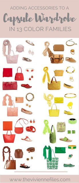
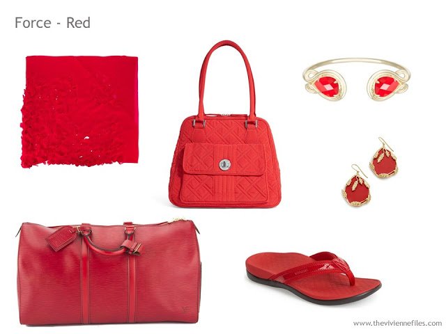
The section of the book that intrigued me first was one that linked a range of colors to certain personal or abstract qualities. I’m showing you the first half of them today, along with some ways that each color could be incorporated into your wardrobe.It’s particularly thought-provoking to me that red is a symbol of force; it’s by far my favorite accent color, and I don’t consider myself to be at all forceful… hmmm…
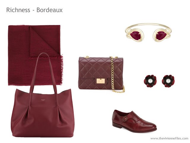
I love this bordeaux; it would be beautiful with so many neutrals. Like maybe camel?
And if you like this bracelet style, but not the color, it is available in 22 colors. Kendra Scott’s website is very different from other jewelry companies, in that you can search by color. It’s addictive fun…
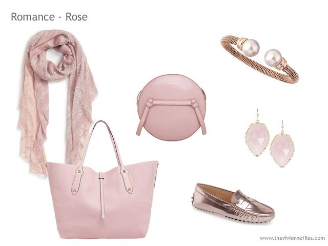
And this – oh those shoes…. and the bracelet… sigh…
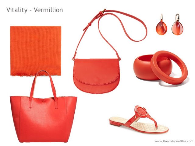
This is certainly energetic, and really attractive for warmer weather.
These colors are way out of my normal range, but I find them lush and rich…
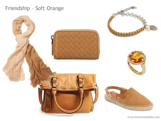
In order to find things that were in the range as described in the book, I ended up searching for camel and then choosing the rosiest among the offerings. And the stone citrine was a good choice, too…
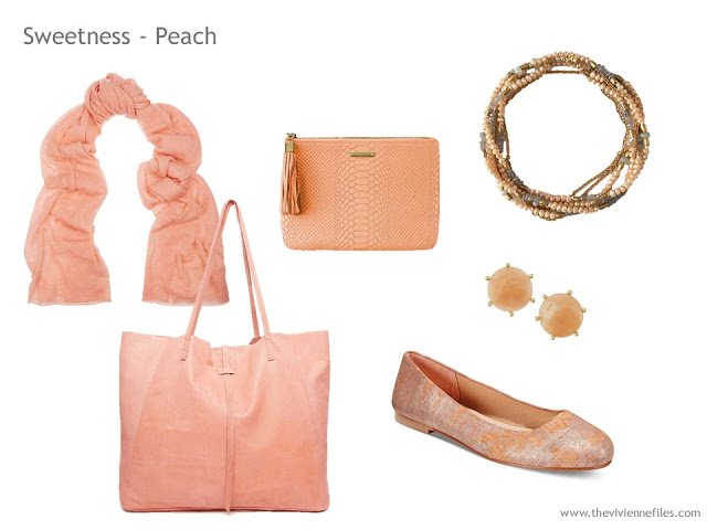
Peach is almost always easy to find, and goes beautifully with all warm colors, and with navy or grey. These shoes with a pale grey outfit would be perfect.
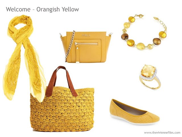
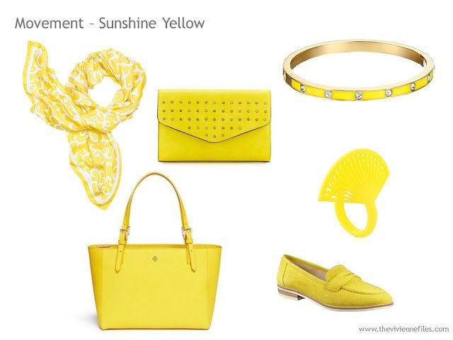
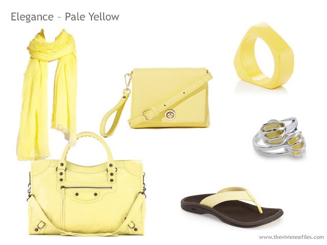
3 shades of yellow! Oh heavens…
From warm and rich to bright and cheerful…
(You will note that some designers seems to gravitate to certain colors. When you find someone who works in your favorite color, it’s wise to keep an eye on their work, in case they come up with something perfect for you.)
And then on to softly subtle…
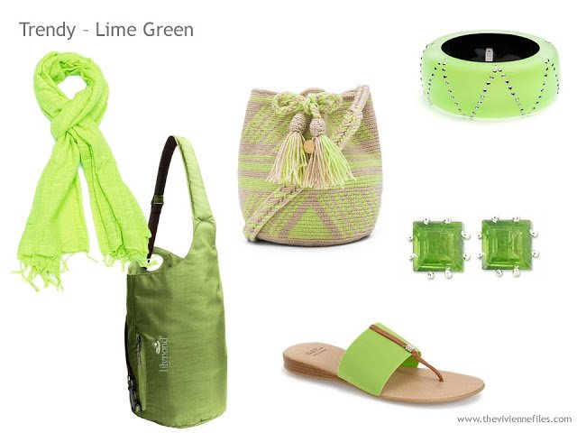
(the sandals are available in TWENTY-FIVE colors, just in case you’re looking for a particular shade!)
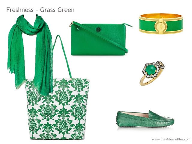
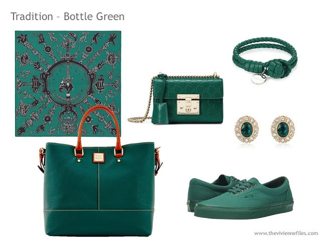
And 3 shades of green!
This is another accent color that just sings of warm weather, doesn’t it?
Picture this with navy:
Tomorrow, if I can get it done, I’ll share the other 13 colors they discussed in the book. I’m eager to know which colors are your favorites!
love,
Janice
Interesting. But the logic would imply that a person who chooses a shade because of their hair and skin color has a personality trait linked to that. Which I find a little like astrology. Fun but not real.
I love your vignettes. I'm drawn to both the vivid shades and the dark ones. What does that say? Hmmm!
This reminds me of the Colour Image Scale by Shigenobu Kobayashi, which I find fun and intriguing, but ultimately absurd, because assigning a single meaning to any color seems the height of absurdity to me.
I do love red – and my husband says I "move through the world with too much force" i.e., I'm forever whacking myself or breaking things. But lately I've been dropping the "too much" in my mind. Here's to forceful women!!!
Must I pick just one as a favorite?
In order of preference:
Rose
Bordeaux
Red
Soft Yellow
Fresh Green
Bottle Green
Peach
I do almost always gravitate to the blush/rose family, so I imagine that could be called my *favorite*, but with the turn of a season, I will then want fresh green or sky blue.
I cannot wait to see the blue range =)
Bottle green for sure! Sadly, the Vans are sold out in my size. That is probably a good thing.
Char Vee, Johnson &Murphy has a loafer in this bottle green that is just lucious.
Lizette Thanks for the tip. They have a store in a mall near me. Will check it out.
Fun! So far I am sweet and elegant. :)
Wow! Is there a color that represents restraint? These vignettes are all so beautiful! Perfectly paired and only a click away… (sigh). Another fabulous post.
So far my favorite is peach.. I guess you will get into the blues tomorrow .. What a lovely post . Love all the bracelets , sigh – Janice Collins Washington DC
Not sure what this says about me, but I'd be happy to have any of these lovely accessory capsules magically appear into my wardrobe. Every one of these colors would look lovely with my collection of black, grey, white and camel basics… :D
-Sara K-
Wow!!! What a lot of work….and such interesting combinations with most neutrals..Thank you Janice.
I'm all about the lime and grass greens. The bottle green is also lovely to look at, but isn't quite my color to wear. I like the rose and bordeaux and red and chestnut too.
But what about olive green? Some of those lime greens looked a bit olivey, I guess, and my favorite leaf green shade might also fit under lime. And I guess emerald might go with grass green.
Carnation/bubblegum pink might be shoved under rose, but fuschia definitely won't be! Maybe it'll come up in the purples!
In related news, I'm working on a project with my own color perception – breaking down the RGB scale into 1000 colors and seeing what basic color (red, brown, purple, etc) I call each one, whether I like it for clothing for myself, and which colors I think of as being the same. Then planning on using data analysis software to look for patterns. Because I am a geek.
-Kaci
So many are compelling to me. But I am drawn to peach, soft orange, and terra cotta, colors that people almost always comment on when I wear them. But recently, I have been drawn to raspberry, of all colors, one that I never wear. Will be interested to see if it is in your next group and what it's meaning is. Maybe it will give me an insight into my sudden affinity for it.
So far my favorites are Bordeaux and terra cotta. Looking forward to next round. I cannot imagine the amount of work involved to put these selections together, but thank you for sharing your amazing creativity with us.
Ditto for me on those two choices, along with the peach.
And the bottle green.
Yes, another big thank you. I am going to search for this book locally in our few remaining used bookstores. I am very impressed with Kaci above doing her PHD in colour analysis. I took a colour analysis course for weavers/dyers a while ago and really learned a lot about how to really see colours. My favorite of all these is the terra cotta.
Deb from Vancouver
For me, it really depends on what the item is. I love the bottle green, for instance, for scarves and handbags, but do not care to wear it as jewelry, shoes, or clothing. The orangish yellow for shoes, bags, and jewelry but not a hint of it in any scarf. The grass green for clothing and handbags, but not jewelry, scarves, or shoes…I look forward to reading the book for more fun thoughts about it.
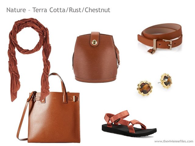
My favorite of these is the terra cotta/rust/chestnut, which is honestly the colour I think of when I think of "brown". I always choose objects in it with texture: crocodile, woven, winkled, etc. I particularly like it in its deeper incarnations and vary the tone slightly piece to piece. A dead-on match ruins it for my eyes, as does a too-smooth finish or adding any red undertones — I aim for the variation/depth found in antique yew woods from nearest the bark and bees-waxed mahogany — not modern stained mahogany, which runs toward the burgundies.
I love it for boots, handbags, scarves, eyewear, and jewelry (horn! shell! bone! tortoise! dark ivory! many of these gorgeous materials are now available lab-created or ethically sourced) with chocolate brown, navy, and matte deepest black. Whenever I find a complex-charcoal sweater, coat, and other very long term piece of clothing that sings with this shade I snap it right up — for decades some of my most-worn and most-complimented ensembles have been some version of these combinations. Amazing with my Longwood scarf from Image Diaries and grey moonstone earrings! I love love it with sard, chatoyancy, chalcedony, cassiterite, hematite, or anglesite earrings or bracelet. The major drawback with this tone is that I am a failure at making it work with any shade of taupe – but not for lack of trying – because this colour of furniture looks fabulous against the right shade of taupe wallpaper.
My perfect aspirational outfit would be a casual, multipurpose dress of this colour with abalone earrings, a graceful multi-metal bracelet, a lovely lightweight scarf or pashmina, a cozy cardigan, a deep slouchy hobo bag like the Issey Miyake Pleats Cauliflower one or something made from hemp perhaps, and some travel-friendly flip flops or mules. From playground to special occasion, if I ever find just the right pieces to make this happen I will wear it all the time. I have yet to find a dress this colour that does not look flat or is not heavy like a tweed or lined wool….but I will keep my eye out.
(sorry this comment is so long – I'll sit on my hands for a while, but continue to read and enjoy your blog daily as usual) : )
Don't you DARE sit on your hands – I love to hear from you! And that goes for ALL readers of The Vivienne Files – get in here and join the conversation. I learn from each and every one of you, and we all share so much good information, encouragement, and humor.
hugs,
Janice
No, don't apologise, I really loved reading your comment. So reassuring to find someone else who can get as obsessive over particular colours as I do – there must be a name for it! You seem to be a loyal follower of your particular version of brown – I tend to chop and change, the current favourite being the deep 'midnight' navy shown in the next post – with a splash of grey in it and a touch of indigo (so different from a nautical navy)!
Alice
Due to your tutelage, I can see a couple of 4 piece basic wardrobe cores with a few of these and you would have an enchanting wardrobe. You could expand it with just one colored t-shirt or multi in several of your selected colors combined. High impact, concise and full of pizzaz. Never boring. Thank you for all your efforts.
I was smitten with bottle green and attracted to the peach.
Peach, chestnut and red are my favorites. I really like that soft yellow too. Very pretty!
Kaci, 1000 colors! WOW! What a project! Good luck!
Thanks Irlincks! Obviously just generating the data is a time-consuming project, especially since it's just an hour here and there that I spend on it. But I really love and am fascinated by color, so it makes me happy :-)
– Kaci
I think I have a shoe fetish… Carol S
The Bordeaux and the Rose appeal to me – I'm looking forward to the blues. Accessory capsules in these colours would be such a fun project to collect.
Kaci, you are my kind of geek.