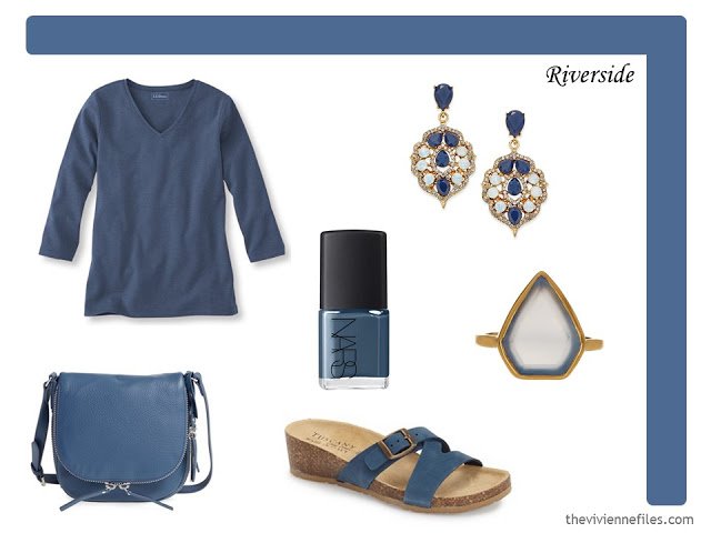
¾ sleeve tee – L.L.Bean; earrings – INC International Concepts; nail polish – Nars Mots Bleus; ring – Savvy Cie; bag – Vince Camuto; sandals – Tuscany
This color is really pretty, but it’s not functionally all that different from the light blue – Serenity – that is one of the 2016 colors of the year. Serenity is a bit more purple, where this is more grey… Nonetheless, it’s a color that could be flattering on a lot of women, particularly if you have blue eyes.
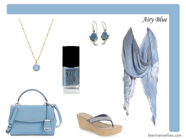
Necklace – Gilt; nail polish – Forever 21 Dusty Blue; earrings – Shanker; bag – MICHAEL Michael Kors; sandals – Athena Alexander; scarf – Eileen Fisher
It’s just dark grey. Seriously. I love grey, but it’s hard to get terribly carried away by a color that’s a core neutral for a lot of people.
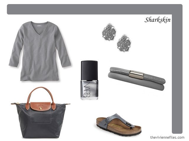
3/4 sleeve tee – L.L.Bean; earrings – Kendra Scott; bag – Longchamp; nail polish – Nars Amarapura; leather bracelet – Endless Jewelry; sandals – Birkenstock
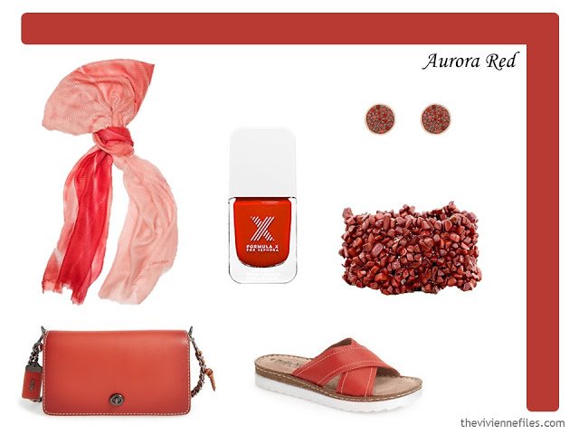
Scarf – Calvin Klein; nail polish – Formula X Flashy; earrings – Henri Bendel; bracelet – Ritu; bag – Coach; sandals – Bella Vita
Sigh… it’s just warm taupe. I love taupe; I think it looks subtle and rich, but I don’t know if it’s something that qualifies as a “new” color. But if you currently wear navy or grey, taupe could be a great accent to try. Or black – that bag just cries out for a black dress…
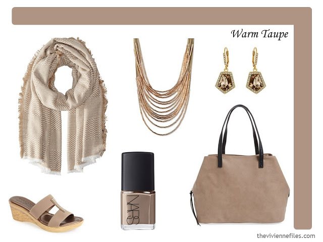
scarf – Hat Attack; cord and bead necklace – Natasha; earrings – Vince Camuto; sandals – Tuscany; nail polish – Nars Bad Influence; bag – Sole Society
It surprises me that there are 2 colors so very similar – the Aurora Red, and this. This color is a bit cooler, and really quite pretty, but madly difficult to find. When I couldn’t find nail polish that captured the subtlety that I was seeking, I decided to settle on this beautiful paler shade instead. Light Dusty Cedar?
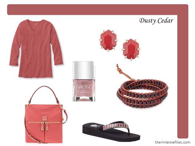
¾ sleeve tee – L.L.Bean; earrings – Kendra Scott; nail polish – Nails Inc Alexa Cashmere; bracelet – Siriporn; bag – Henri Bendel; flip flops – Yellowbox
I grew up in the country, and I’ve lived in Ireland, and I’ve STILL never see a meadow this color. But this is beautiful – and I love the idea of a scarf that should be a winter scarf (dark plaid) in a chiffon. Those kinds of shifts of weight or texture in fabric keep things interesting. And if you’re looking for moderately priced jewelry in a wide variety of colors (that’s SHOPPABLE by color!), look at Kendra Scott. Yes, her jewelry is everywhere, but she carries a really wide range of styles and colors, so you’re still not likely to see yourself coming and going…
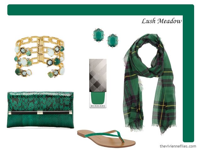
Bracelet – Alexis Bittar; earrings – Kendra Scott; nail polish – Burberry Sage Green; gauze scarf – Arte Cashmere; wallet – Diane von Furstenberg; flip flops – Banana Republic
Oy. I’ve said it before, and I’ll say it again – if you look good in yellow, wear it, and wear it often, because you’ve got an advantage over the majority of women in the world! This is particularly tough color for warm weather – it just feels, to me, like it ought to be a big fluffy sweater. But, maybe, a bikini? But I think you’d need a tan, and we all know better than to do that, don’t we? If you like this color, but don’t think it flatters you, the bracelet, handbag, or a pedicure, might be something to consider. Keeping unflattering colors away from your face can be a game-changer!
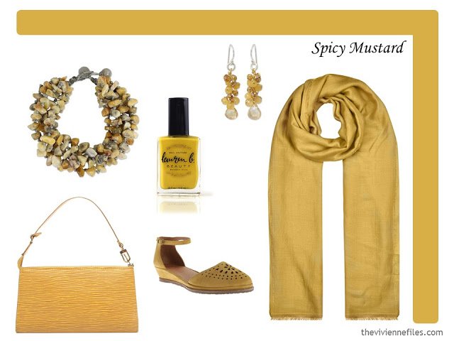
bracelet – Sasina; nail polish – Lauren B Coachella Valley Sun; earrings – Anusara; bag – Louis Vuitton; wedges – Gentle Soles; scarf – Monsoon
I love this color – I call it copper… We can understand why I don’t work for Pantone, eh?
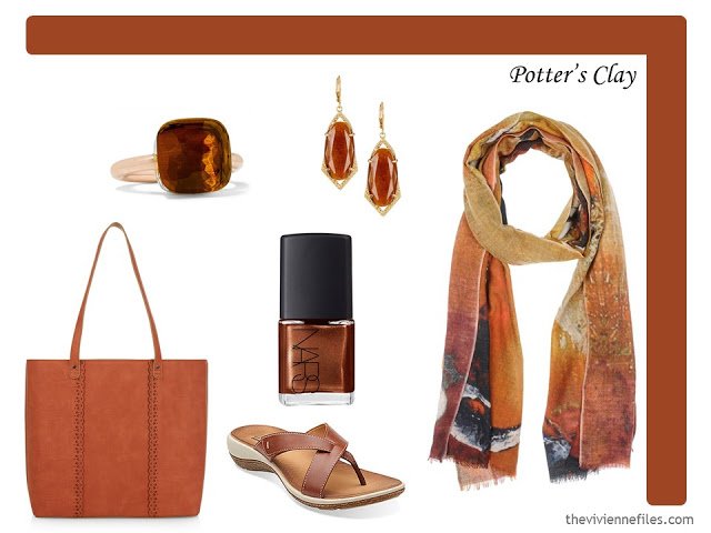
ring – Pomellato; earrings – Vince Camuto; nail polish – Nars Delos; tote – Monsoon; sandals – Clarks; scarf – Meesha
There could not POSSIBLE be a color name that I could dislike more than I dislike this. Bodacious sounds, to me, like a blowsy, loud, slightly obnoxious woman who’s making a spectacle of herself…But if you want to call it bright orchid, it feels much better. And this scarf could certainly brighten up almost any winter coat – navy, grey, black, brown…
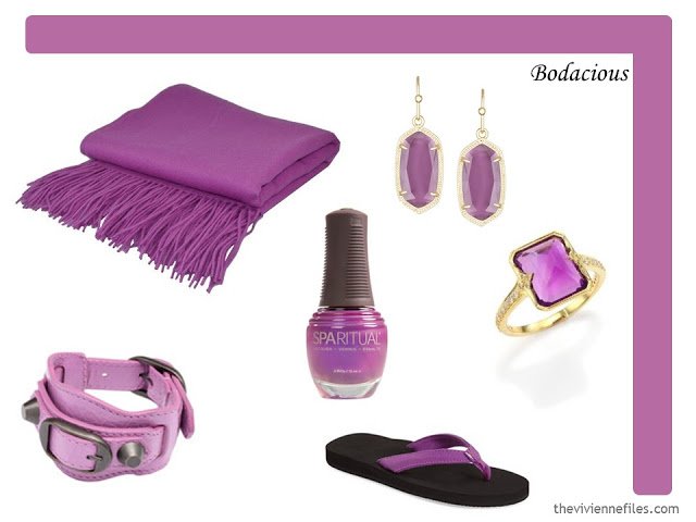
Cashmere wrap – Pür by Pür; earrings – Kendra Scott; leather bracelet – Balenciaga; polish – Sparitual Disco Inferno; ring – Ila; flip-flops – Rainbow
More “1 at a Time” wardrobes are in the works… I still have a LONG list of color schemes!
love,
Janice
PS – You can find the latest Pantone Color Planner and other documents in the Planning Documents section of the website.
Thanks for going through all the colours. I would nearly (but not) get my ears pierced so I could wear the blue earrings (Riverside). Being in the southern hemisphere Autumn right now, I am never sure what the colours are on the minds of the manufacturers, if at all, or if they have forgotten Pantone by the time the clothes hit the shops. Love the accessories they are brilliant. Carol S
I agree, some lovely examples in each of the tones. It seems to be that if one is thinking of choosing a particular accent colour, then it could be useful to purchase all the items you wish to acquire in that year- given the habit fashion houses have of doing substantial changes in tone and intensity each year so as to "invent" a new colour that then doesn't work so well with the previous year's colour. What are your thoughts on this?
It would be fun to choose a new accent color every year, and purchase things through the season in that color – and it would make a lot of sense given the availability of the seasonal color, and the possibility that your purchases would match better. For anybody who has their "core" of neutral things well-established, this is a wonderful idea!
thanks for sharing,
Janice
I could kick myself for not purchasing a pair of capris or shorts last year offering items in a color called "Caribbean Blue". Several varied tops in that color were purchased by me, but not the matching bottom. And now — they are not to be found ! Lesson learned !
That is so insightful. Of course, we see it happening, but I personally never thought of the products being ordered that way by manufacturers. Great advice, as always.
I love the Riverside, Potter's clay, taupe, and lush meadow…so pretty. Thanks for the inspiration!
These are more inspiring that earlier seasons – I particularly like the meadow, and think it would pair well with sharkskin, airy blue and mustard. I'd love to see some outfits based on this palette!
Alice
I love the airy blue and sharkskin I will be planning my Spring wardrobe round these flattering, for me, colours.
I had a business suit in Aurora Red and it looked wonderful on me. Then children happened and my body changed forever. I've never found that particular color in an investment piece again.
I wonder what other names it could go by?
Theresa
At one time St John knits had a collection in this colour that I loved and wore often — if I remember correctly it was named something new-england-y or yacht-inspired in those days: Nantucket Red, Deckhand Red, Faded Barn?
It used to be more frequent as cochineal, carmine, madder, and red ochre, but in the last few decades those colour names tend to bring up brighter, less natural variations of this. It still comes up sometimes in leather and raffia goods, and sometimes 100% linens, but is almost impossible to find in other materials. Although, if it is in style right now, it is sure to come across the clothing and housewares market in the next year or so at all price levels, too.
It occurs often in stone from the Rocky and Himalayas, and back in the 'olden days' (pre1980s) when paint and dyes had lead in them, lead oxide and/or chromate lent this undertone to many shades of coral, pink, red, and orange. Antique oriental rugs and textiles almost always have this tone in their reds because of the way vegetable dyes fade over time.
In medieval stained glass they used gold oxide and potash to achieve this warm red, and the old masters painted in it often. So, looking for this colour, I would probably look at true oil paints on an art website, or go to paint store and check out the heritage and/or full spectrum offerings and look there. They are likely to be named things that might spur a productive search.
Also, looking at what names the most expensive designers are currently using for a colour often leads me downmarket, too, to options major brands call something. With quirky shades like this and chartreuse that works for me, sometimes.
— With quirky shades like this and chartreuse, designer is worth seeking on eBay, charity shops, or Poshmark in my opinion to get the rich undertones, or direct from designers if it's in your budget. Hand dyed and hand loomed pieces from artisans at boutiques, galleries, during travel to less developed countries, at art fairs, and sometimes on Etsy are another source for pieces in natural colours with more subtle undertones, like this red.
I do have some silk and cotton pieces, including a pair of jeans, that were dyed with natural dyes and have faded to just this colour, so maybe check out vintage and secondhand reds, too? Just a thought.
As a side note, Pinterest has many pinners (Red paint's "House" board for example, or just search various minerals) who collect pins that lead me to specific tones of colour that I may be looking for for various reasons.
cheers
Sue G
Oh – not that the above was not already TOO long – but, menswear often has this shade of red. I might try to find simple Ts/sweaters, or unisex accessories like socks and scarves at Urban Outfitters, Brooks Brothers, or Woolwich mens'.
Thank you for all this information, it really adds value for me. This is a colour I really love and it is so elusive. Natural dyes are the best way I think to achieve this colour. Donna Karan used this colour on her collections which I still sigh over.
Deb from Vancouver
Wonderful post, Sue, thanks for the info. I think the names of colours are really interesting and loved 'Deckhand Red, Faded Barn' – hilarious!
Alice
Bodacious is not a color. Didn't David Keith's character use that distasteful word to refer to a "set of ta tas" in An Officer an A Gentleman? The color could only be called bright orchid. What on earth was Panetone thinking?
Your charming post reminded me so much of my favorite scene from Mr Blandings Builds His Dream House. Like you, Myrna Loy is perfect about the messiness of trying to find just the right colour:
https://www.youtube.com/watch?v=7ZwOGVWqHAw
: ) Sue G
Janice, I was recently asked why I visit your blog on a daily basis above all others and what is it that's so interesting and what am I learning? Simple, I have a master-class on colour, practical help in planning and organising various types of capsules, a growing knowledge of art and design, a growing directory of retail stores and designers and not a bit of pressure or envy to boot as it is not fashion led. I'm sure your loyal followers can come up with a few more examples of why they choose to visit everyday. By the way, today's post was as refreshing as a Spring morning….
Sharon from Plymouth, UK.
Bodacious is a dumb name for a color! I am loving the warm taupe, Potter's Clay and the Riverside! Will have to remember that for Fall! Very nice accessories Janice. Your attention to detail is amazing!
Many of these colours are my favorites and they are usually very hard to find. So really looking forward to the Fall merchandise.
Deb from Vancouver
I love the bright orchid and I do not look flashy in it. I wear it with a conservative grey striped shirt and black scarf, with black tights. Very gamin and it suits me. But yes, you do have to be careful how you wear this colour or you could look very loud.
I would like to wrap myself in that Potter's Clay scarf! Great ideas here for play and purpose.
riverside and dusty cedar are my accent colors;black and olive green are my cores. finding things in these colors is difficult,so shopping is easy. I am hoping to find light weight, flowing knits for summer, but am not holding my breath. it was hard enough in fall and winter. I've not whopped land's end before, so it appears I may be trying it out. keep the visions and guidance coming.
Love the blues. Aurora red looks like brick red and dusty cedar looks like dusty rose. No offense to Pantone but Spicy Mustard looks too much like the gold kitchen appliances from when I was a kid.
I'm pretty sure Bodacious is loosely based on Queen Boadicea. And if it wasn't before, it is now. Because I said so. ;-)
I love your explanation! But I just looked up the origins, and it's a conflation of bold and audacious, which I don't like AT ALL. I say we all just adopt your logic and toss the other…
hugs,
Janice