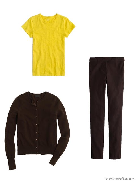
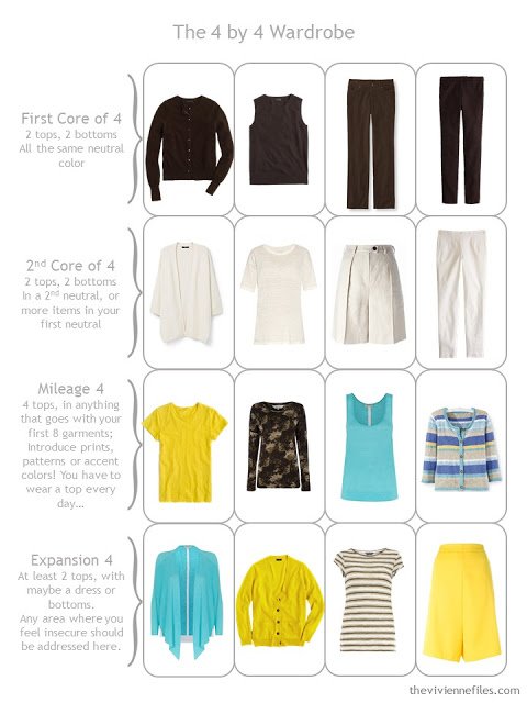
This is really a great color scheme – the accent colors are sufficiently different from each other that introducing them into an outfit gives you two very different sensibilities…And I didn’t set out to find so many pieces from one source, but when I found that they had matching pieces in brown, it didn’t seem like a bad idea!
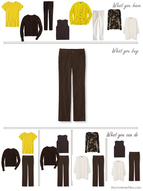
So the matching brown pieces made it impossible to resist getting a brown shell, too. I think of this as a wardrobe that’s ideally suited for changeable weather, or for those of us who have hot flashes…
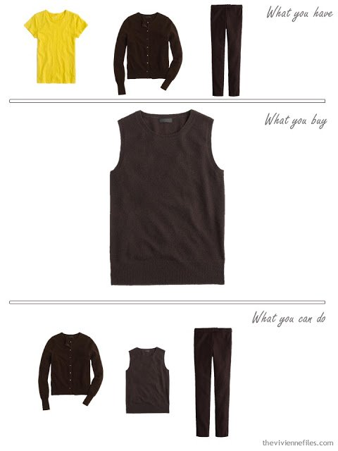
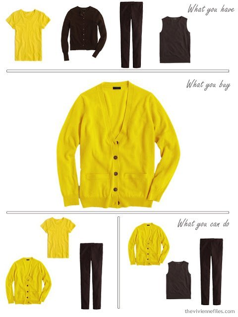
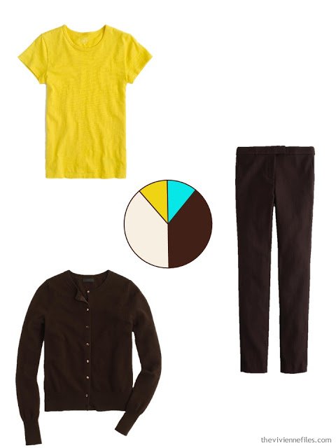
I love this yellow…
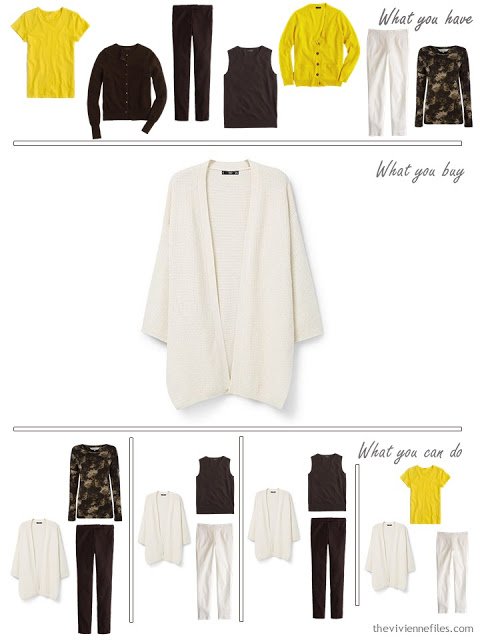
Cream and brown together are an underrated combination – every bit as classic as black and white, and much more flattering for many among us.
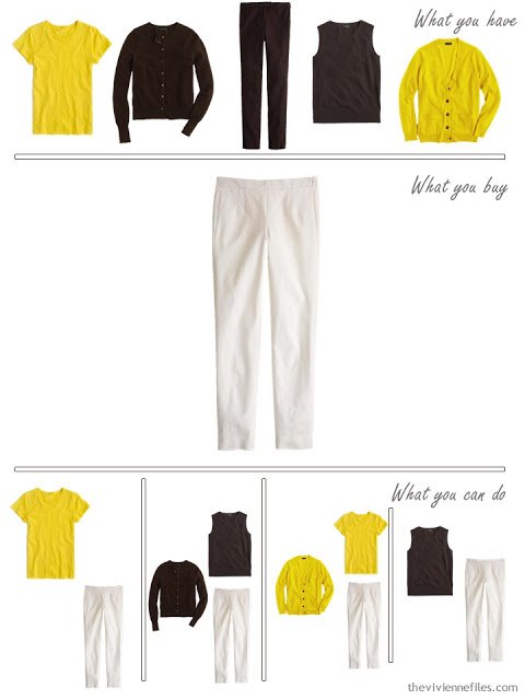
Pants – J. Crew
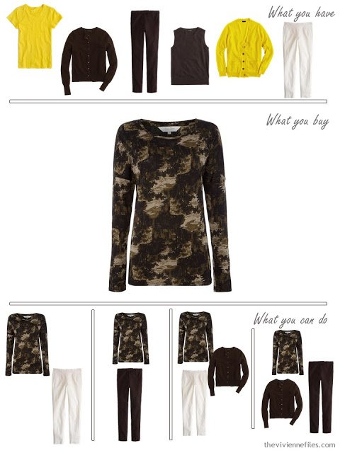
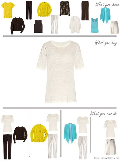
Finding print or patterned clothes in these colors has proven to be REALLY difficult, so when I saw this tee shirt, I grabbed it. The lightest color here is still darker than the cream that we were targeting, but it will still blend nicely. So long as the brown shades have the same degree of red in them, blending is always a good option.
In lieu of a skirt, I thought I’d go with another pair of pants, in a different fabric. Corduroy feels VERY different in an outfit from twill or gabardine.
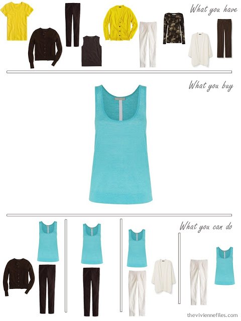
Now for a bit of aqua!
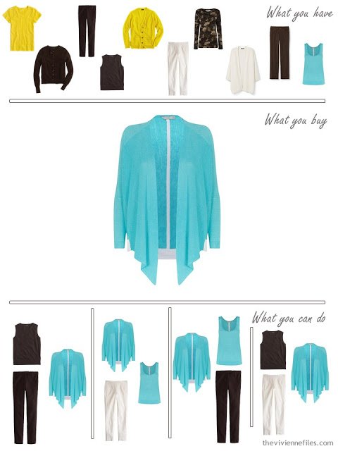
And another bit!
Since I skipped a brown skirt, I thought I’d skip a cream one too – this is a more casual wardrobe than the earlier versions of “1 at a Time.” These are the kinds of modifications that you can freely make when you adapt this system to your own needs!
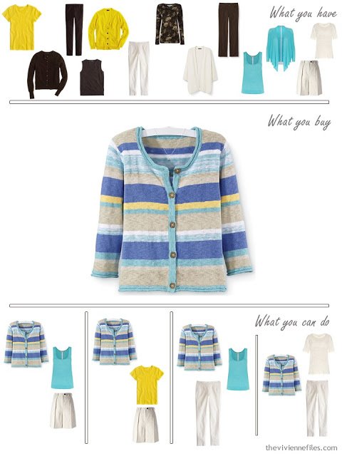
I turned the Internet UPSIDE DOWN looking for this cardigan, and then I turned it over AGAIN trying to find an image that didn’t have a stupid clothes hanger (and a necklace!) on it. I failed… but this sweater was made for these colors, don’t you think?
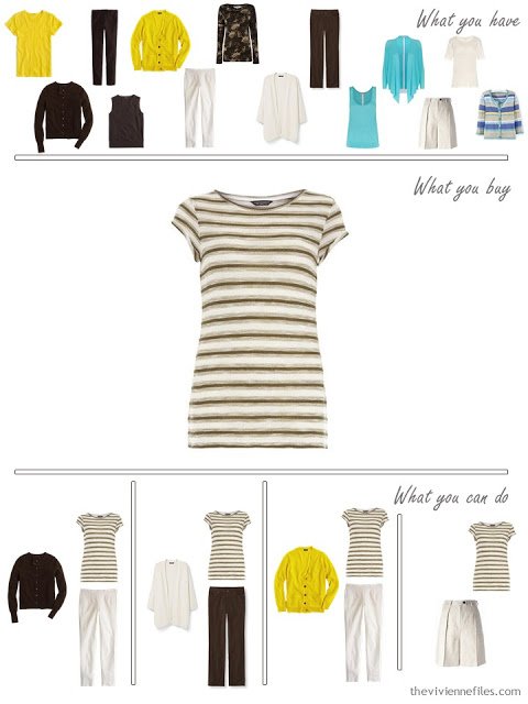
An additional bit of print might be nice – a neutral striped tee shirt is ALWAYS a good idea!
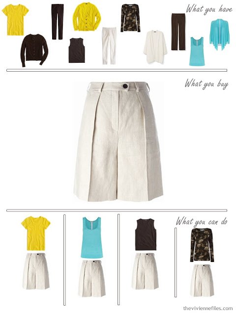
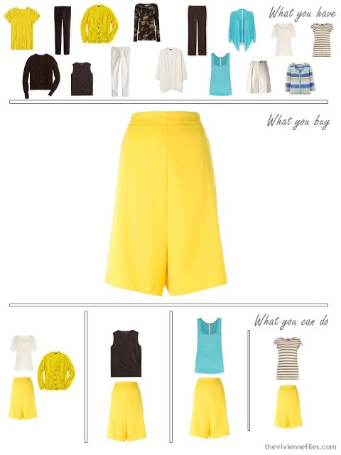
And since I’ve eschewed skirts so far, I thought I’d go a bit crazy with the last piece – yellow culottes. (although Stella McCartney refers to these as shorts, and who am I to argue with her?)
What a fun wardrobe, when it’s all together!
I can’t wait until I get to find accessories for THIS one….
more brown on Tuesday,
love,
Janice
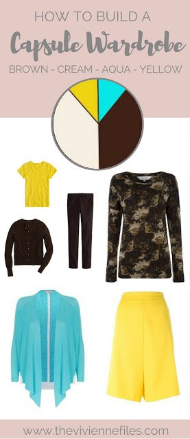
I love turquoise and brown together. Just the perfect yin and yang. The sharpness of turquoise with the richness of brown.
I agree with Taste of France. Well done!
I also love brown and cream together, like a banana split with chocolate sauce. or brownies with whipped cream. Sorry, typing this before breakfast. I see that you have create the possibility of many sweater sets, allowing for much creativity.
Deb from Vancouver
You have me chuckling Deb: brown and cream is a favourite combo of mine too, as are banana splits and brownies with cream, not to mention Vienna coffee. Just wondering how to factor something in a soft blue into my Sunday brunch …
Robyn in Tasmania
I really like the way you can take these core principles of choosing two neutrals that you really like, then choosing 2,3 or 4 accent colours that really suit you, or you really love. Just curious,would you strongly the priciple of column dressing to a young adult who has a really svelte figure, or is the column more important for us whose figures are less trim?
My favourite so far in this series. I love the yellow and there are some interesting shapes in the garments- lots of scop for unusual combinations. Alice.
The yellow, brown and cream scream banana to me. All you need is some peridot jewelry to make it complete. ;P
This makes my little heart go pitty pat! Love these colors and can't wait for the accessories.
I about swooned when I saw this combo. Love it! I can't wait for the accessories either. :) I would probably tone down the yellow a little bit.
That's an interesting wardrobe. The pieces are not as effortless… I think that screaming yellow really draws attnetion to itself with the brown, and is just too strident to mix much with However, if these colors suited you, you would not risk looking "too much the same" all the time! Your colors would definintely stand out! It is so much fun to see how colors work together with your systems.