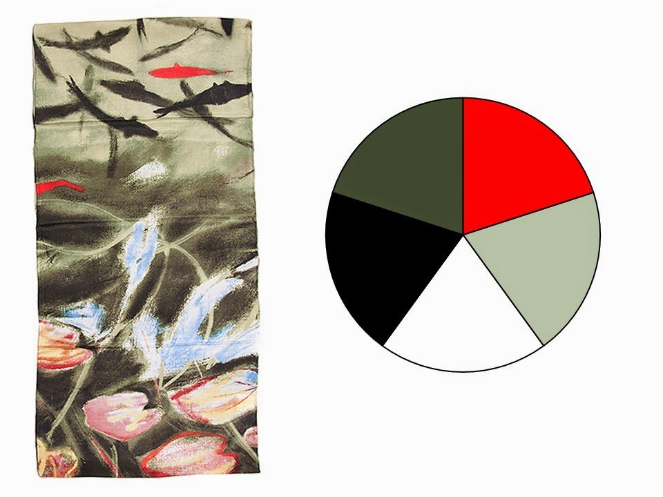
Dark Pond Alhambra Granada by Elizabeth Blackadder
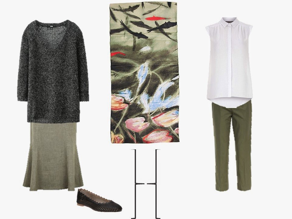
The way you fold a scarf can make a huge difference in what’s shown or concealed – the beautiful Mai Tai is a master at showing you how this works (and just, in general, how to wear a scarf to brilliant effect.)
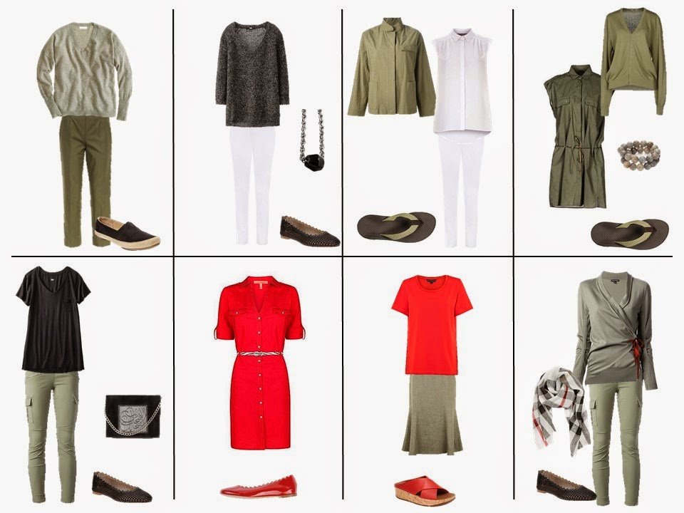
Red and white works beautifully with olive accents. And if you want to look for perfect jewelry in this color range, look for the stone labradorite – it often shows glorious greens and greys.
And now your shirtdress is red, rather than soft blue…
What a great ensemble!
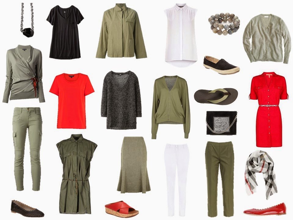
necklace – Caipora Jewellery, top – Mossimo, jacket – Isabel Marant Etoile, sleeveless top – Dorothy Perkins, bracelet- Nest, sweater- J.Crew, wrap top – Ann Demeulemeester, tee shirt – French Connection, sweater – Uniqlo, cardigan – Heritage, canvas shoes – Cloud9, sandals – Chaco, bag – Dareen Hakim, red shirtdress – Mango, jeans – J Brand, perforated flat – Chloe, shirtdress- Hartford, skirt – Eastex, sandals – Fitflop, jeans – Kaliko, capris – Lafayette 148 New York, scarf – Burberry, flats- Chloe
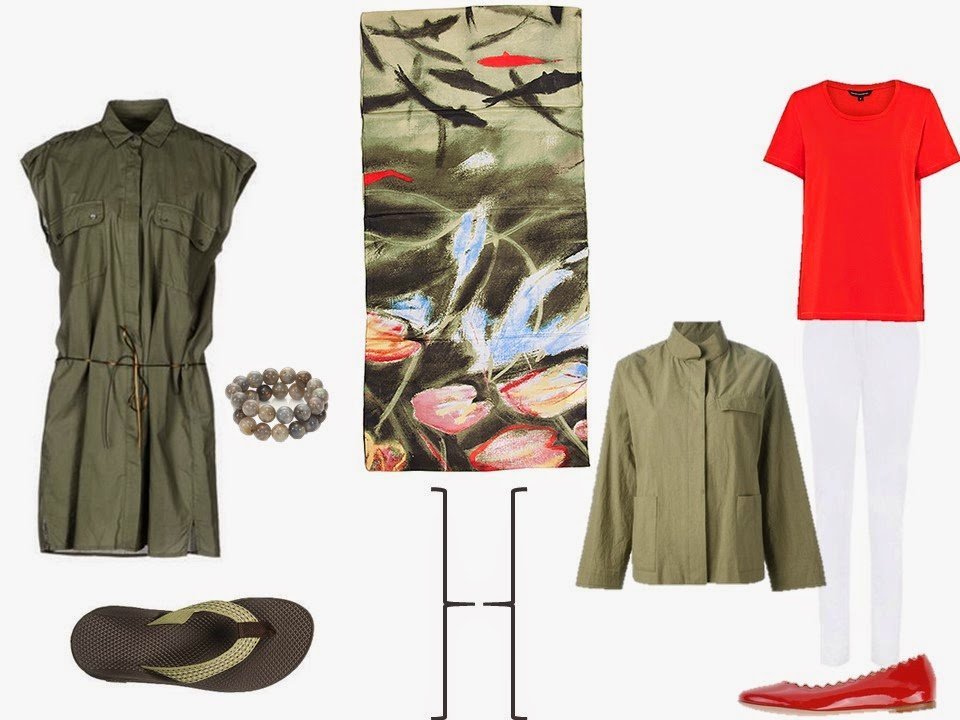
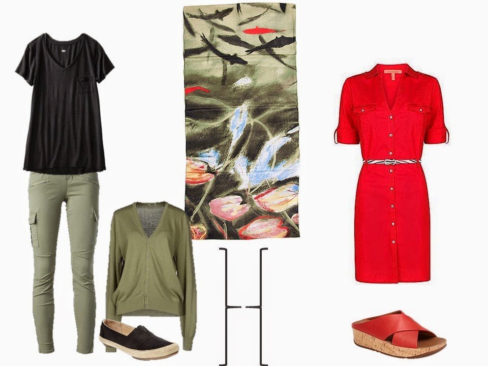
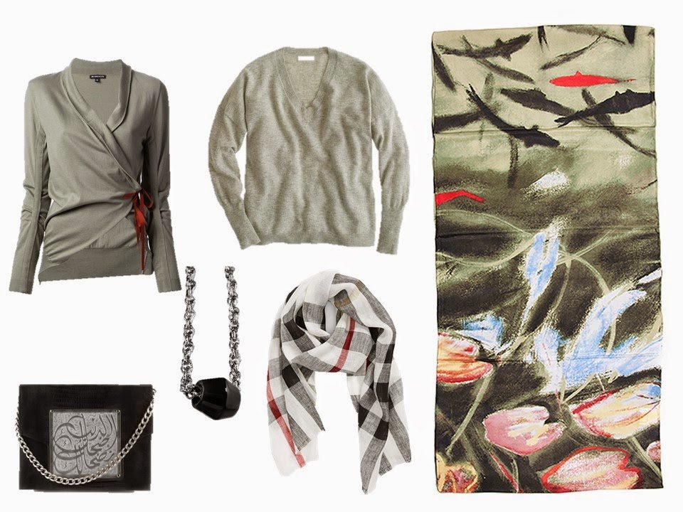
With these garments in a suitcase, one could go anywhere–for weeks. One of my favorite posts ever, Janice. I especially love the way that this orangey-red and gray looks so much fresher than the old stand-by black and red.
I agree with Gail. This is wonderful. After my shopping fast is over, I think I might veer to my beloved mud colors again.
love love love love thanks!
Even though I would look absolutely horrendous in this capsule, I love it, and think it looks HUGELY wearable and it's just so pretty.
I liked yesterday's post showing pastels with the olive gray neutrals, although I rarely wear pastels, but today's post simply reinforces my original thought – this is a GOOD TO GO capsule for ALL seasons. AWESOME posts. . . thanks so much !
Lovely and you are not lazy. You are a master of showing us just how versatile items can be. For someone on a budget its much better to see just how far you can stretch an item if need be.
I don't think using the same neutrals is lazy, I think these two posts show how a good set of basics can be changed up across the seasons with different accent colors (yesterday's capsule seemed perfect for spring, and today's seems more like autumn, with the scarf as a bridge between the two). This is a strategy I'm playing with in my own wardrobe, I'm hoping that shifting my color palette with the seasons will help fill my need for variety without making me overwhelmed by options at any one time.
Not lazy at all! Eminently sensible, actually, to plan a year-round wardrobe using a neutral base, with the accent colors changing with the seasons. Thank you for all the work you put into sharing your knowledge with us.
Nice options there. Some of the outfits are a bit dull in colour for me, but if you actually added the scarf (instead of just using it for inspiration), you'd be away laughing.
I'm not sure about the olivey-grey. I'm a 'cool winter' in the old colour descriptions so I think olive is probably not my friend. Cool greys are all good, though.
This one is magnificent! I have always loved the combination of olive and red, and it all works so perfectly here. I once had a number of olive pieces, but they seemed to disappear when gray began sneaking into my wardrobe. I am now rethinking the whole thing.
I've been trying to get away from black, but this makes me rethink that stance! Thank you for the inspiration!