February 19, 2013
Here’s where the Pantone colors became nearly impossible for me – these are difficult to find, and I’m still struggling to make the outfits work…
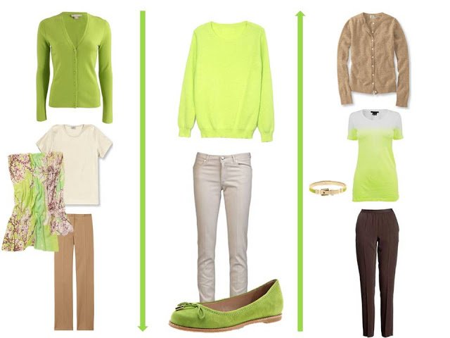
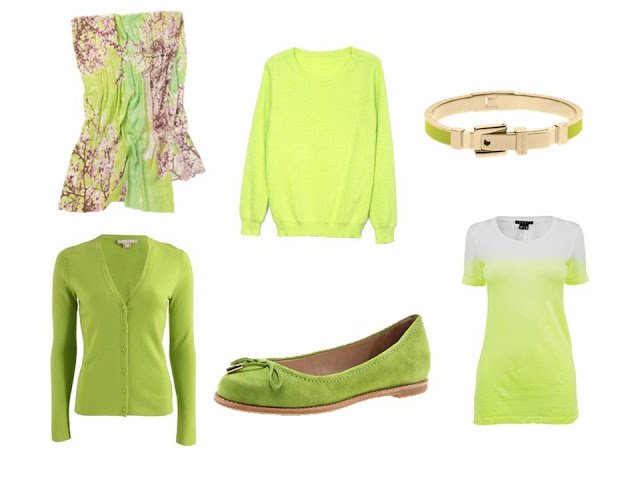
Scarf – Anthropologie, cardigan – Michael Kors, sweater – Romwe, flats – Le Saunda, leather & enamel bracelet – Michael Kors, tee shirt – Theory
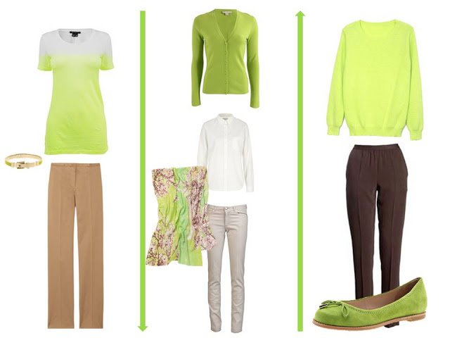
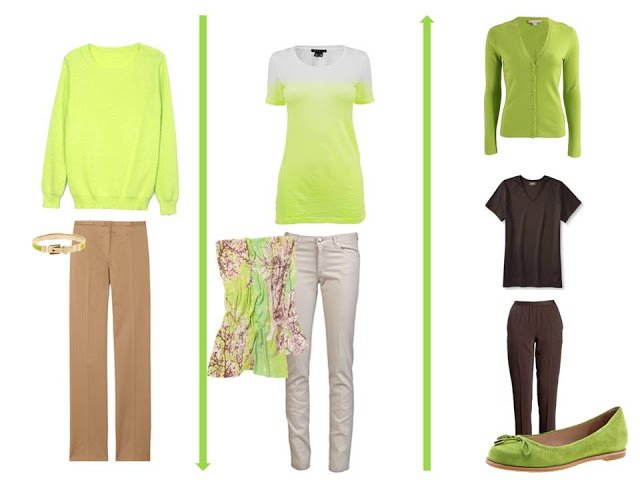
The Common Wardrobe with which we started:
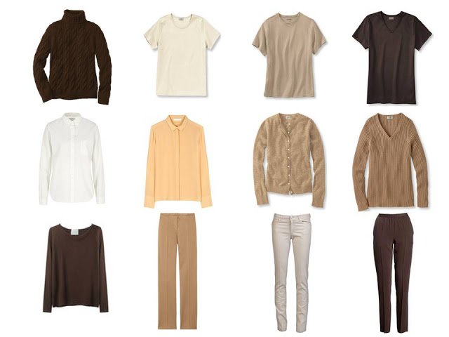
Top row – L.L.Bean, cream shirt – Kitsune, peach blouse – Chloe, cardigan & v-neck sweater – L.L.Bean, brown long-sleeved tee – La Garconne, tan pants – Jil Sander, cream jeans – Les Copains, brown pants – Maison Martin Margiela
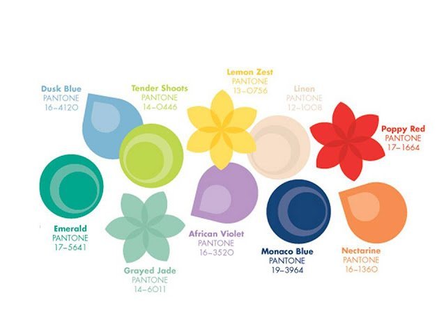
Pantone Spring/Summer 2013
love,
Janice
difficult to find – maybe that's a good thing – this shade is difficult for most women to wear – but one that many high school and college girls would gladly try (and mostly wear well)
That was my feeling – I know a couple of people who would look great in this color, but for the most part it wouldn't flatter me, nor most of my friends. We should bear in mind, however, that Pantone does NOT intend these colors only for women's apparel; I can see this shade of green making an appearance in home decor… (not MY home, but in stores, certainly!)
Honestly, I would not even sit on a sofa that is "tender shoots" – I look so bad and sickly in this color, that even furniture might reflect on me and make me look ill!
Beg to differ, Janice. This is the fashion, not home dec set. If you check Pantone's site, you will find what the featured fashion designers are doing with this palette.
I do like the MK cardigan as the color is a bit more saturated and pair it with brown or navy.
I actually like this color. Of course, my skin tone is more warm and I do think that this green has enough yellow in it to make coordinating it with cooler colors difficult. I agree that the cardigan color is more wearable than the neon pullover. I would stay away from any versions that truly looked "neon." I have seen a few companies offering items in a "celery" which is closer to the color of the inner ring on the Pantone graphic. Celery is a little more muted and looks to have a much wider range of coordinating possibilities. I have seen it paired with navy and it looks quite fresh but not over the top.
I agree that "celery" looks nice on some people and with some other colors, like navy. Janice did a good job of locating similar shades of tender shoots, but it's a tough one. I find it personally repellent, but I try to keep in mind that all colors have their place in this world!
A tender, not neon, shade of this yellow-green would look great with aqua, turquoise–especially with the right print or scarf tying it together, I think. Heroic effort here to make it work with brown, though.
I was surprised to find how much of this color–true chartreuse to something more acid yellow-green–there actually is in the spring-summer wardrobe in my closet (I have no fewer than four bags, two pairs of sandals, and two raincoats in something quite Tender Shoots). And it really makes black basics pop. Inspired by this discussion today, I decided to plan my spring break travel packing around this as the accent color. So, yes, all colors do have their place in the world!
Are you aware of how infuriatingly difficult your blog is to load & comment on? It won't load in Firefox, & it takes multiple reloads to get it to load in Chrome in classic format so that you can pull up a comment box?
The problem with working with this color is that its not geared to your basic picks. That celery green demands to be paired with navy & black, not washed out beige & grey. And the neutral that works the best with yellow greens is purple, there's a reason why its the classic color combination in sarees & such, they are opposites on the color wheel.
Target, interestingly enough, has a plethora of this shade right now. It's not my cup of tea (I just think neon is best left to the younger fashionistas). However, it's everywhere in the Prabal Gurung 'guest' line. I saw one of their own beautiful beige linen scarves that was edged in neon-y green 'tender shoots'.
I think Target's a good choice for a color like this—that's on trend, but possibly not a place you'd want to invest a lot of money, you know?
Hi – I personally LOVE the pantone version of this colour – more chartreuse than neon! I am a warm spring (strawberry blond hair, freckles, blue/green eyes) and find this to be a very flattering colour and snap up good quality/classic pieces whenever I find them which is not very often. Does anyone else gravitate to 'unpopular' colours – and revel in the fact that not many people want them? I do – chartreuse, salmon, absolutely! I generally wear this tone of green with either light basics (tan, grey)in the summer and with darker neutrals (navy, charcoal) in the winter. I agree that it doesn't lend itself to warmer mid/darker tone neutrals. I have a fantastic skirt that marries this tone with darker green, teal, navy and gold in brocade flowers – some colours just have to be shown off! I agree with you Janice – this is a colour that will likely show up as an accent and definitely in summer housewares, but probably not as a large amount of clothing options – especially with the competing green Emerald as colour of the year.
I, too, can wear this color along with tangerine and certain yellows. My current favorite scarf is from Madewell, is predominantly black with a coral and chartreuse print. I love that Janice paired this with some brown options.
Enjoying the comments.
I've tried this color and can't work it into my wardrobe, no way.
I agree that it would probably be better paired with navy or black, but it still wouldn't be in my closet.
Those shoes are swoon-worthy! I love the scarf, too. You've done a lovely job. :)
Like Michelle, this colour is really flattering on me. I find it interesting that others find it repellent. I do agree that it is much harder to coordinate a wardrobe around this colour, but I love it with the lighter neutrals. I seem to find that most of the colours that are very flattering on me don't play well with neutrals, which is frustrating when I would prefer a minimalist style wardrobe.
If you have very dramatic personal contrast, I agree it could look great with black, but i don't think that is the only option for this colour.
As a freckle face Celt, this colour suits me too. I have lots of it in my wardrobe – mostly for the Summer, but I have a snuggly chunky knit sweater in this colour for the worst Winter days. I find it's a colour that works particularly well with deep chocolate brown. In fact most neutrals that work with a soft aqua shade work with this green.
I have a sweater in this color that I just wore last weekend on a beautiful sunny day in Sonoma's wine country. I paired it with a warm navy silk blouse and blue jeans. I got compliments from strangers and I felt bright and pretty but not loud.
I love the chartreuse and celery versions of this colour. I abhor ANY neon colour, wherever it comes from on the colour wheel. It is actually a good colour for bright and warm springs and is great with navy. I think it is a colour that is best in small doses but so many of the pick-me-up colours are.